
Focus Management
Focus Management allows a user to select a particular visual element or component in your app. On a physical device, this is accomplished through keypress input on the D-Pad. When testing on the simulator, use the arrow keys + enter key.
Focus management is required to make TV navigation easy for users. Without visual feedback, there is no way to let the user know if a visual element, such as an image or button, requires further action. To build an app for a TV platform, you need a way to handle and give feedback about the focus of UI elements within the app.
Focus management overview video
The following video provides and introduction to focus management on a Vega Fire TV device.
Basic focus handling in Vega
How to indicate focus
Focus indicators are essential visual indications that show which element on a screen currently has keyboard focus. While these indicators are commonly implemented through styling changes like background colors or opacity adjustments, it's crucial to include physical property changes for accessibility reasons.
Physical changes—such as adding borders, modifying element size, or introducing additional UI components—ensure that focus states remain visible under various conditions. Unlike purely visual changes (color or opacity), physical alterations remain detectable even with accessibility setting such as High Contrast mode enabled.
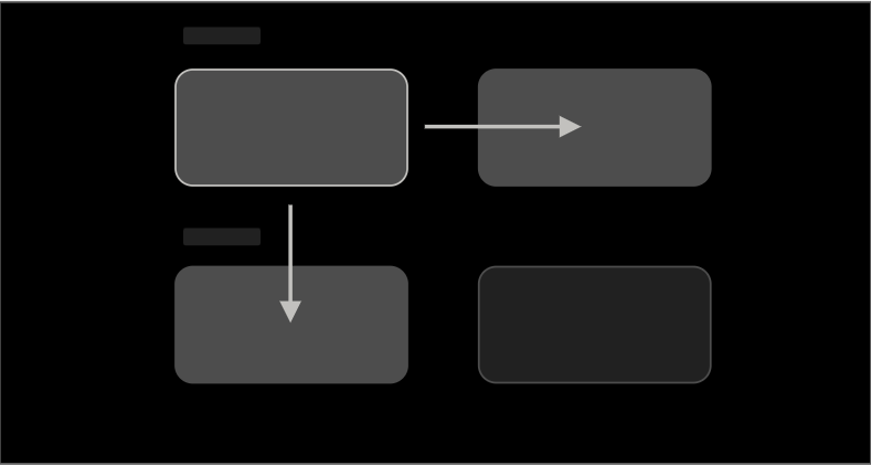
Component with out-of-the-box indications when focused
In Vega, similar to React Native, focus indication isn't provided at the platform level for most components. Only two components, <Button/> and <TouchableOpacity/>, change their appearance when focused. Opacity here is changed to 0.2 and can be modified using activeOpacity props.
| Component | Not in focus (default state) | Focused (opacity changed) |
|---|---|---|
<Button/> |
 |
 |
<TouchableOpacity/> |
 |
 |
Responding to focus In Vega
You can dynamically alter a component's appearance based on its focus state using the onFocus and onBlur props. These props accept callback functions that are triggered when the component gains or loses focus, respectively.
Here's an example of adding a blue border to a component when it gains focus:
const FocusablePressable = () => {
  const [isFocused, setIsFocused] = useState(false);  // Using state to track focus.

  return (
    <Pressable
      style={[styles.button, isFocused && styles.buttonFocused]}  // Conditionally providing the style based on focus state.
      onFocus={() => setIsFocused(true)} // Setting focus state via onFocus().
      onBlur={() => setIsFocused(false)} // Unsetting focus state with onBlur().
    >
      <Text style={[styles.text]}>
        {'Presssable'}
      </Text>
    </Pressable>
  );
};

const styles = StyleSheet.create({
  button: {
    padding: 10,
    backgroundColor: 'gray',  // Providing a default border color.
    borderRadius: 5,
  },
  buttonFocused: {
    borderWidth: 2,
    borderColor: 'blue', // Changing the border color to blue when in focus.

  },
});
Components focusability in Vega
When working with interactive components in TV applications, it's essential to understand how focus behavior works across different components. Some components are focused by default, while others can be made focusable or not focusable using the focusable prop. When using containers like FlatList or TVFocusGuideView, the focus behavior can change depending on the focusable settings of the container and its child components.
Focus Navigation Behaviors in Vega
This section explores focus navigation behaviors in Vega, using examples to demonstrate various scenarios and expected behaviors. Vega aims to provide an experience consistent with React Native on Fire OS.
Cartesian focus management
Cartesian focus management (or implicit focus management) is a strategy in which focus moves to the "closest" item in the direction of a D-Pad key press. On the simulator, you use the arrow keys + ENTER key. Vega applies Cartesian Focus Management unless your app has implemented specific logic to override (Please refers to Customizing Focus Behavior in Vega section for different ways to override the behavior)
In layouts with uniformly shaped items arranged along horizontal and vertical axes, focus navigation is intuitive:
- Pressing the Down button moves focus to the item directly below.
- Pressing the Right button moves focus to the adjacent item horizontally.
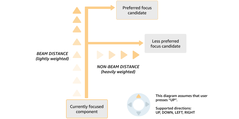
In layouts with a non-uniformly shaped item, when a user chooses a movement direction using the D-pad on the control, any element in the same general direction as the D-pad control event is a candidate to receive focus. The candidate which is the shortest weighted distance (distance along the input direction is weighted less heavily) is considered the next focused candidate.
When components overlap, focus candidates are selected without regard to their Z-ordering within the view hierarchy. For example, if you press the UP button and there is a partially obscured component, but it is calculated to be located at a shorter weighted distance, it is given focus instead of an unobscured component further away. The following sections provides detailed case studies on how component receives focus in different layouts.
Case studies for Cartesian focus navigation algorithm in different layouts
When dealing with more complex layouts, especially with a non-uniformly shaped item, focus navigation becomes dependent on the sizes and spatial relationships of components. While Vega implements a focus-finding algorithm similar to Fire OS for consistency, certain scenarios might produce different navigation behaviors based on size and location of the item.
Here are some case studies where the item directly projected in the path of vertical axis does not receive focus.
Case Study 1: Investigating cases where pressing the DOWN button is not resulting in the focus moving to the item directly below
This setup consists of 4 items and simulates the use case where the focus was on the [Top Item] and the user presses the DOWN button.
This setup consists of 4 items and simulates the use case where the focus was on the [Top Item] and the user presses the DOWN button.
[  Top Item ] [Top Item side]
      |
      v
            [Side Item]
[Bottom Item]
Demo: When the [Side Item] overlaps with [Bottom Item] horizontally

Behavior for the demo on the Left:
- When pressing the DOWN button from [Top Item]: Focus moves to [Small Item].
- This occurs because the bottom edge of the [Small Item] and the top edge of the [Bottom Item] don't overlap horizontally.
Behavior for the demo at the right:
- With similar component positioning, the focus moves to [Bottom Item] instead.
- This different behavior occurs because the bottom edge of the [Small Item] now overlaps horizontally with the top edge of the [Bottom Item].
Demo: When the [Side Item] overlaps with [Bottom Item] vertically

Behavior for the demo on the top:
- When pressing the DOWN button from [Top Item]:
- Focus moves to [Small Item].
- This occurs because the left edge of the [Small Item] overlaps vertically with the right edge of the [Top Item].
Behavior for the demo at the bottom:
- With similar component positioning: Focus moves to [Bottom Item] instead.
- This occurs because the left edge of the [Small Item] does not overlaps vertically with the right edge of the [Top Item].
Summary
The focus algorithm considers more than just alignment.
- Edge overlap between components matters.
- Distance to next focusable element is considered.
- Component positioning critically affects navigation paths.
The visualization helps understand why sometimes focus movement might seem unexpected and how to position components for desired navigation paths.
Recommendations to override the behavior
If the behavior of default focus navigation is not desired, Vega offers different APIs to override the behavior:
FocusManager.setNextFocus()method.nextFocusUp/nextFocusDown/nextFocusLeft/nextFocusRightprops.FocusManager.focus()to programmatically assign focus to a specific element.destinationprop from <TVFocusGuideView> control the focus when navigating into a container.
Case Study 2: Focus skipping the full-width element when navigating between rows of items with different widths
In the following component layout, when the focus is on Item 1 and the user presses the DOWN button, focus might shift to the [Full-width item] beneath [Item 1] or to the [Full-width item] depending on the layout of the component.
[ Item 1 ]
[      Full-width item         ]
[ Item 3 ] [ Item 4 ] [ Item 5 ]
The demo apps explains the criteria that could affect the focus navigation.
Baseline scenario
Providing the baseline dimensions of the [Full-width item] is 1208 in width and 104 in height. With this configuration, focus moves from [Item 1] to [Item 3] when pressing the DOWN button.
Full-width Item 2 is skipped when navigating down from Item 1.
Demo on the height of the [FULL WIDTH] Item affects the navigator behavior.

Scenario 1: Decreasing the width prevents the focus from skipping the wider item
With the width decrease from 1208 to 1070 and height remains unchanged, the [Full-width item] receives focus when pressing the Down button from [Item 1].
Full-width Item 2 receives focus when navigating down from Item 1 with width updated from 1208 to 1270.

Scenarios 2: Increasing the height prevents the focus from skipping the wider item
By increasing the height of the [Full-width item] from 104 to 105, where width remains unchanged, the [Full-width item] receives focus when pressing the DOWN button from [Item 1].
Full-width Item 2 receives focus when navigating down from Item 1 with height updated from 104 to 105.

Implementation to override the default behavior
The default focus behavior might not suit the needs of every app. The app can declaratively define custom focus paths between components using setNextFocus() from the FocusManager turbo module.
- Forcing focus moves from [Item 1] to [Full-width item] upon pressing the DOWN button.
- Up navigation from [Item 3] to [Full-width item].
- Down navigation from [Full-width item] to [Item 3].
Focus Behavior in Vega
Handling focus between an item across different rows
Lists such as ScrollView and FlatList include basic focus management support. Index based navigation is used and the list is scrolled only when the next focusable item is out of screen or the ScrollView boundary. Scrolling from last or first element in the direction of the list moves the focus to the next list. For example, when focus is on last element on the right end of the list, pressing the RIGHT button moves the focus to the tile in the list below. If the focus is on Element 1.3, pressing the D-pad RIGHT button moves the focus to Element 2.3.
The default focus behavior in the above example might not be the desired user experience. Some apps might prefer "trapping" the focus at the end of the row. In the example above, if the focus is on Element 1.3, pressing the D-pad RIGHT button would not move focus. There are suggested implementations for both FlashList and FlatList.
Restore focus
Platform limitation
The Vega platform does not provide built-in focus restoration capabilities. Focus restoration is available through certain React Navigation stack navigators.
Stack navigator behavior
- @amazon-devices/react-navigation__stack
- ❌ No automatic focus restoration
- @amazon-devices/react-navigation__native-stack
- ❌ No automatic focus restoration
Implementation options for restoring focus
For multi-screens applications built by React Navigation:
- Store a reference to the most recently focused element for each screen.
- Use
useFocusEffect()to detect when a user returns to a screen. - Inside
useFocusEffect(), callFocusManager.setFocus()with the stored reference to restore focus to the correct element.
Configure initial focus
The are two main approaches to managing initial focus.
- The
hasTVPreferredFocusprop sets focus during the component initial mount. This prop only works during the initial rendering phase. - You can combine
useEffectoruseFocusEffect(From React Navigation) withFocusManager.setFocus()for a more dynamic approach, particularly when your app needs to actively restore focus states within a multi-page application built with React Navigation. This approach provides more flexibility and control over focus behavior beyond the initial mount phase.
Customize focus behavior
Vega provides the following paradigms for focus management.
- Focus Props and Methods: If you want to override the default focus behavior for specific components in your app, Vega supports various focus-related props and
TurboModulemethods. Think of these as defining edge cases where you don't want the default behavior. - Specialized Focus Components: In some cases, you might want behavior that differs in some systematic way from the default Cartesian behavior (for example, you might be familiar with TVFocusGuideView). This section contains a list of custom components (including
TVFocusGuideView) supported by Vega.
Focus props and methods
Focus props are props you can set on components (with focusable set to true) to change how focus moves from those components. The following is a list of focus props for each direction.
nextFocusUpnextFocusDownnextFocusLeftnextFocusRight
To override the next-focus value of a component in any direction, set the nextFocusUp, nextFocusDown, nextFocusLeft, and nextFocusRight props. Setting the value to a node handle of the same component effectively blocks the behavior for a button press in the given direction.
- Setting the value to undefined re-enables default Cartesian behavior for a button press in the given direction.
- If you want a more imperative API, the
FocusManagerTurboModuleprovides functions that mirror the behavior of the focus props. There's also asetFocusRootAPI that prevents focus from leaving a component or its children. See Focus Manager (Vega) for more details.
Example:
const useNodeHandle = (ref) => {
  const [nodeHandle, setNodeHandle] = React.useState<number | null>(null);
  React.useEffect(() => {
    if (ref.current) {
      setNodeHandle(findNodeHandle(ref.current));
    }
  }, [ref.current]);
  return nodeHandle;
};

const focusableComponent = () => {
  const ref1 = React.useRef(null);
  const ref2 = React.useRef(null);
  const ref3 = React.useRef(null);

  const ref1Handle = useNodeHandle(ref1);
  const ref2Handle = useNodeHandle(ref2);
  const ref3Handle = useNodeHandle(ref3);

  // Three focusable components explicitly define some or all of their
  // directional overrides. Overrides that sets the next focus to the same
  // component effectively act to block the button press. For components
  // that have directions that are not explicitly declared or set to undefined,
  // the fallback behavior of Cartesian focus strategy will be taken.
  return (
          <View>
            <TouchableOpacity
                    ref={ref1}
                    onPress={() => {}}
                    // block 'up' presses
                    nextFocusUp={ref1Handle || undefined}
                    // block 'right' presses
                    nextFocusRight={ref1Handle || undefined}
                    // explicitly focus on Component 2 on 'left' press
                    nextFocusLeft={ref2Handle || undefined}
                    // explicitly focus on Component 3 on 'down' press
                    nextFocusDown={ref3Handle || undefined}>Component 1</TouchableOpacity>
            <TouchableOpacity
                    ref={ref2}
                    onPress={() => {}}
                    // explicitly focus on Component 1 on 'right' press
                    nextFocusRight={ref1Handle || undefined}>Component 2</TouchableOpacity>
            <TouchableOpacity
                    ref={ref3}
                    onPress={() => {}}
                    // explicitly focus on Component 1 on 'up' press
                    nextFocusUp={ref1Handle || undefined}>Component 3</TouchableOpacity>
          </View>
  );
};
FocusManager turbo module
In addition to the props above, the FocusManager turbo module provides an imperative API for defining focus behavior edge cases. For a list of supported methods, see Focus Manager (Vega).
setNextFocus()—clearNextFocus()—setFocusRoot()focus()—blur()getFocused()
Specialized focus components
TVFocusGuideView
TVFocusGuideView provides the Vega implementation of React Native's TVFocusGuide APIs. For more information, see TVFocusGuideView. This component is a port from react-native-tvos.
Dispatching synchronous focus events
This is a new feature provided by Vega that allows the focus event to be dispatched synchronously between the UI thread and JS. The UI thread waits to process a new focus change until the previous focus or blur event finishes executing. Any other focus or blur event that is received while the UI thread is blocked is queued up.
Synchronous focus aims to solves the focus issues we see during rapid key presses:
- When an app updates the zIndex on an item upon receiving focus, the change of zIndex causes the item to be removed and reinserted. As a result, the item is no longer focused and focus is lost. In another case, if the item was placed inside a <TVFocusGuideView>, instead of loosing the focus,
TVFocusGuiderecovers the focus onto the first child.
Before considering to use the feature, check the following section for details on the side effects and potential impacts to user experience.

Should your app enable synchronous focus
Consider using synchronous focus in the following situations:
- You are seeing issues where focus is being reset back to the first item inside a <TVFocusGuideVIew/>.
- There is a specific UI requirement that strictly enforces all the side effects of focusing or blurring an item that has completed before focus moves to another item.
Our guidance is the following:
- Keep the usage as minimal as possible.
- Your app needs to be optimized and follow the App Performance Best Practices to avoid unnecessary re-rendering.
- Keep the
onFocus()andonBlur()as light weight as possible to avoid blocking the UI thread longer than needed.
With focus and blur events being dispatched synchronously, it is implied that the UI thread is blocked and sitting idle before any onFocus() and onBlur() events return. This results in different impacts on performance and rendering during rapid keypresses. The following section details some of the known impacts and solutions.
Known impacts and solutions
Longer animations might be skipped during rapid key presses
If an app has animations scheduled when an item is being focused or blurred, animations might be skipped when the duration is longer than the gap between each keypress. If the behavior is observed in an app, reduce the animation duration to improve responsiveness.
Laggy behavior observed in the app when there are unnecessary re-renders
When an event is dispatched synchronously, the app needs to be optimized to avoid unnecessary re-renders. For more information on optimization, see App Performance Best Practices.
In addition, to avoid blocking the UI thread longer than necessary, the app shouldn't have any long running logic as part of the onFocus() or onBlur() callbacks.
Frame drops might be observed with in-progress animation when a focus or blur event is dispatched
The UI Thread is blocked until the JavaScript onFocus() or onBlur() callbacks return. In an app that has re-occurring animation or any animations that is running at the same
time the event is dispatched, frame drops could be observed.
How to enable the synchronous focus event
React Native for Vega implements the enableSynchronousFocusEventsVegaprop. This prop allows the app to selectively choose between synchronous and asynchronous focus event dispatching for each component.
How to use the prop:
-
When
enableSynchronousFocusEventsVegais set to true. The app shouldn't call any methods that could programmatically alter focus inside theonFocus()andonBlur()implementations. These methods include:requestTVFocus()FocusManager.Focus()and.Blur()ref.focus()andref.blur()
-
Don't change the value of
enableSynchronousFocusEventsVegaafter the initial render. -
Don't mix components with different
enableSynchronousFocusEventsVegavalues under a common parent container.For example, avoid the following pattern that mixes the usage of
enableSynchronousFocusEventsVegafor a component:<View> <Pressable enableSynchronousFocusEventsVega> <Pressable > <Pressable enableSynchronousFocusEventsVega> <View>Instead, use a pattern in which all components in a container have the same value:
    <PageContainer>
      <Navbar>
        <TouchableOpacity enableSynchronousFocusEventsVega>
        <TouchableOpacity enableSynchronousFocusEventsVega>
      </Navbar>
      <HomeContent>
        <Pressable >
        <Pressable >
      </HomeContent>
    </PageContainer>
Sample Usage:
<View
   focusable
   enableSynchronousFocusEventsVega
   onFocus={() => { console.log('view-onfocus'); }}
   onBlur={()=> { console.log('view-onBlur');}}
>
   <Text>
       {`Sample For making a View that received onBlur/onFocus synchronous`}
   </Text>
</View>

<TouchableOpacity
   enableSynchronousFocusEventsVega
   onPress={() => { console.log("touchableOpacity-pressed"); }}
   onFocus={() => { console.log('touchableOpacity-onfocus'); }}
   onBlur={()=> { console.log('touchableOpacity-onBlur'); }}
>
   <Text>
       {`Sample For making a TouchableOpacity that received onBlur/onFocus synchronous`}
   </Text>
</TouchableOpacity>
react-native, react-native-tvos, and react-native-kepler
The Vega platform supports React Native using the react-native-kepler Javascript package. This follows a similar approach to other out-of-tree platforms such as react-native-macos.
The general recommendation is to import APIs and components from the react-native namespace, as this provides app developers with portability across all platforms that React Native supports. react-native allows sharing the same namespace using Metro configurations, as detailed in the React Native documentation.
This approach becomes more complex when dealing with platform-specific features. For example, platform-specific APIs like FocusManager are only available in the react-native-kepler namespace, and importing them from react-native would result in errors.
The Vega platform adds additional complexity as it supports both multimodal and TV platforms. React Native took a forked approach and created react-native-tvos to add TV platform support and features like TVFocusGuideView. These are available through the react-native-tvos namespace.
In contrast, Vega has ported TV-specific components (For example, TVFocusGuideView) to the react-native-kepler namespace. This single namespace then supports both multimodal and TV platforms. You can import TV-specific components and APIs from the @amazon-devices/react-native-kepler namespace.
Related topics
Last updated: Oct 01, 2025