Headline (1.4.0 - 1.5.0)
(This is not the most recent version of AlexaHeadline. Use the Other Versions option to see the documentation for the most recent version of AlexaHeadline)
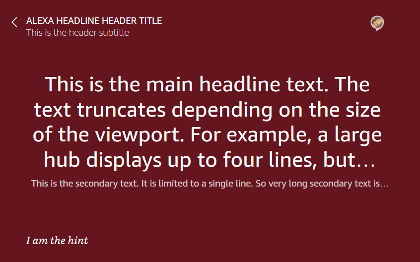
The Alexa headline template (AlexaHeadline) displays short, informational text string on the screen. This is a full-screen template that can include a header, footer, and background.
Import the alexa-layouts package
To use AlexaHeadline, import the alexa-layouts package.
The latest version of the alexa-layouts package is 1.7.0. AlexaHeadline was introduced in version 1.1.0.
AlexaHeadline parameters
All parameters except type are optional.
| Name | Type | Default | Description | Version added |
|---|---|---|---|---|
|
|
String |
|
Image/video alignment to apply to background image/video. Defaults to center. |
1.1.0 |
|
|
Boolean |
|
When |
1.1.0 |
|
|
— |
Color to use as a background color. Used when neither |
1.1.0 | |
|
|
Boolean |
|
When |
1.1.0 |
|
|
String |
— |
URL for the background image source. Used when |
1.1.0 |
|
|
Boolean |
|
When |
1.1.0 |
|
|
String |
|
Image or video scaling to apply to background image or video. Defaults to |
1.1.0 |
|
|
String |
|
Audio track to play on when playing the video. Can be |
1.1.0 |
|
|
Boolean |
|
When |
1.1.0 |
|
|
— |
The background video source. Provide a source in the same format shown for the |
1.1.0 | |
|
|
Array |
— |
Array of entity data to bind to this template. |
1.2.0 |
|
|
String |
— |
Hint text to display in the footer. Use |
1.1.0 |
|
|
String |
— |
URL for attribution image source. Displays when |
1.1.0 |
|
|
Number |
|
The opacity of the attribution text and attribution image. |
1.3.0 |
|
|
Boolean |
|
When |
1.1.0 |
|
|
String |
— |
Attribution text to render in the header. Shown when |
1.1.0 |
|
|
Boolean |
|
When |
1.1.0 |
|
|
String |
— |
An accessibility label to describe the back button to customers who use a screen reader. |
1.1.0 |
|
|
|
Command to run when the user selects the back button. Defaults to |
1.1.0 | |
|
|
String |
|
Optional color value to use as the background color for the Header. Defaults to |
1.1.0 |
|
|
Boolean |
|
Toggle to display the divider that appears at the bottom of header to help separate it from the content below. Default to |
1.1.0 |
|
|
String |
— |
Secondary text to render in header. |
1.1.0 |
|
|
String |
— |
Primary text to render in header. |
1.1.0 |
|
|
String |
|
The language for the text displayed in the template. This language determines the default font used for the text. For example, when set to |
1.4.0 |
|
|
String |
|
Specifies the layout direction for the content. Set this property to either |
1.4.0 |
|
|
String |
— |
Primary text to display. Text is truncated based on the size of the viewport. For example, on a large hub, up to four lines of text display, but on a smaller hub, two lines display. |
1.3.0 |
|
|
String |
— |
Secondary text to display in a single line. Displayed below the primary text. Text is truncated to display on a single line. |
1.1.0 |
|
|
String |
|
Set the dark or light color theme. The selected theme controls the colors used for the template. |
1.1.0 |
|
|
String |
— |
Always set to |
1.1.0 |
AlexaHeadline example
Related topics
- Alexa Design System Overview
- Responsive Components and Templates
- Alexa Design Guide: Responsive Components
Last updated: Oct 30, 2025