Alexa Blogs
With the release of the Echo Show, you can complement your voice user experiences with visuals. This raises the need to think about new customer interactions and new design patterns. In this series, we’ll cover examples of adding support for screens in your voice first designs. In part 1, we covered how to choose the appropriate body template for welcome screens, multi-turn dialogs, and displaying details.
In this post, we’ll cover scenarios where you want to offer a list of options on Echo Show using one of the list templates. There’s a vertical list (list template 1) and a horizontal list (list template 2). The user can scroll using touch or voice if there are too many items to fit on one screen. The user can also select an item using voice or by tapping a selection.
To improve the user’s ability to scan the list, be selective about which information you show, and choose a layout that helps the user browse items quickly.
Vertical Lists
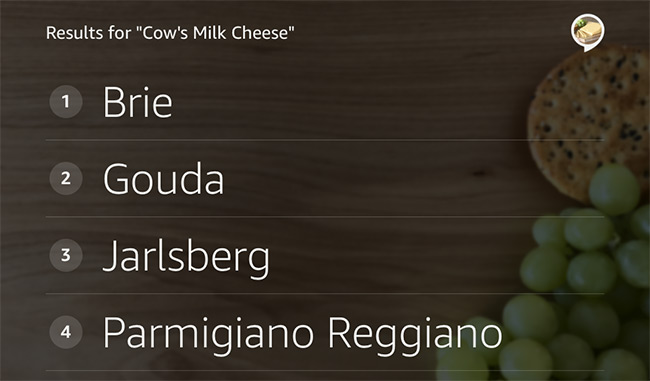
Use vertical lists (list template 1) for lists without images and for lists where images are not unique to the list items. Also, use vertical lists for efficiency when small images are enough to provide a good user experience. Vertical lists are ideal for the following types of content:
- Lists of sample utterances (phrases the user can say in your skill)
- Numeric information, for example prices or calorie counts
- Lists of stock quotes
- Bank transaction history
- Lists of food items
- Lists of contacts
- Table of contents
- Time tables
- Vertical Lists
List template 1, vertical list
Text for a list item can wrap onto a second line. After the second line, text is truncated and does not extend to a third line. To specify text for the second line, use a line break or use the secondary text field. To place text in the far right column, use the tertiary text field.
List template 1 with primary, secondary, and tertiary text fields
Horizontal Lists
Use a horizontal list (list template 2) when you have unique images that help users recognize or choose items from the list. A horizontal list is also great for books, albums, movies, videos, destinations, unique establishments/businesses, and products.
For items the user might skim, consider showing more items on screen by using a narrower image for each item. When the user needs to study the details of each item, for example when choosing a recipe, consider using a wider image.
List Template 2 with portrait images
List template 2 with landscape images
List Template 2 can accommodate several textual elements as well as images in a variety of aspect ratios, and resizes your images to fit the template. The image height should be 280px and the image width should be between 192px and 498px. The template scales down images that are larger than the maximum width of 498px and the maximum height of 280px.
List template 2 with square images, 280x280
Best Practices
When introducing a list on Echo Show, it’s best to keep it simple and provide minimal information about the content and let the user peruse the list.
Avoid instructions like “You can say the name of the cheese or tap on the item.” Such instructions are redundant and have limited value to the user because interacting with lists is common across skills. Also, avoid stating the item count unless the count is important and changes from interaction to interaction.
Additionally, don’t ask a question before presenting the list. For example, asking “Which cheese do you want? Gouda, cheddar, brie…” confuses the user about when to speak, and the user may try to answer the question while Alexa reads the options. Don’t use prompts that encourage the user to barge in, for example, “When you hear the option you want, just say it.” Barge-ins are also discouraged because the user has to use the wake word to interrupt Alexa’s response.
Usually, list items don’t need ending punctuation because the text isn’t a full sentence. However, a list of sample questions that you’re providing to the user should contain question marks. For example, a list item may contain “What happened on this day in 1918?”
As you design your screen, reference the Alexa Design Guide for more best practices.
Code Sample Showing List Template
When coding for the list template, you’ll need to issue a display directive to show the list on the screen. You’ll also need to support when the user taps on an item. You’ll assign a token to identify each item and you’ll get a Display.ElementSelected JSON request with that token when the user selects an item.
Here’s and example request that shows a type and a token.
"request": {
    "type": "Display.ElementSelected",
    "requestId": "amzn1.echo-api.request.7zzzzzzzzz",
    "timestamp": "2017-06-06T20:05:04Z",
    "locale": "en-US",
    "token": "getTopicName-Cookie-Contest"
  }
This code sample will show you how to detect a request from an Echo Show (which supports the display directive) or the Echo Show renderer simulator. You’ll also see how to use the Display.RenderTemplate directive to display a list template.
When building a sample skill, you may want to reference the supported image sizes and formats and markdown.
Also in This Series
In addition to complementing your voice experience by showing more information (see part 1), in part 3, we’ll cover how to play videos.
For more information about the Alexa Skills Kit and Echo Show, check out the following resources:
- Echo Show Product Page on Amazon.com
- Best Practices for Skill Card Design
- Alexa Skills Kit (ASK)
- Alexa Dev Chat Podcast
- Alexa Developer Forums
Build a Skill, Get a Free Echo Dot and More
We’d like to help you bring your big idea to life with Alexa. Publish a custom skill in August, and we’ll send you a free Echo Dot so you can experiment and daydream. You can also earn limited-edition Alexa developer socks. Learn more about our promotion, and start building with the Alexa Skills Kit today.


