Visual language
These guidelines apply to the center stack display. To create a cohesive experience for customers, Alexa should be seamlessly integrated into your system, see Guiding Principles. When it comes to visual language, the highest priority is to help customers know they are speaking to Alexa and to follow the Alexa brand guidelines. The guidelines in this section highlight our requirements and some suggestions to make your experience feel more aligned with the Amazon visual language.
Branding
(Required) Attribute Alexa when displaying Alexa content. Follow the Alexa Brand Guidelines.
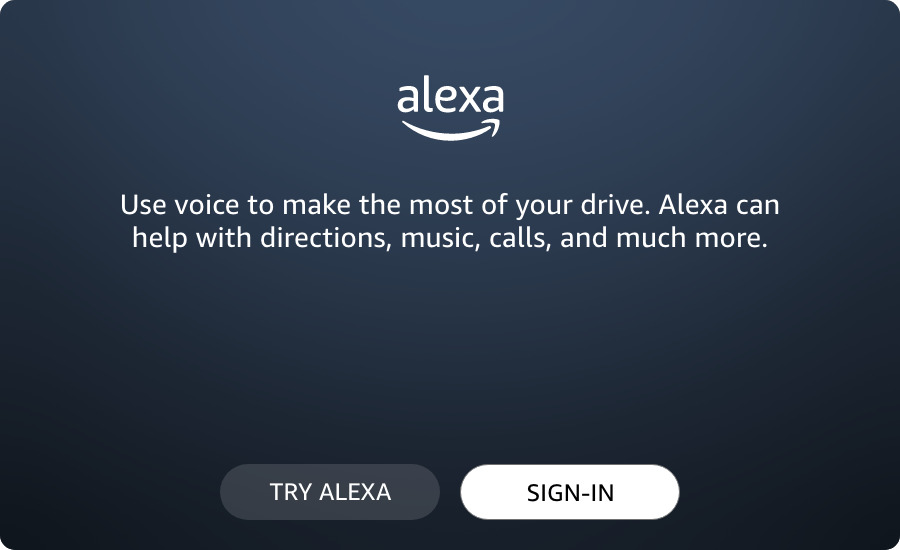
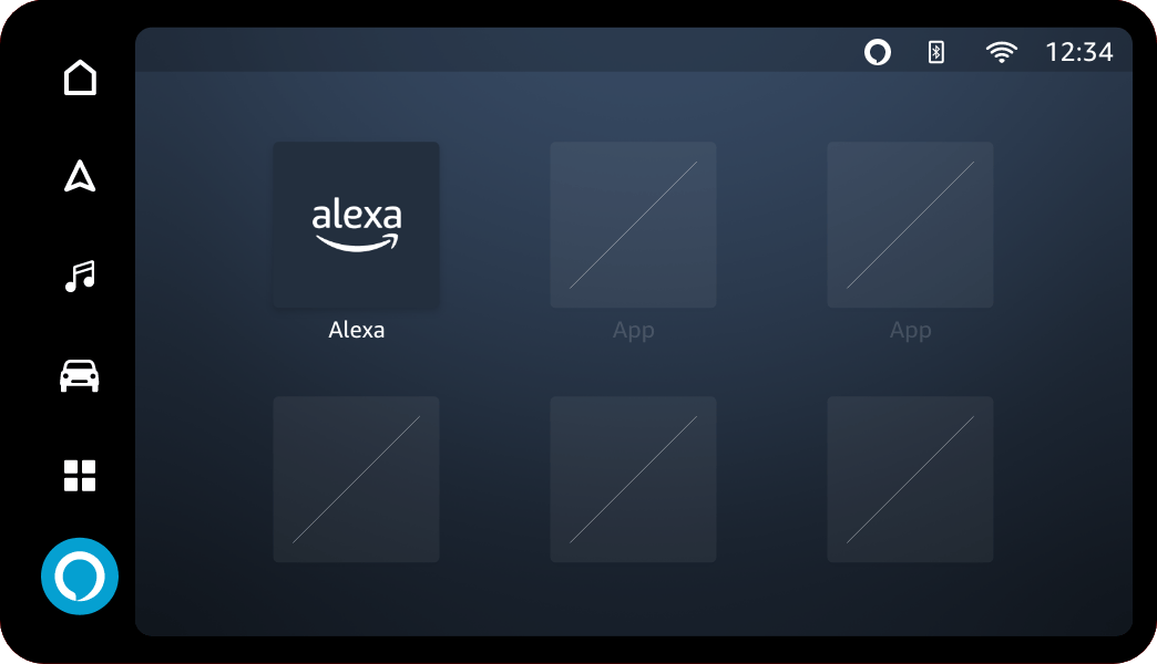
(Required) Use the Alexa smile logo for attribution, app icon, and in setup screens.


(Required) Use the Alexa Talk Bubble Button for Tap-To-Talk(TTT).
If your product uses a TTT button to invoke Alexa, represent it with the Alexa Talk Bubble Button. To learn more about how TTT works, see Invoking Alexa for details.


(Required) Use the Small Space Alexa Talk Bubble when the space is 30dp or smaller.
For example, attributing Alexa in a status bar would use the Small Space Talk Bubble instead of the Smile Logo.

Note: Alexa is a proper noun and must be capitalized when written as text. Follow Amazon's Marketing Guidelines.
(Required) Do not squeeze or stretch any Alexa logos.
The Alexa Smile Logo, the Alexa Talk Bubble Button, and the Small Space Alexa Talk Bubble must be displayed at their original aspect ratios without being stretched or squeezed.
(Required) Display the Alexa logo only in Alexa Blue (#00CAFF), Squid Ink (#232F3E), or White (#FFFFFF).
 Alexa Blue #00CAFF |
 Squid Ink #232F3E |
 White #FFFFFF |
(Required) Use only Alexa brand graphics to indicate that Alexa is listening.
Except for the physical PTT button on the steering wheel, don't use additional icons to invoke or represent Alexa. Use only Alexa icons and voice chrome to represent Alexa.

Typography
(Recommended) Use a font size that is glanceable.
Because screen size, density, and location differ across systems, we don't have a prescribed minimum font size. We do ask that you make the font size as reasonably large as possible so that the screen is glanceable for driving.
(Recommended) To follow Alexa's visual language, use Amazon Ember.
If your experience does not have a unique system font, you may use Amazon Ember for Alexa experiences. This is included in the Design Toolkit.
Colors
(Required) You must use 4.5:1 or higher for color contrast on text or images with text.
To make sure all customers can easily see and use Alexa, you must use an AA accessible contrast ratio of 4.5:1.
(Required) Use more than just color to convey meaning. For example, change font style or include an icon.
For example, a green label on a text box might not be perceptible as a required signifier to colorblind customers. However, the color could still be used if paired with a redundant visual indicator such as bold type.
(Required) Do not use red within an Alexa interface as it is distracting and can be associated with errors or warnings.
(Recommended) In UI elements, use #151920 instead of pure #000000 black.
Use a slight off-black to improve the visual aesthetics. This color also better aligns with the Alexa visual language.
Voice chrome design
The Alexa voice chrome represents the different attention states for Alexa. See Invoking Alexa for details.
Last updated: Nov 25, 2023