
SeekBar
SeekBar组件是一个交互式进度控件,提供媒体导航功能。通过提供电视媒体播放器中常用的高级播放控制功能,它的运用不仅限于基本进度条。
使用场景
SeekBar组件非常适合需要媒体导航的应用,例如:
- 视频/音频播放器
- 时间轴拖动
- 内容预览系统
- 进度跟踪接口
- 交互式媒体导航
该组件通过属性来实现自定义,允许您针对特定用例自定义行为和外观,同时保持一致和直观的用户体验。
用户体验
核心属性
currentValue
必需
内容进度的当前位置值。
<SeekBar currentValue={300} totalValue={1200} />
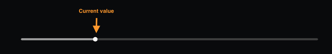
类型 number
必须介于0和totalValue(含)之间。
totalValue
必需
搜索栏的最大值,表示总持续时间或范围。
<SeekBar currentValue={0} totalValue={300} />
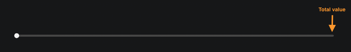
类型 number
step
使用方向键导航时要递增或递减的值。值可以是正数或负数。
<SeekBar step={1} currentValue={0} totalValue={120} />
类型 number
默认值 10
交互控制属性
disabled
启用或禁用具有遥控器事件的所有用户交互。
<SeekBar disabled={true} currentValue={0} totalValue={1200} />
类型 boolean
默认值 false
disabledWhenNotFocused
如果为true,则在未聚焦搜索栏时禁用用户交互。此属性对于焦点管理至关重要的电视界面非常重要,如果您希望组件自动处理焦点管理而不是在应用代码中手动处理它,则此属性是理想的选择。
<SeekBar disabledWhenNotFocused={true} currentValue={0} totalValue={1200} />
类型 boolean
默认值 false
disableThumbnail
启用或禁用预览缩略图功能。要显示缩略图,请使用thumbnailImageSource属性。
<SeekBar disableThumbnail={true} currentValue={0} totalValue={1200} />
类型 boolean
默认值 false
trapFocus
控制SeekBar组件的焦点导航行为。
<SeekBar trapFocus={true} currentValue={0} totalValue={1200} />
类型 boolean
默认值 false
启用后,限制用于SeekBar中的向左或向右方向键导航的焦点。向上或向下导航到SeekBar上方或下方的控件仍然可用。
partialDisablingConfiguration
用于控制要禁用哪些特定的用户交互。
<SeekBar
  partialDisablingConfiguration={{
    skipBackward: true,
    skipForward: true,
    playPause: false,
  }}
  currentValue={0}
  totalValue={1200}
/>
Type PartialDisablingConfiguration
如果提供,此属性将覆盖全局disabled和disabledWhenNotFocused设置。
该属性仅用于禁用特定按钮。例如,您可以禁用skipForward >>或skipBackward <<,同时保持搜索行为(right和left方向键)或移除自定义处理的默认行为。
可用操作:
playPauseskipBackwardskipForwardleftrightselectback
当您提供PartialDisablingConfiguration对象时,操作的所有默认值都将设置为false。
注意 禁用back按钮仅会影响SeekBar的内部使用,不会影响外部导航或组件外部的其他交互。
回调属性
onValueChange
滑动时滑块值发生变化时触发回调。
<SeekBar
  onValueChange={(value) => console.log("新值:", value)}
  currentValue={0}
  totalValue={1200}
/>
类型 (value: number) => void
onSlidingStart
滑动交互开始时触发回调。对于方向键,回调会在初始按下向左或向右(按下按键)时触发。
<SeekBar
  onSlidingStart={() => console.log("滑动已开始")}
  currentValue={0}
  totalValue={1200}
/>
类型:() => void
onSlidingEnd
滑动交互结束时触发回调。对于方向键导航,在松开向左或向右方向键时(按键弹起)触发。
<SeekBar
  onSlidingEnd={() => console.log("滑动已结束")}
  currentValue={0}
  totalValue={1200}
/>
类型 () => void | undefined
onRewindPress
当用户触发快退操作时触发回调。默认情况下,按下此按钮会模拟长按交互,在内容中向后搜索。
对于遥控器中的快退按钮<<,在松开按键时(按键弹起)触发。
<SeekBar
  onRewindPress={() => console.log("按下快退键")}
  currentValue={0}
  totalValue={1200}
/>
类型 () => void
相关属性:longPressIntervalDuration、stepMultiplierFactor、enableSkipForwardBackwardAcceleration。
onFastForwardPress
当用户触发快进操作时触发回调。默认情况下,按下此按钮会模拟向前搜索内容的长按交互。
对于遥控器 >>中的快进按钮,在松开按键时(按键弹起)触发。
<SeekBar
  onFastForwardPress={() => console.log("按下快进键")}
  currentValue={0}
  totalValue={1200}
/>
类型 () => void
相关属性:longPressIntervalDuration、stepMultiplierFactor、enableSkipForwardBackwardAcceleration。
onPress
当用户按下遥控器上的选择按钮时触发回调。
<SeekBar
  onPress={(thumbValue) => console.log("按下位置:", thumbValue)}
  currentValue={0}
  totalValue={1200}
/>
类型 (seekBarThumbValue: number) => void
onPlayPause
当用户按下遥控器上的播放或暂停按钮时触发回调。
<SeekBar
  onPlayPause={(thumbValue) => console.log("播放/暂停位置:", thumbValue)}
  currentValue={0}
  totalValue={1200}
/>
类型 (seekBarThumbValue: number) => void
onFocus
当搜索栏获得焦点时触发回调。
<SeekBar
  onFocus={() => console.log("聚焦于SeekBar")}
  currentValue={0}
  totalValue={1200}
/>
类型 () => void
onBlur
当搜索栏失去焦点时触发回调。
<SeekBar
  onBlur={() => console.log("SeekBar变模糊")}
  currentValue={0}
  totalValue={1200}
/>
类型 () => void
onSeekInteractionChange
在使用方向键进行搜索交互期间触发回调。
该事件对象包含指示搜索方向的方向属性:
'forward': 向右方向键导航搜索(初始按下)'rewind': 向左方向键导航搜索(初始按下)'fast_forward': 长按向右方向键导航'fast_rewind': 长按向左方向键导航null: 在搜索交互结束时发送(当用户在搜索后松开方向键时)
<SeekBar
  onSeekInteractionChange={(event) => {
    switch(event.direction) {
      case 'forward':
        console.log('开始向前搜索');
        break;
      case 'rewind':
        console.log('开始向后搜索');
        break;
      case 'fast_forward':
        console.log('快进');
        break;
      case 'fast_rewind':
        console.log('快退');
        break;
      case null:
        console.log('搜索交互已结束');
        break;
    }
  }}
  currentValue={currentPosition}
  totalValue={totalDuration}
  longPressDelay={300}
/>
类型 (event: InteractionEventPayload) => void
事件序列
onSeekInteractionChange回调在方向键交互期间按特定顺序触发。
向右方向键示例
- 初始按下(按下按键):
event.direction = 'forward' - 如果保持按下的时间足够长(超出
longPressDelay):event.direction = 'fast_forward' - 释放时(按键弹起):
event.direction = null
向左方向键示例
- 初始按下(按下按键):
event.direction = 'rewind' - 如果保持按下的时间足够长(超出
longPressDelay):event.direction = 'fast_rewind' - 释放时(按键弹起):
event.direction = null
完整事件流程
长按交互的完整顺序是:
['forward' or 'rewind'] → ['fast_forward' or 'fast_rewind'] → [null]
短按时(快速点击),顺序为:
['forward' or 'rewind'] → [null]
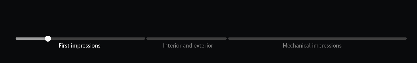
视觉自定义属性
Markers
要在拖动条上显示的标记数组。
支持三种类型的标记:
// ReactNode标记 - 自定义组件
<SeekBar
  markers={[
    {
      position: 200,
      node: () => (
        <Text style={{color: 'white', marginTop: 20}}>Description</Text>
      ),
    },
    {
      position: 30,
      node: (
        <View style={{width: 15, height: 15, backgroundColor: 'red'}} />
      ),
    },
  ]}
  currentValue={0}
  totalValue={1200}
/>

// 点标记 - 分割条形的彩色点(常用于广告)
<SeekBar
  markers={[
    { position: 30, pointColor: '#FF0000' },
    { position: 60, pointColor: '#00FF00' }
  ]}
  currentValue={0}
  totalValue={1200}
/>

// 分段标记 - 将条形分隔成段
<SeekBar
  markers={[
    { position: 30, type: 'break' },
    { position: 60, type: 'break' }
  ]}
  currentValue={0}
  totalValue={1200}
/>

// 点和分段组合标记
<SeekBar
  markers={[
    { position: 20, pointColor: 'red' },
    { position: 40, type: 'break' },
    { position: 120, pointColor: 'red' },
    { position: 190, type: 'break' }
  ]}
  currentValue={0}
  totalValue={1200}
/>
类型 ReactNodeMarker[] | BreakMarker[]
标记类型
- ReactNode标记: 用于复杂视觉元素的自定义React组件。
- 点标记: 将拖动条划分为分段的彩色点,通常用于广告标记。
- 分段标记: 将条形分隔为不同段的分隔标记。
限制
- ReactNode标记不能与点或分段标记组合
- 点和分段标记可以一起使用
- 点标记之间应至少有3%的间距
- 点标记最多只能在搜索栏总宽度的97%内放置
示例1
Point markers

示例2
分段标记
displayAboveThumb
要在搜索栏滑块拇指上方呈现的自定义内容。您可以使用渲染函数或React Node。渲染函数接收属性:{ mode, stepValue, multiplier, focused }。
// 静态内容
<SeekBar
    displayAboveThumb={
      <View
        style={{ alignItems: 'center', justifyContent: 'center', height: 50, width: 100 }}>
        <Text style={{color: 'white'}}>Seeking...</Text>
      </View>
    }
    currentValue={0}
    totalValue={1200}
/>

// 动态内容
<SeekBar
  displayAboveThumb={({ mode, stepValue, multiplier }) => (
    <View
      style={{ alignItems: 'center', justifyContent: 'center', height: 50, width: 100 }}>
      <Text style={{color: 'white'}}>
        {`${mode} `}
        {stepValue * multiplier}s
      </Text>
    </View>
  )}
  currentValue={0}
  totalValue={1200}
/>

Type DisplayAboveThumbType | React.ReactNode
displayBelowThumb
要在搜索栏滑块拇指下方呈现的自定义内容。您可以使用渲染函数或React Node。
<SeekBar
  displayBelowThumb={<Text>直播</Text>}
  currentValue={0}
  totalValue={1200}
/>

类型 (() => React.ReactNode) | React.ReactNode
thumbIcon
自定义的滑块拇指图标组件。您可以使用渲染函数或React Node。渲染函数接收{ focused }属性。
// 静态图标
<SeekBar
  thumbIcon={<View style={{ width: 20, height: 20, backgroundColor: 'yellow', borderRadius: 10 }} />}
  currentValue={0}
  totalValue={1200}
/>

// 动态图标
<SeekBar
  disabledWhenNotFocused={true}
  thumbIcon={({ focused }) => (
    <View style={{
      width: focused ? 24 : 20,
      height: focused ? 24 : 20,
      backgroundColor: focused ? 'yellow' : 'gray',
      borderRadius: 12
    }} />
  )}
  currentValue={0}
  totalValue={1200}
/>
类型 ((props: ThumbIconProps) => React.ReactNode) | React.ReactNode
注意 当使用带有focused回调参数的动态图标时,请设置disabledWhenNotFocused={true}以实现正确的焦点行为。
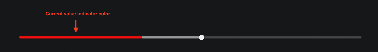
currentValueIndicatorColor
进度指示器已填充部分的颜色。您可以使用静态颜色或根据焦点状态返回颜色的函数。
<SeekBar
  currentValueIndicatorColor="#FF0000"
  currentValue={0}
  totalValue={1200}
/>

// 基于焦点的动态颜色
<SeekBar
  disabledWhenNotFocused
  currentValueIndicatorColor={(isFocused) => isFocused ? '#FF0000' : '#888888'}
  currentValue={0}
  totalValue={1200}
/>
类型 ColorValue | ((isFocused: boolean) => ColorValue)
barTrackColor
滑块未填充部分的颜色。
<SeekBar barTrackColor="#626262" currentValue={0} totalValue={1200} />

类型 ColorValue
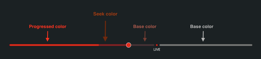
segmentColors
分段的颜色配置。
<SeekBar
  segmentColors={{
    0: { baseColor: "lightgreen", seekColor: "limegreen", progressedColor: "green", },
    1: { baseColor: "pink", seekColor: "brown", progressedColor: "red" },
  }}
  markers={[
    { position: 200, type: 'point', pointColor: 'red' },
    { position: 400, type: 'break' },
  ]}
  currentValue={0}
  totalValue={1200}
/>
类型SegmentColorsConfig
interface SegmentColorsConfig {
  [index: number]: {
    baseColor?: ColorValue; // 未交互时的基色
    seekColor?: ColorValue; // 进行搜索时的颜色
    progressedColor?: ColorValue; // 进度颜色
  };
}
分段颜色的配置对象,允许按索引自定义特定分段。您可以为任何分段指定颜色,不一定按顺序指定,也可以跳过不需要自定义颜色的分段。
注意 如果启用了动画,则不会应用segmentColors seekColor。如果没有分隔标记,则分段颜色将不适用于搜索栏。
用法示例
黄色分段颜色
  const segmentColors: SegmentColorsConfig = {
    2: {
      progressedColor: '#ffff00',
      seekColor: '#797926',
      baseColor: '#2e2e00',
    },
  };

红色分段颜色
  const segmentColors: SegmentColorsConfig = {
    0: {
      progressedColor: '#ff0000',
      seekColor: '#811e1e',
      baseColor: '#432f2f',
    },
    1: {
      baseColor: '#727272',
    },
  };
样式属性
barStyle
滑块的样式覆盖项。
<SeekBar
  barStyle={{ height: 8, borderRadius: 4 }}
  currentValue={0}
  totalValue={1200}
/>

类型 StyleProp<ViewStyle>
currentValueIndicatorStyle
进度指示器的样式覆盖项。
<SeekBar
  currentValueIndicatorStyle={{ backgroundColor: "#FF0000" }}
  currentValue={0}
  totalValue={1200}
/>
类型 StyleProp<ViewStyle>
timeShiftIndicatorStyle
用于时移指示器的样式覆盖项。
<SeekBar
  timeShiftIndicatorStyle={{ backgroundColor: "#00FF00", opacity: 0.7 }}
  currentValue={0}
  totalValue={1200}
/>

类型 StyleProp<ViewStyle>
缩略图属性
thumbnailStyle
缩略图容器的样式覆盖项。
<SeekBar
  thumbnailStyle={{ borderRadius: 8, borderWidth: 2 }}
  currentValue={0}
  totalValue={1200}
/>

类型 StyleProp<ViewStyle>
thumbnailImageSource
缩略图预览的图像来源。接受动态来源的渲染属性。
// 静态来源
<SeekBar
  thumbnailImageSource={{ uri: 'https://example.com/thumbnail.jpg' }}
  currentValue={0}
  totalValue={1200}
/>

// 动态来源
<SeekBar
  thumbnailImageSource={(thumbValue) => ({ uri: `https://example.com/thumb_${thumbValue}.jpg` })}
  currentValue={0}
  totalValue={1200}
/>
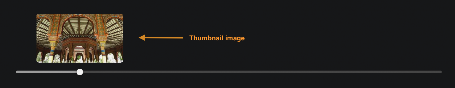
类型 ((thumbValue: number) => ImageSourcePropType) | ImageSourcePropType
thumbnailImageStyle
缩略图的样式覆盖项。
<SeekBar
  thumbnailImageStyle={{ width: 120, height: 80 }}
  currentValue={0}
  totalValue={1200}
/>

类型 StyleProp<ImageStyle>
thumbnailImageResizeMode
缩略图的大小调整模式。
<SeekBar
  thumbnailImageResizeMode="contain"
  thumbnailImageSource={{ uri: "https://example.com/thumbnail.jpg" }}
  currentValue={0}
  totalValue={1200}
/>
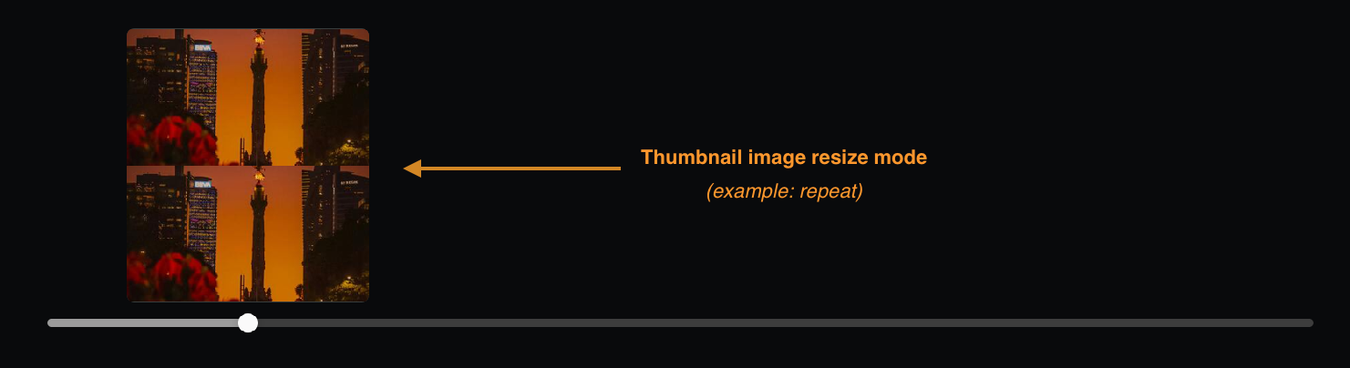
类型 ImageResizeMode
默认值 "cover"
thumbnailLabel
要在缩略图中显示的标签。接受动态内容的渲染属性。
// 静态标签
<SeekBar
  thumbnailLabel="Preview"
  thumbnailImageSource={{ uri: 'https://example.com/thumbnail.jpg' }}
  currentValue={0}
  totalValue={1200}
/>

// 动态标签
<SeekBar
  thumbnailLabel={thumbValue => `${thumbValue} sec`}
  currentValue={0}
  totalValue={1200}
/>
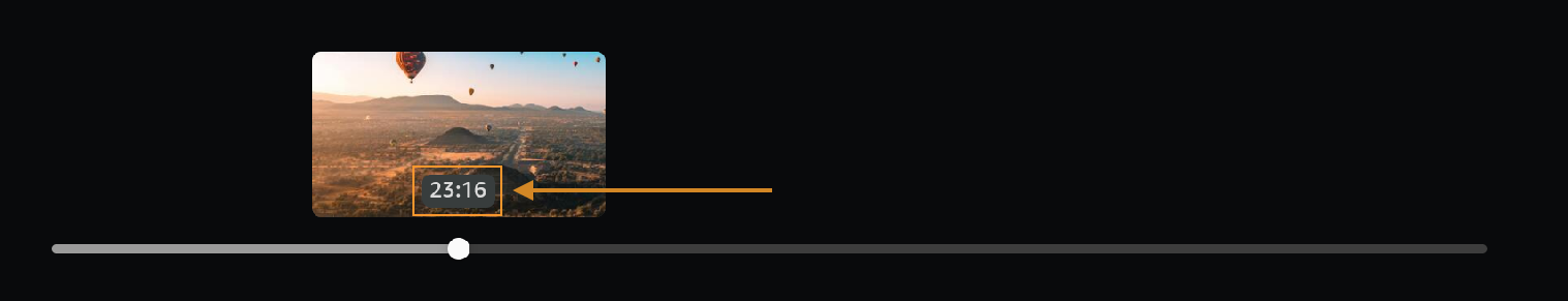
类型 ((thumbValue: number) => string) | string
thumbnailLabelTextStyle
缩略图标签文本的样式覆盖项。
<SeekBar
  thumbnailLabelTextStyle={{ color: "white", fontSize: 14 }}
  thumbnailLabel="Preview"
  currentValue={0}
  totalValue={1200}
/>

类型 StyleProp<TextStyle>
thumbnailLabelContainerStyle
缩略图标签容器的样式覆盖项。
<SeekBar
  thumbnailLabelContainerStyle={{
    backgroundColor: "rgba(0,0,0,0.7)",
    padding: 4,
  }}
  thumbnailLabel="Preview"
  currentValue={0}
  totalValue={1200}
/>

类型 StyleProp<ViewStyle>
交互计时属性
longPressIntervalDuration
方向键长按操作的间隔持续时间(以毫秒为单位)。控制按住方向键时搜索操作更新的频率。建议保留默认值,因为它与遥控器发送的事件频率相匹配。
<SeekBar longPressIntervalDuration={400} currentValue={0} totalValue={1200} />
类型 number
默认值 200
示例1
长按间隔持续时间: 200
示例2
长按间隔持续时间: 400
longPressDelay
用户触发长按操作需经过的时间(以毫秒为单位)。对于方向键输入,用户按住左键或右键可触发长按。
<SeekBar longPressDelay={500} currentValue={0} totalValue={1200} />
类型 number
默认值 250
示例1
长按延迟: 200
示例2
长按延迟: 3000
keyDownThrottleDelay
限制按键按下事件的延迟。有助于防止在快速按键时进行过度的事件处理。
<SeekBar keyDownThrottleDelay={100} currentValue={0} totalValue={1200} />
类型 number
默认值 0
animationDuration
当enableAnimations为true时,动画的持续时间(以毫秒为单位)。控制滑块拇指和进度过渡所需的时间。为了在长按和快进或快退交互中获得更好的动画感知,可在longPressIntervalDuration和animationDuration中使用相同的值。如果enableAnimations为false,则不起作用。
<SeekBar
  animationDuration={200}
  enableAnimations={true}
  currentValue={0}
  totalValue={1200}
/>
类型 number
默认值 200
搜索行为属性
maxStepValue
长按期间渐进搜索的最大步长值。限制了加速过程中搜索步长的大小。
<SeekBar
  maxStepValue={50}
  currentValue={0}
  totalValue={3000}
  enableLongPressAcceleration
/>
类型 number
默认值 160
stepMultiplierFactor
渐进式搜索步长的乘法系数。确定加速期间搜索速度的增加速度。step值将乘以该系数。仅在启用了enableLongPressAcceleration或enableSkipForwardBackwardAcceleration时适用。
<SeekBar
  stepMultiplierFactor={2}
  enableLongPressAcceleration
  currentValue={0}
  totalValue={1200}
/>
类型 number
默认值 1
示例
stepMultiplierFactor={1}: 持续加速 -1x → 2x → 3x → 4x, ..stepMultiplierFactor={2}: 快速加速 - 随着时间推移速度加倍1x → 2x → 4x → 8x, ..stepMultiplierFactor={3}: 快速加速 - 随着时间推移速度达到三倍1x → 3x → 6x → 12x, ..
stepMultiplierFactorInterval
步长乘数之间的时间间隔增加。控制方向键向左或向右长按加速期间搜索速度的增大频率(以毫秒为单位)。stepMultiplierFactor处理速度的提高。
<SeekBar
  stepMultiplierFactorInterval={1500}
  stepMultiplierFactor={1}
  enableLongPressAcceleration
  currentValue={0}
  totalValue={1200}
/>
类型 number
默认值 1000
lowerSeekLimit
搜索栏范围内的最小可搜索值。防止搜索到该值之前的位置。
<SeekBar lowerSeekLimit={300} currentValue={0} totalValue={1200} />
类型 number
默认值 0
upperSeekLimit
搜索栏范围内的最大可搜索值。防止搜索到该值之后的位置。
<SeekBar upperSeekLimit={600} currentValue={0} totalValue={1200} />
类型 number
默认值 totalValue
enableLongPressAcceleration
启用长按交互期间的渐进加速。启用后,根据stepMultiplierFactor和stepMultiplierFactorInterval设置,步长乘数随时间推移而增大(例如,1x、2x、3x、4x)。step值乘以当前乘数。影响按住向左或向右按键或按钮时的搜索速度。
<SeekBar
  enableLongPressAcceleration={true}
  stepMultiplierFactor={1}
  currentValue={0}
  totalValue={1200}
/>
类型 boolean
默认值 false
enableSkipForwardBackwardAcceleration
在向前或向后跳过交互时启用渐进加速。启用后,连续向前跳转 (>>) 或向后跳转 (<<) 按钮会根据stepMultiplierFactor设置增加步长乘数(例如,1x、2x、3x、4x、5x)。step值乘以当前乘数。
<SeekBar
  enableSkipForwardBackwardAcceleration={true}
  stepMultiplierFactor={1}
  currentValue={0}
  totalValue={1200}
/>
类型 boolean
默认值 false
enableAnimations
启用或禁用搜索栏滑块拇指和进度动作的动画。
当为true时,拖动条会顺畅地以动画显示位置变化,并且不应用timeShiftIndicatorStyle属性。如果为false,则位置会立即发生变化,所有视觉元素都会被渲染。
<SeekBar enableAnimations={true} currentValue={0} totalValue={1200} />
类型 boolean
默认值 false
类型定义
PartialDisablingConfiguration
interface PartialDisablingConfiguration {
  back?: boolean; // 禁用返回操作
  playPause?: boolean; // 禁用播放/暂停操作
  skipBackward?: boolean; // 禁用向后跳转操作
  skipForward?: boolean; // 禁用向前转跳操作
  right?: boolean; // 禁用向右操作
  left?: boolean; // 禁用向左操作
  select?: boolean; // 禁用选择操作
}
InteractionEventPayload
type InteractionEventPayload = {
  direction: "forward" | "rewind" | "fast_forward" | "fast_rewind" | null;
};
DisplayAboveThumbProps
type DisplayAboveThumbProps = {
  mode: SeekMode; // 当前搜索模式
  stepValue: number; // 搜索增量的步长值
  multiplier: number; // 加速搜索的当前乘数系数
  focused: boolean; // 搜索栏是否有焦点
};
SegmentColorsConfig
interface SegmentColorsConfig {
  [index: number]: {
    baseColor?: ColorValue; // 未交互时的基色
    seekColor?: ColorValue; // 进行搜索时的颜色
    progressedColor?: ColorValue; // 进度颜色
  };
}
ThumbIconProps
type ThumbIconProps = {
  focused: boolean; // 搜索栏是否有焦点
};
SeekMode
type SeekMode =
  | "forward" // 普通向前搜索
  | "idle_forward" // 快进搜索状态但未主动搜索
  | "rewind" // 普通快退搜索
  | "idle_rewind" // 快退搜索状态但未主动搜索
  | "fast_forward" // 加速快进搜索
  | "fast_rewind" // 加速快退搜索
  | undefined;
Last updated: 2025年9月30日