
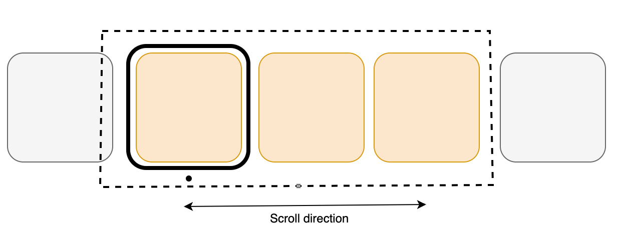
VUIC Carousel
Carousel用于在Vega应用的用户界面屏幕中实现单行内容元数据图块。Carousel通常出现在主屏幕网格布局、与此类似用户界面或Related Content(相关内容)推荐行中等多种场景中。
用法
此版本的Carousel包含在@amazon-devices/kepler-ui-components ~2.0.0中。检查您的package.json以确认版本的设置如下所示。
"dependencies": {
    // ...
    "@amazon-devices/kepler-ui-components": "~2.0.0"
}
导入
import { Carousel } from '@amazon-devices/kepler-ui-components';
示例
水平Carousel
import React, {memo} from 'react';
import {Image, Pressable, View} from 'react-native';
import {
  Carousel,
  CarouselRenderInfo,
  ItemInfo,
} from '@amazon-devices/kepler-ui-components';
import {useState} from 'react';

import {ItemType, ScrollableProps} from '../../Types';
import {CAROUSEL_STYLE} from './Style';

export const HorizontalScrollable = ({data}: ScrollableProps) => {
  function ItemView({item}: CarouselRenderInfo<ItemType>) {
    const [focus, setFocus] = useState<boolean>(false);
    const onFocusHandler = () => {
      setFocus(true);
    };
    const onBlurHandler = () => {
      setFocus(false);
    };

    return (
      <Pressable
        style={[
          CAROUSEL_STYLE.itemContainer,
          focus && CAROUSEL_STYLE.itemFocusContainer,
        ]}
        onFocus={onFocusHandler}
        onBlur={onBlurHandler}>
        <Image style={CAROUSEL_STYLE.imageContainer} source={{uri: item.url}} />
      </Pressable>
    );
  }

  const renderItemHandler = ({item, index}: CarouselRenderInfo<ItemType>) => {
    return <ItemView index={index} item={item} />;
  };

  const itemInfo: ItemInfo[] = [
    {
      view: ItemView,
      dimension: {
        width: 250,
        height: 420,
      },
    },
  ];

  const getItemForIndexHandler = (index: number) => ItemView;

  const keyProviderHandler = (item: ItemType, index: number) =>
    `${index}-${item.url}`;

  return (
    <View style={CAROUSEL_STYLE.container}>
      <Carousel
        data={data}
        orientation={'horizontal'}
        containerStyle={CAROUSEL_STYLE.horizontalCarouselContainerStyle}
        itemDimensions={itemInfo}
        itemPadding={20}
        renderItem={renderItemHandler}
        getItemForIndex={getItemForIndexHandler}
        keyProvider={keyProviderHandler}
        hasTVPreferredFocus
        hideItemsBeforeSelection={false}
        itemSelectionExpansion={{
          widthScale: 1.2,
          heightScale: 1.2,
        }}
        numOffsetItems={2}
        focusIndicatorType={'fixed'}
        maxToRenderPerBatch={10}
        firstItemOffset={100}
        dataStartIndex={0}
        initialStartIndex={0}
        shiftItemsOnSelection={true}
        trapFocusOnAxis={false}
        selectionBorder={{
          enabled: true,
          borderColor: '#FFFFFF',
          borderWidth: 2,
          borderRadius: 0,
          borderStrokeRadius: 0
        }}
      />
    </View>
  );
};

export const HorizontalMemoScrollable = memo(HorizontalScrollable);
垂直Carousel
import {Image, Pressable, View} from 'react-native';
import {
  Carousel,
  CarouselRenderInfo,
  ItemInfo,
} from '@amazon-devices/kepler-ui-components';
import {memo, useState} from 'react';
import React from 'react';
import {ItemType, ScrollableProps} from '../../Types';
import {CAROUSEL_STYLE} from './Style';

export const VerticalScrollable = ({data}: ScrollableProps) => {
  function ItemView({item}: CarouselRenderInfo<ItemType>) {
    const [focus, setFocus] = useState<boolean>(false);
    const onFocusHandler = () => {
      setFocus(true);
    };
    const onBlurHandler = () => {
      setFocus(false);
    };

    return (
      <Pressable
        style={[
          CAROUSEL_STYLE.itemContainer,
          focus && CAROUSEL_STYLE.itemFocusContainer,
        ]}
        onFocus={onFocusHandler}
        onBlur={onBlurHandler}>
        <Image style={CAROUSEL_STYLE.imageContainer} source={{uri: item.url}} />
      </Pressable>
    );
  }

  const renderItemHandler = ({item, index}: CarouselRenderInfo<ItemType>) => {
    return <ItemView index={index} item={item} />;
  };

  const itemInfo: ItemInfo[] = [
    {
      view: ItemView,
      dimension: {
        width: 250,
        height: 420,
      },
    },
  ];

   const getItemForIndexHandler = (index: number) => ItemView;

  const keyProviderHandler = (item: ItemType, index: number) =>
    `${index}-${item.url}`;

  return (
    <View style={[CAROUSEL_STYLE.container]}>
      <Carousel
        containerStyle={CAROUSEL_STYLE.verticalCarouselContainerStyle}
        data={data}
        orientation={'vertical'}
        itemDimensions={itemInfo}
        itemPadding={10}
        renderItem={renderItemHandler}
        getItemForIndex={getItemForIndexHandler}
        keyProvider={keyProviderHandler}
        hasTVPreferredFocus
        hideItemsBeforeSelection={false}
        itemSelectionExpansion={{
          widthScale: 1.2,
          heightScale: 1.2,
        }}
        focusIndicatorType="fixed"
        numOffsetItems={2}
        maxToRenderPerBatch={11}
        itemScrollDelay={0.2}
      />
    </View>
  );
};

export const VerticalMemoScrollable = memo(VerticalScrollable);
异构Carousel
import {Image, Pressable} from 'react-native';
import {
  Carousel,
  CarouselRenderInfo,
  ItemInfo,
} from '@amazon-devices/kepler-ui-components';
import {useCallback, useState} from 'react';
import React from 'react';
import {ItemType, ScrollableProps} from '../../Types';
import {CAROUSEL_STYLE} from './Style';

export const HeterogeneousItemViewScrollable = ({data}: ScrollableProps) => {

  function ItemViewType1({item}: CarouselRenderInfo<ItemType>) {
    const [focus, setFocus] = useState<boolean>(false);

    const onFocusHandler = useCallback(() => setFocus(true), []);
    const onBlurHandler = useCallback(() => setFocus(false), []);

    return (
      <Pressable
        style={[
          CAROUSEL_STYLE.itemContainerType1,
          focus && CAROUSEL_STYLE.itemFocusContainer,
        ]}
        onFocus={onFocusHandler}
        onBlur={onBlurHandler}>
        <Image style={CAROUSEL_STYLE.imageContainer} source={{uri: item.url}} />
      </Pressable>
    );
  }

  function ItemViewType2({item}: CarouselRenderInfo<ItemType>) {
    const [focus, setFocus] = useState<boolean>(false);

    const onFocusHandler = useCallback(() => setFocus(true), []);
    const onBlurHandler = useCallback(() => setFocus(false), []);
    return (
      <Pressable
        style={[
          CAROUSEL_STYLE.itemContainerType2,
          focus && CAROUSEL_STYLE.itemFocusContainer,
        ]}
        onFocus={onFocusHandler}
        onBlur={onBlurHandler}>
        <Image
          style={CAROUSEL_STYLE.imageContainer}
          resizeMode="cover"
          source={{uri: item.url}}
        />
      </Pressable>
    );
  }

  const renderItemHandler = ({item, index}: CarouselRenderInfo<ItemType>) => {
    return index % 2 === 0 ? (
      <ItemViewType1 index={index} item={item} />
    ) : (
      <ItemViewType2 index={index} item={item} />
    );
  };

  const itemInfo: ItemInfo[] = [
    {
      view: ItemViewType1,
      dimension: {
        width: CAROUSEL_STYLE.itemContainerType1.width,
        height: CAROUSEL_STYLE.itemContainerType1.height,
      },
    },
    {
      view: ItemViewType2,
      dimension: {
        width: CAROUSEL_STYLE.itemContainerType2.width,
        height: CAROUSEL_STYLE.itemContainerType2.height,
      },
    },
  ];

  const getItemForIndexHandler = (index: number) => {
    return index % 2 === 0 ? ItemViewType1 : ItemViewType2;
  };

  const keyProviderHandler = (item: ItemType, index: number) =>
    `${index}-${item.url}`;

  return (
    <Carousel
      data={data}
      containerStyle={CAROUSEL_STYLE.horizontalCarouselContainerStyle}
      orientation={'horizontal'}
      itemDimensions={itemInfo}
      itemPadding={40}
      renderItem={renderItemHandler}
      getItemForIndex={getItemForIndexHandler}
      keyProvider={keyProviderHandler}
      hasTVPreferredFocus
      hideItemsBeforeSelection={false}
      itemSelectionExpansion={{
        widthScale: 1.1,
        heightScale: 1.1,
      }}
      focusIndicatorType="fixed"
      numOffsetItems={3}
      maxToRenderPerBatch={11}
      firstItemOffset={100}
    />
  );
};
功能
FocusIndicator
FocusIndicator样式指定在响应方向键向左和向右键按下操作时,焦点指示器如何在项目列表中移动。
Natural
Natural样式使焦点指示器沿滚动方向漂移,直到其到达列表的开头或末尾。

Fixed
fixed样式会使焦点指示器保持锁定在初始项目的位置。滚动时,项目会重新定位,使聚焦的项目保持不变。
固定焦点样式
对于较大的项目集,在用户滚动项目时,固定焦点样式会将焦点项目固定在某个位置。当用户接近列表的开头或结尾时,滚动行为会平滑过渡到自然流动。
可选属性pinnedFocusOffset允许用户定义所选项目的固定位置,而FocusIndicatorType包括焦点样式PINNED。
pinnedFocusOffset的范围从0%到100%。这是视口大小百分比。高度用于垂直轮播,宽度用于水平轮播。它定义了所选项目相对于视口起始位置(水平模式,从右向左书写的语言除外)或顶端边缘(垂直模式)的固定位置。
focusIndicatorType和pinnedFocusOffset。| 属性 | 类型 | 默认值 | 详情 |
|---|---|---|---|
| focusIndicatorType | focusIndicatorType = fixed | natural | pinned |
fixed |
按下方向键向左和向右键时焦点指示器在项目列表中移动的方式。fixed - 焦点固定在项目最左边的位置。 natural - 焦点漂浮在滚动的方向上。pinned - 在列表的开头和结尾,焦点行为会模仿自然滚动。当用户滚动浏览项目时,焦点项目将固定在滚动轴某个位置,该位置由pinnedFocusOffset确定。 |
| pinnedFocusOffset | Percentage | undefined |
undefined |
决定选定项目焦点固定的位置,这是一个以Carousel前端边缘为基点的相对位置。此值是字符串Percentage类型,例如“50%”。注意: 如果 focusIndicatorType设置为pinned,但pinnedFocusOffset未定义,则Carousel的focusIndicatorType行为默认为natural。 |
pinnedFocusOffset的当前实现无法正确处理0%和100%的值。对于0%,将focusIndicatorType设置为fixed,对于100%,设置为natural。再循环
再循环技巧包括重复使用现有列表项视图,以在用户滚动时显示新数据,而不是为每个项目创建新视图。这样可以减少内存使用量并优化呈现。
再循环视图不会为数据源中的每个项目分配项目视图。相反,它只分配适合屏幕的项目视图数量,并在用户滚动时重复使用这些项目布局。当视图首次滚动到视线之外时,它会经历再循环过程,如下图所示,详细步骤如下。

- 当视图滚动到视线之外且不再显示时,它会变成废弃视图。
-
再循环器为这些视图提供了再循环视图堆缓存系统。
a. 当要显示新项目时,将从再循环池中提取视图以供重复使用。由于此视图在显示之前必须由适配器重新绑定,因此它被称为脏视图。
b. 再循环脏视图:适配器为下一个要显示的项目找到数据,并将此数据复制到该项目的视图中。这些视图的引用检索自再循环器视图的视图持有者。
c. 再循环视图将添加到即将出现在屏幕上的Carousel中的项目列表中。
- 当用户将Carousel滚动到列表中的下一个项目时,屏幕上会显示再循环视图。同时,另一个视图会滚动到视线之外,并按照上述步骤进行再循环。
可变滚动速度
Carousel组件引入了一项通过scrollDuration属性控制滚动速度的新功能。与Flatlist或Flashlist等现有组件不同,此功能增强了灵活性,使最终用户能够精细调整滚动体验,以符合自己的喜好。
scrollableFocusScaleDuration属性控制焦点进入或退出可滚动区域时项目选择变化的动画持续时间。根据需要调整此值以实现更平滑的过渡。
itemScrollDelay在磁贴过渡时生效,例如当它们移动时。如果只有焦点在移动,itemScrollDelay则不适用。
属性
| 属性 | 类型 | 默认值 | 是否必需 | 详情 |
|---|---|---|---|---|
| testID | string |
kepler-shoveler |
FALSE | 用于在端到端测试中定位此可滚动区域的唯一标识符。 |
| 数据 | Item[] |
- | 是 | 数据是给定类型项目的普通数组。 |
| itemPadding | number |
- | 是 | 滚动方向上相邻项目之间的间距,以像素为单位。 |
| orientation | Orientation = Horizontal | Vertical |
horizontal | 否 | 用于呈现可滚动项目的方向。 |
| itemDimensions | ItemInfo[] |
- | true | 包含用于呈现此可滚动区域的子项所有视图及其大小。 |
| maxToRenderPerBatch | number |
8 | FALSE | 在可滚动区域中再循环时一次可呈现的最大项目数量。 |
| numOffsetItems | number |
2 | 否 | 在将组件再循环到末尾之前,要保留在可滚动区域顶部/左侧的项目数量。 |
| firstItemOffset | number |
0 | 否 | 向可滚动区域添加的顶部/左侧内边距的量。 |
| itemSelectionExpansion | Dimension = { width: number; height: number } |
(0,0) | 否 | 根据项目的尺寸为所选项目分配的空间 |
| shiftItemsOnSelection | boolean |
true | FALSE | 确定在切换选择时是否应成排切换项目。 |
| focusIndicatorType | FocusStyle = fixed | natural | pinned |
fixed |
FALSE | 按下方向键向左和向右键时焦点指示器在项目列表中移动的方式。 fixed - 焦点固定在项目最左边的位置。 natural - 焦点漂浮在滚动的方向上。 pinned - 在列表的开头和结尾,焦点行为会模仿自然滚动。当用户滚动浏览项目时,焦点项目将固定在滚动轴某个位置,该位置由 pinnedFocusOffset确定。 |
| pinnedFocusOffset | Percentage | undefined |
undefined |
FALSE | 决定选定项目焦点固定的位置,这是一个以Carousel前端边缘为基点的相对位置。此值是字符串Percentage类型,例如“50%”。注意: 如果 focusIndicatorType设置为pinned,但pinnedFocusOffset未定义,则Carousel的focusIndicatorType行为默认为natural。 |
| hasTVPreferredFocus | boolean |
false | 否 | 可滚动区域是否应尝试获得初始焦点。 |
| initialStartIndex | number |
0 | FALSE | 可滚动区域初始聚焦的选定索引。 |
| dataStartIndex | number |
0 | 否 | 表示可滚动区域可用的第一个数据索引。 |
| hideItemsBeforeSelection | boolean |
FALSE | 如果设置为true,则作为转动枢轴的项目/选定的项目之前的所有项目都会被隐藏。 | |
| itemScrollDelay | number |
0.2 | FALSE | 滚动每个项目时,动画时间(以秒为单位)。 |
| trapFocusOnAxis | boolean |
false | FALSE | 防止焦点移动到可滚动区域外部与其轴相邻的最近组件。这意味着,如果可滚动区域是水平的,并且用户位于第一个项目并按下向左键,或者用户位于最后一个项目并按下向右键,则此标记会防止焦点离开可滚动区域。 |
| containerStyle | StyleProp<ViewStyle> |
undefined | FALSE | 图像滑块容器的视图样式。 |
| selectionBorder | SelectionBorderProps |
{ enabled: false, borderColor: 'white', borderWidth: 8, borderRadius: 8, borderStrokeRadius: 4, borderStrokeColor: 'black', borderStrokeWidth: 3, } |
否 | 当此标记设置为true时,会有一个可设置样式的边框包住选中的项目。 |
| ref | React.Ref<ShovelerRef<Key>> |
undefined | 否 | 进行引用以访问Carousel组件的ScrollTo和EnableDPad方法。 |
| 属性 | 函数签名 | 默认值 | 是否必需 | 详情 |
|---|---|---|---|---|
| renderItem | (info: ShovlerRenderInfo) => React.ReactElement | null |
- | true | 呈现可滚动的项目。 |
| getItemForIndex | (index: number) => React.FC |
- | 是 | 要么是所有元素的固定步长大小,要么是提供每个项目索引步长大小的方法。 |
| keyProvider | (data: ItemT, index: number) => keyT |
- | true | 从对象中提取密钥。 |
Carousel通过其ShovelerRef<KeyT>支持以下方法:
| 属性 | 函数签名 | 默认值 | 详情 |
|---|---|---|---|
| scrollTo | (index: number, animated : boolean) : void; |
- | 滚动至Carousel中指定索引项目。 |
| enableDpad | (enable: boolean) : void; |
- | 在Carousel上支持HW键事件。 |
type Dimension = {  width: number; height: number }
type ItemInfo<Prop = any> = {
    view: React.FC<Prop>;
    dimension: Dimension
}
自定义
可变滚动速度
以使用itemScrollDelay属性修改Carousel上每个项目之间的滚动速度,默认为0.2秒。
焦点指示器样式
轮播支持两种类型的焦点指示器。
Natural
使焦点指示器沿滚动方向漂移,直至到达列表的开头或末尾。
Fixed
使焦点指示器保持锁定在初始项目的位置,并且滚动项目时会重新定位,使聚焦的项目保持固定。
选择项目时缩放
与原始大小相比,Carousel上选定或聚焦的项目的高度和宽度可以按指定系数扩展。
在选择之前显示/隐藏项目
可用于在固定滚动期间隐藏或显示所选项目之前的项目。如果在所选项目之前显示一个项目,可以向用户提供一个视觉提示,即左边还有更多项目可用。
容器样式
可用于设置整个Carousel视图的样式。常见样式包括背景颜色、不透明度、宽度和高度。
选择边框
Carousel组件现在支持当某个用户界面项目获得焦点时,在其周围显示边框。此更改引入了一些新属性,用于配置边框样式,以及一个布尔值,用于您选择使用原生边框或者设置自定义边框。选择边框的常见用例包括:
默认边框样式,selctionBorder.enabled为true
selectionBorder={{
  enabled: true
}}
默认边框样式,selectionBorder.enabled为false
selectionBorder={{
  enabled: false
}}
边框样式,带有borderProps和borderStrokeProps属性
selectionBorder={{
    enabled: true,
    borderColor: 'white',
    borderWidth: 4,
    borderRadius: 4,
    borderStrokeRadius: 0,
    borderStrokeColor: 'transparent',
    borderStrokeWidth: 0
}}
故障排除
getItemForIndex不是一个函数
您可能会遇到和下面的示例类似的错误。
TypeError: getItemForIndex is not a function (it is undefined)
This error is located at:
    in ItemRenderer
    in KeplerScrollable
    in KeplerScrollableWithRef
    in Scrollable (created by App)
    in RCTView (created by View)
    in View (created by App)
    ...
此错误是由于VUIC版本2.0.0版本中对Carousel的更改造成的。这些增强需要更改组件的输入属性和行为。
验证您使用的程序包版本。转到应用的package.json文件并找到"@amazon-devices/kepler-ui-components"依赖项。
如果程序包版本为2.0.0或更高版本,则您使用的是最新版本的Carousel。您可以通过两种方法来解决错误:使用新版本并更新您的实现,或者恢复到较旧版本。
方法1: 更新您的实现
如果您想继续使用VUIC版本2.0.0,则需要更新Carousel组件的实现。有关更多信息,请参阅上文的迁移到最新版本。
方法2: 恢复到之前的Carousel版本
如果您想继续使用先前版本的Carousel,请在package.json文件中将"@amazon-devices/kepler-ui-components"的版本更改为~1.0.0。
垂直滚动功能仅在高度已设定的情况下适用
对于垂直滚动(具体指自然滚动),您需要将containerStyle设置为固定的高度值。
如果将shiftItemsOnSelection设置为false,则会观察到意外的重叠行为。
如果您将shiftItemsOnSelection设置为false且未设置正确的高度和宽度,则会在Carousel中观察到重叠行为。您需要设置正确的高度和宽度才能解决此问题。shiftItemsOnSelection属性将允许Carousel组件在选择自行扩展的同时腾出更多空间。如果您将其设置为false,则Carousel不会扩展。
ItemDimension尺寸应等于或大于Card的尺寸
如果您未将itemDimension尺寸设置为等于或大于Card尺寸,则可能无法正确对齐。
本页涉及的是KUIC版本1.0.6中的Carousel组件,由Vega SDK版本0.8及更早版本支持。
迁移到最新Carousel版本以增强性能和新功能,例如再循环、可变滚动速度和焦点指示器。
概览
轮播是一种设计元素,用于以吸引人的方式为用户显示选项列表。它们通常用在视频和音乐应用程序的主页上,以显示所有可用的可播放内容。它还可以在设备的系统用户界面中使用,以引起人们对各种功能的注意。此Carousel组件允许您轻松地在屏幕上构建此类项目的列表,同时还提供自定义功能。
与传统的Flatlist组件相比,Carousel可自动使其项目处于可设定焦点状态。它还提供了一个视觉指示器来指示当前聚焦的项目。您可以覆盖默认的视觉指示器,也可以提供自定义外观。在后台,Carousel使用RecyclerListView。再循环器列表在大型列表上性能比Flatlists更高,因为它们在垃圾回收和内存使用方面更有效。
用法
Carousel组件的输入与React Native的Flatlist类似。与Flatlist一样,此组件要求您指定一个数据数组和一个呈现函数来获取这些数据并生成轮播项目。这些项目将在轮播内呈现,并且可以通过遥控器和触摸进行滚动。
Carousel的一个独特要求是指定轮播项目的尺寸。所有轮播项目都分配了用于呈现的固定空间量,任何溢出部分都会被裁剪。
导入
import { Carousel } from '@amazon-devices/kepler-ui-components';
示例
const data = [{imageUrl: "...", title: "...."}, ...]
const renderItem = ({ index, item }) =>
    {
        return <VideoTile title={item.title} image={item.imageUrl}>
    }

<Carousel
    data={data}
    renderItem={renderItem}
    itemDimensions={{ height: 280, width: 200 }}
    testID="Carousel"
    accessibilityLabel="Carousel"
/>
属性
| 属性 | 类型 | 默认值 | 是否必需 | 描述 |
|---|---|---|---|---|
data |
any[] | 无 | 是 | 轮播中显示的项目的数据,该数组的每个元素对应轮播中的一个项目。例如,呈现第一项所需的所有数据都应位于数据数组的第一个元素中。renderItem() 将使用这些数据来呈现每个组件。 |
renderItem |
({index: number, item: any}) => JSX.Element |
无 | 是 | 此函数将使用给定数据呈现轮播中的项目。对数据数组中的每个元素调用renderItem(),并应该返回应存在于轮播中该索引处的组件。默认情况下,轮播中呈现的每个项目都由TouchableOpacity组件包装。这样做是为了使轮播项目在默认情况下可设定焦点。默认的聚焦样式是项目周围的白色边框。要阻止这种默认行为,可使用focusDisabled属性。 |
itemDimensions |
{ height: number; width: number; } |
无 | 是 | Carousel为轮播中的每个项目提供固定的空间。项目不必占用分配给它们的整个空间。例如,假设Carousel项目在被聚焦时其大小会变大。那么在这些场景中,itemDimensions应该是完全变大的项目的大小。任何超出itemDimensions中指定空间的内容都将被裁剪。 |
customFocusedStyle |
ViewStyle | undefined | 否 | 这允许您在聚焦轮播项目时指定自己的自定义样式。此样式适用于Carousel项目周围的包装器。该属性会覆盖默认的聚焦样式。 |
focusDisabled |
布尔值 | false | 否 | 此项让您可以禁用Carousel提供的焦点效果。若要在聚焦项目时获得复杂的效果(例如在FireTV启动器中),应使用此项。customFocusedStyle不能完全满足复杂动画的处理需求。在这些场景中,您应将focusDisabled设置为true。然后,可以在用于轮播项目的组件中自己实现焦点效果。 |
orientation |
horizontal | vertical | horizontal | 否 | 设置轮播的方向和布局。 vertical: Carousel将为垂直定向。所有项目将排列在一列中,第一项显示在列的顶部。 horizontal: Carousel将为水平定向。所有项目都将排成一行,第一项出现在该行的最左边。 |
gap |
数字 | 0 | 否 | 以像素为单位指定轮播项目之间的间隔。即使设置为0,轮播项目周围仍会有间隙。此间隙源自默认聚焦样式。向未聚焦的元素添加透明边框,这样在聚焦项目时不会发生不必要的布局更改。这可以通过使用customFocusedStyle并将borderWidth设置为0来覆盖。 |
itemContainerStyle |
ViewStyle | undefined | 否 | 设置包含所有轮播项目的轮播内部容器的样式。 |
style |
ViewStyle | undefined | 否 | 设置整个Carousel的样式。使用此属性指定Carousel的尺寸并将其放置在屏幕上。 |
自定义
可以使用样式属性 (itemContainerStyle) 和gap属性进行自定义。您还可以使用customFocusedStyle属性自定义轮播项目被聚焦时的显示方式。
示例
const data = [{imageUrl: "...", title: "...."}, ...]

const renderItem = ({ index, item }) =>
{
    return <VideoTile title={item.title} image={item.imageUrl}>
}
const customFocusStyle = {
    borderColor: 'yellow',
    borderRadius: 20,
}
<Carousel
    data={data}
    renderItem={renderItem}
    itemDimensions={{ height: 280, width: 200 }}
    orientation={"horizontal"}
    customFocusedStyle={customFocusStyle}
    gap={30}
    testID="Carousel"
    accessibilityLabel="Carousel"
/>
交互性
| 模态 | 是否可用 |
|---|---|
| 方向键 | 是 |
| 触摸 | 是 |
| 语音 | 否 |
无障碍功能
| 属性 | 是否可用 |
|---|---|
accessible |
是 |
accessibilityRole |
否 |
accessibilityLabel |
是 |
accessibilityValue |
否 |
accessibilityActions |
否 |
accessibilityState |
否 |
用户界面体验
默认情况下,Carousel是水平的,聚焦元素周围有白色边框。根据用户在呈现函数中使用的内容,轮播的视觉效果可能会有很大差异。如演示所示,对于放入轮播中的项目或项目的形状没有任何限制。如果需要动画,可以将它们直接添加到自己传入的项目上。
Last updated: 2026年2月4日