
更改主页布局、侧边栏、Continue Watching行等
您可以自定义主页布局,以纳入用于浏览类别的可见侧边栏。您还可以修改Continue Watching(继续观看)和Watchlist(播放列表)行。其他主题(更改应用标志、图标和启动画面以及更改字体、媒体播放元素、相关内容等)列出了您可以进行的其他更改。)
- 自定义主页布局
- 更改主页的视觉元素
- 在“完整浏览”主页布局中更改侧边栏
- 删除Watchlist(播放列表)行和按钮
- 修改应用主屏幕上的Continue Watching(继续观看)行
- 自定义Search(搜索)按钮
- 更新使用条款
- 后续步骤
自定义主页布局
默认的主屏幕布局使用ContentBrowseActivity。这种布局被称为“主页浏览”布局。
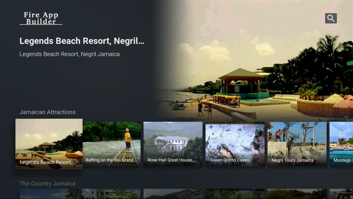
ContentBrowseActivity的主页。此视图按不同的频道或组排列视频。当您查看某个频道时,该频道组中的第一个视频将显示为特色背景图像,其标题和描述显示在左上方。您可以改用FullContentBrowseActivity将主页布局更改为压缩程度更高的视图。这种替代主页布局被称为“完整浏览”主页布局。

FullContentBrowseActivity的主页。通过此活动,所有视频将显示在压缩程度更高的网格中,其中频道列在侧栏的左侧。没有任何视频以大型特色图像形式叠加在背景中。应用显示在右上角。当用户浏览视频标题时,左侧边栏可能会折叠起来。这可为您的视频内容提供更多空间和关注度。
要将主页更改为“完整浏览”布局,请执行以下操作:
- 打开Navigator.json文件(位于app > assets)。
-
在
graph对象中,找到CONTENT_HOME_SCREEN:"com.amazon.android.tv.tenfoot.ui.activities.ContentBrowseActivity": { "verifyScreenAccess": false, "verifyNetworkConnection": true, "onAction": "CONTENT_HOME_SCREEN" } - 将
com.amazon.android.tv.tenfoot.ui.activities.ContentBrowseActivity更改为com.amazon.android.tv.tenfoot.ui.activities.FullContentBrowseActivity。
更改主页的视觉元素
下图显示了可以在主页浏览布局(默认)上自定义的视觉属性:

 标志
标志
有关详细信息,请参阅更改应用标志部分。
 视频标题和描述
您可以更改视频标题和描述的颜色。在应用的custom.xml文件中,更新以下元素:
<color name="primary_text">#f4084f</color>
<!--红色用于卡片视图上的文本和播放进度条文本。-->
此元素还控制预览屏幕上视频标题和描述的颜色(该预览屏幕在您单击视频但尚未开始媒体播放时出现)。它还控制按钮上文本(例如“Watch Now”(立即播放)和“Resume Playback”(恢复播放))的颜色。
有关如何更改这些元素的字体本身的详细信息,请参阅更改字体。
 类别标题颜色
您可以更改类别标题的颜色。更改此颜色还会更改“完整浏览”布局中左侧导航栏中的文本颜色。在应用的custom.xml文件中,更新以下元素:
<color name="tertiary_text">#99FFFFFF</color>
此元素还控制Related Content(相关内容)文本的颜色,该文本出现在预览屏幕和媒体播放屏幕的视频下方。
 卡片视频标题颜色
您可以更改卡片上视频标题的颜色。更改此颜色还会更改视频播放期间进度条上的文本颜色。在应用的custom.xml文件中,更新以下元素:
<color name="secondary_text">#FFFFFFFF</color>
 背景颜色
背景颜色
您可以更改应用的背景颜色。此属性影响所有屏幕。在应用的custom.xml文件中,更改以下元素:
<color name="background">#22282E</color>
 渐变宽度
渐变宽度
您可以控制背景和预览图像之间渐变区域的大小。在应用的custom.xml文件中,调整以下元素的dp值:
<dimen name="content_image_gradient_size">100dp</dimen>
 预览图像大小
您可以在右上角控制预览图像的大小。在应用的custom.xml文件中,调整以下元素的dp值:
<dimen name="content_image_height">350dp</dimen>
<dimen name="content_image_width">540dp</dimen>
 搜索按钮图标和搜索背景
有关如何自定义搜索的信息,请参阅下一部分自定义搜索按钮。对搜索按钮的自定义会更改该按钮在主屏幕和搜索屏幕上的外观。
在“完整浏览”主页布局中更改侧边栏
“完整浏览”布局会显示导航左侧边栏。您可以自定义侧边栏的颜色和其中显示的类别标题。

侧边栏颜色
您可以更改左侧导航栏的颜色。在应用的custom.xml文件中,更新以下元素:
<color name="browse_headers_bar">#ff69b4</color>
侧边栏中的类别标题和副标题
您可以更改侧边栏中显示的类别标题。选定和未选定的类别标题均采用此颜色。选定类别标题以粗体显示,未选定类别标题颜色更柔和且静音。
在应用的custom.xml文件中,更新了以下元素:
<color name="tertiary_text">#99FFFFFF</color>
请注意,对于默认的主页布局(“浏览”),此元素控制视频行上方的类别标题。对于“完整浏览”布局,它会更改左侧导航栏中类别标题的颜色。
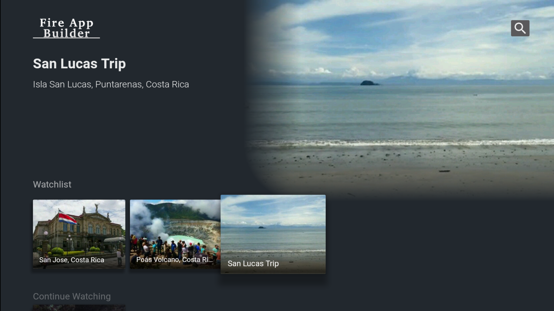
删除Watchlist(播放列表)行和按钮
默认情况下,Content Details(内容详情)屏幕包含“Add to Watchlist”(添加到播放列表)按钮。
您添加到播放列表的视频显示在应用主屏幕的Watchlist行中。您可以向Watchlist中添加的内容项的数量不受限制。
更改Watchlist行的名称
要更改Watchlist行的显示名称,请打开应用的custom.xml文件(位于app > assets > res > values),然后添加以下内容:
<string name="watchlist_row">Watchlist</string>
将Watchlist行移至顶部
目前,您无法移动Watchlist行的位置。
删除Watchlist行
要从主屏幕移除Watchlist行和Content Details屏幕上的“Add to Watchlist”按钮,可打开Navigator.json文件(位于app > assets),然后将enableWatchlistRow: false添加到config对象,如下所示:
  "config": {
    "showRelatedContent": true,
    "useCategoryAsDefaultRelatedContent": true,
    "searchAlgo": "basic",
    "enableCEA608": false,
    "enableRecentRow": true,
    "enableWatchlistRow": false,
    "maxNumberOfRecentItems": 5
  }
修改应用主屏幕上的Continue Watching(继续观看)行
应用主屏幕上的Continue Watching行显示您最近观看的内容。
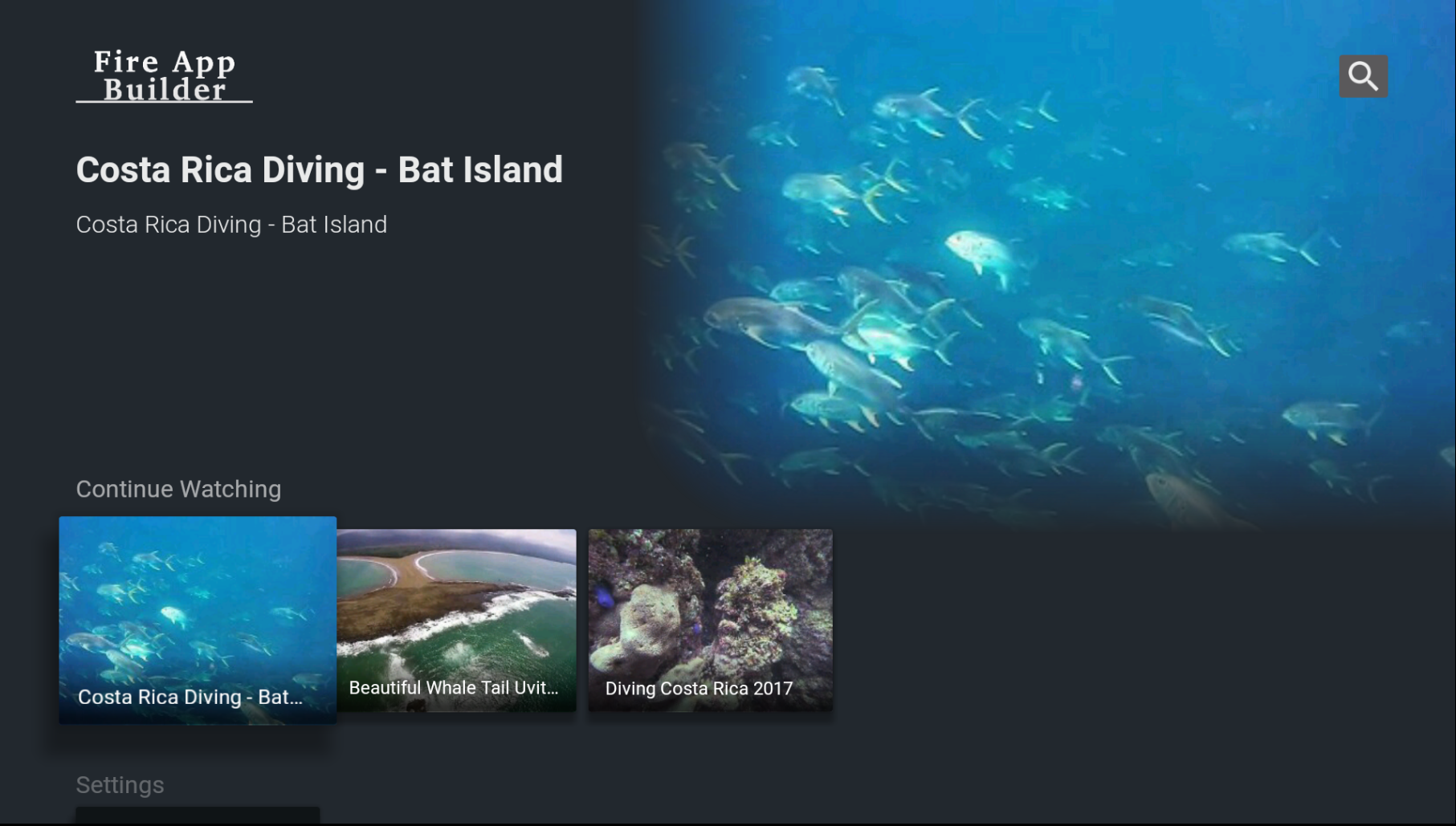
如果内容的播放时间超过10秒,则会将其添加到该行中。
更改Continue Watching行的阈值时间
如果您想更改这个10秒的阈值时间(视频被视为最近观看所需达到的播放时间),请在应用的custom.xml文件(位于app > assets > res > values)中调整以下值:
<integer name="recent_grace_period">10000</integer>
该值必须以毫秒为单位。默认值10000为10秒。
调整Continue Watching行中Number of Recent Items(最近项目的数量)
默认情况下,Continue Watching行最多显示5个项目。您最多可以将此限值调整为20。要调整显示的最近项目的数量,请打开您的Navigator.json文件(位于app > assets)并更改maxNumberOfRecentItems值:
"config": {
  "showRelatedContent": true,
  "useCategoryAsDefaultRelatedContent": true,
  "searchAlgo": "basic",
  "enableCEA608": false,
  "enableRecentRow": true,
  "maxNumberOfRecentItems": 10
}
更改Continue Watching行的名称
要更改Watchlist行的显示名称,请打开应用的custom.xml文件(位于app > assets > res > values),然后添加以下内容:
<string name="recent_row">Continue Watching</string>
将Continue Watching行移至顶部
目前,您无法移动Continue Watching行的位置。
删除Continue Watching行
要从主屏幕上删除Continue Watching行,请在同一个config对象中将enableRecentRow设置为false,如下所示:
  "config": {
    "showRelatedContent": true,
    "useCategoryAsDefaultRelatedContent": true,
    "searchAlgo": "basic",
    "enableCEA608": false,
    "enableRecentRow": false,
    "maxNumberOfRecentItems": 5
  }
自定义Search(搜索)按钮
您可以自定义搜索按钮图标、背景颜色和搜索框字段颜色。搜索按钮的颜色和背景也出现在主屏幕上。

搜索按钮图标
要更改搜索按钮图标,请执行以下操作:
- 如果您尚未在应用中创建drawable文件夹,请在应用的assets > res目录中创建一个名为drawable的新文件夹。
- 通过Finder或Explorer打开您的drawable文件夹。
-
将您的搜索图标和背景的图像添加到此文件夹。
例如,您可以复制初始ic_search.png图像。您可以在TVUIComponent > res > drawable中找到该图像。或者,如果您想浏览文件目录结构,可以前往TVUICopmonent > res > drawable > drawable-xhdpi。搜索图标是一个34x34像素的透明PNG图像。为了与深色背景形成对比,该图标为白色。
-
在应用的custom.xml文件中,更新以下文件名以与您的新搜索图标相对应:
<drawable name="search_icon">@drawable/ic_search</drawable>
搜索按钮背景颜色
要更改搜索按钮的背景颜色,请调整应用custom.xml文件中的以下元素:
<color name="accent">#EE962D</color>
搜索框背景颜色
当您开始键入搜索查询时,搜索框背景会出现在搜索屏幕上。这种颜色通过图像文件(而不是十六进制代码)进行控制,以实现渐变。要更改搜索框背景的颜色,请执行以下操作:
- 如果您尚未在应用中创建drawable文件夹,请在应用的assets > res目录中创建一个名为drawable的新文件夹。
- 通过Finder或Explorer打开您的drawable文件夹。
-
将您的搜索框背景的图像添加到此文件夹。
例如,您可以复制初始bg_gradient_search图像。您可以在TVUIComponent > res > drawable中找到该图像。或者,如果您想浏览文件目录结构,可以前往TVUIComponent > res > drawable > drawable-xhdpi。文件名是bg_gradient_search.9.png。这是一个宽3像素、高1082像素的图像。它水平重复以填充搜索背景表单空间。
-
在应用的custom.xml文件中,更新以下文件名以与您的新搜索背景图像相对应:
<drawable name="search_background">@drawable/bg_gradient_search</drawable>
更新使用条款
“使用条款“部分显示在应用的页脚中,并链接到terms_of_use.html文件(位于app > assets)。

您可以在custom.xml file文件中调整此链接的目标:
<string name="terms_of_use_file">terms_of_use.html</string>
使用条款文件是一个示例文件,在分发应用之前,您应该对其进行编辑。例如,您可以选择在此文件中加入使用条款、最终用户许可协议、隐私声明和或其他法律声明。
使用条款文件还包括针对示例应用默认内置的开源组件的声明。这些声明仅出于方便起见而提供。亚马逊对其准确性或完整性不作任何陈述,并且不会对任何不准确或不完整之处负责。
后续步骤
如果需要,转到更改字体、媒体播放元素、相关内容等。本主题列出您可以对应用外观进行的其他可能修改。您也可以直接进入下个流程图,IV: 添加组件以获得更多功能。
Last updated: 2018年1月16日