
DRS Teaser Page Guidelines
The Dash Replenishment Service (DRS) Teaser Page is used to educate customers about automatic reordering capabilities for your device and is the first DRS related screen a customer will see during device registration. From this page, customers will have the option to sign up for automatic reordering or decline and return the device setup experience.
- Guidelines
- Standard Layout Guidelines
- Logo Guidelines
- Illustration
- Buttons
- Standard vs Custom designs
- Designing for other languages
- Teaser Page Examples
- Deliverable Checklist
- Design Resources
Guidelines
To pass the Amazon DRS certification, the UX of your apps or microsites must follow the below guidelines for its teaser page, and our CX guidelines for the overall experience. Please familiarize yourself with them and liaise with your Amazon Point of Contact for more information.
Standard Layout Guidelines
An Amazon-approved Teaser Page for mobile and web will contain all the required items for the customer to have an optimal DRS experience. There are three Teaser page types:
-
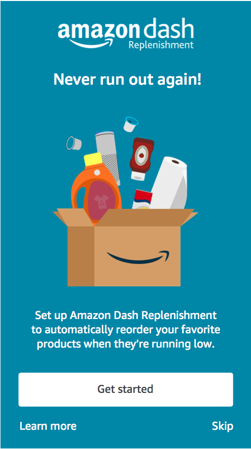
App or website (mobile) without a product description.
-
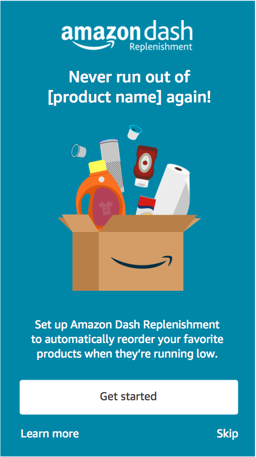
App or website (mobile) that contains the product name that is being replenished.
-
Desktop website (web) that contains the product name that is being replenished.

Layout Components (Mobile)
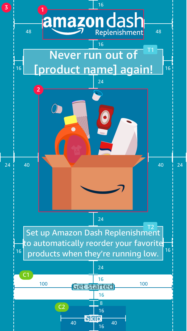 |
1 Logo (40 x 162 px) - Center-aligned and placed on top of the page. 2 Illustration (238 x 223 px) (Customizable) - Place under the headline text. 3 Background (Customizable) - The background color is customizable. However, make sure the background holds enough contrast to pass the accessibility test with the rest of the content. T1 Headline Text (Customizable) - Center-aligned and placed under the logo. T2 Body Text (Customizable) - Center-aligned and placed under the hero illustration. C1 Get Started Button - Place the button under the body text and center-align. C2 Skip and Learn More Button - Both links should be center-aligned to each other and placed under the Get Started button. Learn more should be aligned to the left while Skip is aligned to the right. |
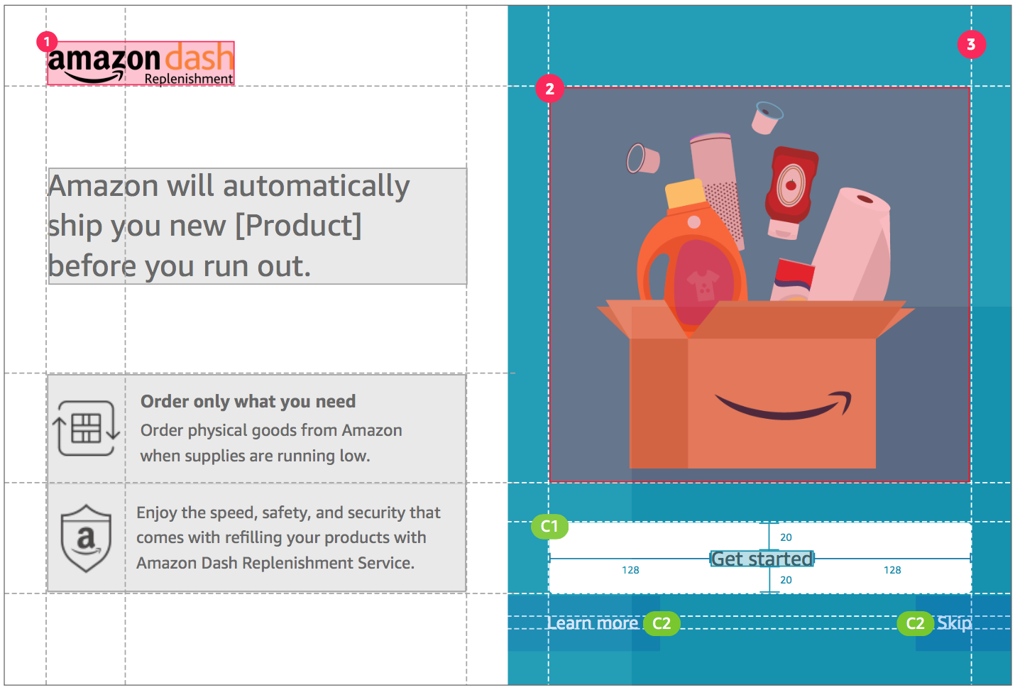
Layout Components (Web)
 |
|
1 Logo (36 x 146 px) - Place the logo on the top left of the page. 2 Illustration (334 x 314 px) (Customizable) - Place illustration on the right side and sitting above the Get Started Buttons. 3 Background on the Right Side (Customizable) - Background color on the right is customizable. However, make sure the background holds enough contrast to pass the accessibility test with the rest of the content. T1 Headline Text (Customizable) - Left-align and place under the logo. T2 Body Text (Customizable) - Left-aligned and place under the headline text. C1 Get Started Button - Place the button under the hero illustration and center-align. C2 Skip and Learn More Button - Both links should be center-aligned to each other and placed under the Get Started button. Learn more should be aligned to the left while Skip is aligned to the right. |
Logo Guidelines
Logo sizing
Standard sizes are 40 x 163 px for Mobile and 36 x149 px for Web.
The logo should not be smaller than the approved minimum size. This minimum size is measure by the height of the word “Dash” in all logos and applies to all logos in the Amazon family.
Logo clear space
Clear space in the area around the logo that should remain free of any other logos, graphics, text, or borders.
Logo color
Acceptable color usage is displayed below. Please do not alter.
Logo Best Practices
a Don't make the logo too small or too big.
Standard sizes are 40 x 163 px for Mobile and 36 x 149 px for Web.
b Do keep the space around the logo clear of any other logo, graphics, text, or borders.
c Do Keep the logo centered to the page.
d Don't use a logo that is too small and pixelated.
e Don't distort or change the logo colors.
f Do make sure there is enough contrast between background color (white) and the logo. Be sure to test for accessibility.
Illustration
The illustration will represent the product that your DRS-enabled device automatically replenishes.
Illustration Layout Guides

1 Illustration - 238 px by 223 px - The key visual component should be within the red frame. Anything outside of the frame should be considered as the background.
2 Content Size Within the Frame - Content should be centered and cover at least two-third of the frame. Measurements are 238x px by 223px
Illustration Style Guides

1 Make it Easy to Identify - The illustration should be used to help communicate to your customers what the DRS service does for them. Use images that are literal, contextual, and easy to understand.
2 Keep it Simple, Flat, and Delightful - The illustration should be delightful and relatable. Using flat and simple forms is an easy way to do this.
3 Pay Extra Attention to Colors, Contrast, and Balance - Content should be centered and cover at least two-third of the frame. Measurements are 238px by 223px
Illustration Best Practices

a Don't make the key visual too small.
b Don't make the key visual too big.
c Do keep the key visual centered on the screen.
d Do Make sure there is enough contrast between background color and the white layover text. Dark backgrounds are the best. Be sure to test for accessibility.
e Don't use images that are too small and pixelated.
Buttons
Button Design

1 Get Started Button
Text Link: Amazon Ember Regular, 16pt, #000000
Web button
Size: 319 px x 56 px
Padding: 128 px left and right 20 px top and bottom
Corner radius: 3px
Mobile button
Size: 272 px x 44 px
Padding: 100 px left and right 16 px top and bottom
Corner radius: 3px
2 Skip & Learn more Buttons
Text link: Amazon Ember Regular, 16pt, #FFFFFF
Standard vs Custom designs
Fonts download is available here.
Standard Copy (Mobile)

1 Illustration - 238 px by 223 px - The key visual component should be within the red frame. Anything outside of the frame should be considered as the background.
2 Content Size Within the Frame - Content should be centered and cover at least two-third of the frame. Measurements are 238x px by 223px
a Replace [product name] with the type of product your device orders.
Standard Copy (Web)

1 One-size-fits-all Copy for Machines that Order Products in Multiple CategoriesIf your devices orders product in a specific category, replace [product] with the type of product your device orders
Customizable Copy Word Count (Mobile)

1 Title Copy
Title copy has to be equal or less than 24 characters and must fit within 2 lines
Font: Amazon Ember Medium, 20pt #FFFFFF
2 Body Copy
Body copy has to be equal or less than 88 characters and must fit within 4 lines.
Font: Amazon Ember Regular, 14pt #FFFFFFF
Designing for other languages
If you are planning to launch in Germany, France, Italy, Spain or Japan you will need to ensure that your teaser page is localized for the additional languages. You can find the Sketch assets in the Design Resources section.


Teaser Page Examples
Depending on the DRS-enabled device that is being created, these are some of the teaser page examples that can inform the customer about the device ability to automatically replenish one or more consumables.

Deliverable Checklist
Here is a handy checklist to run before you finalize your design.
Illustration size is 238px by 223px
File format is .PNG with transparent background
Illustration composition is correctly sized and centered according to the design template. Illustration can be scaled both to Mobile and Web sizes
Background color should pass the accessibility test
Design Resources
These additional resources will help you complete the design of the Teaser Page.
- Get the Teaser Page Sketch Templates.
- Get a Custom Teaser Page Illustration: we've partnered with the design studio, Identity Visuals, to create custom illustrations for the teaser page. If you wish to leverage this opportunity, please contact your Amazon Point of Contact. Their flat fee of $1200 includes:
- One Teaser Page illustration.
- Design onboarding and briefing.
- Three sketches, of which one will be approved.
- Full illustration of one of the sketches, with up to three revisions.
- Get the DRS brand guidelines and Teaser Page Templates.
- Get the DRS guidelines and templates.
Last updated: Apr 11, 2023