
SeekBar
The SeekBar component is an interactive progress control that provides media navigation capabilities. It extends beyond a basic progress bar by offering advanced playback control features commonly used in TV media players.
Usage scenarios
The SeekBar component is ideal for apps requiring media navigation, such as:
- Video/audio players
- Timeline scrubbing
- Content preview systems
- Progress tracking interfaces
- Interactive media navigation
The component provides customization through props, allowing you to customize the behavior and appearance to specific use cases while maintaining a consistent and intuitive user experience.
User experience
Core props
currentValue
Required
The current position value of the content progress.
<SeekBar currentValue={300} totalValue={1200} />
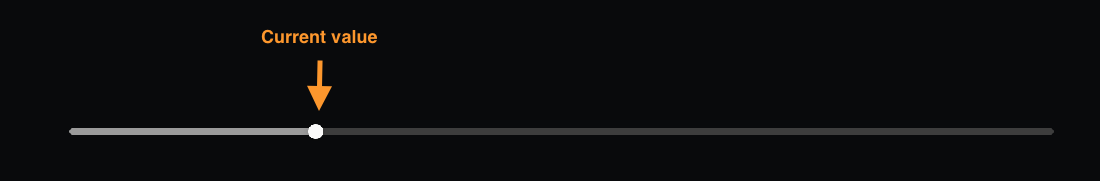
Type number
Must be between 0 and totalValue (inclusive).
totalValue
Required
The maximum value for the seek bar, representing the total duration or range.
<SeekBar currentValue={0} totalValue={300} />
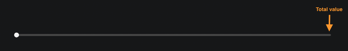
Type number
step
The value to increment or decrement when using D-Pad navigation. Values can be positive or negative.
<SeekBar step={1} currentValue={0} totalValue={120} />
Type number
Default 10
Interaction control props
disabled
Enables or disables all user interactions with the remote events.
<SeekBar disabled={true} currentValue={0} totalValue={1200} />
Type boolean
Default false
disabledWhenNotFocused
When true, disables user interaction when the seek bar is not focused. This prop is important for TV interfaces where focus management is critical, and ideal when you want the component to handle focus management automatically rather than managing it manually in your app code.
<SeekBar disabledWhenNotFocused={true} currentValue={0} totalValue={1200} />
Type boolean
Default false
disableThumbnail
Enables or disables the preview thumbnail image functionality. To display thumbnail images, use the thumbnailImageSource prop.
<SeekBar disableThumbnail={true} currentValue={0} totalValue={1200} />
Type boolean
Default false
trapFocus
Controls focus navigation behavior for the SeekBar component.
<SeekBar trapFocus={true} currentValue={0} totalValue={1200} />
Type boolean
Default false
When enabled, traps focus for left or right D-Pad navigation within the SeekBar. Up or down navigation to controls above or below the SeekBar remain available.
partialDisablingConfiguration
Provides control over which specific user interactions to disable.
<SeekBar
  partialDisablingConfiguration={{
    skipBackward: true,
    skipForward: true,
    playPause: false,
  }}
  currentValue={0}
  totalValue={1200}
/>
Type PartialDisablingConfiguration
When provided, this prop overrides the global disabled and disabledWhenNotFocused settings.
The prop is useful for disabling only specific buttons. For example, you can disable skipForward >> or skipBackward << while maintain seek behavior (right and left D-pad) or removing default behavior for custom handling.
Available actions:
playPauseskipBackwardskipForwardleftrightselectback
When you provide the PartialDisablingConfiguration object, all default values for the actions are set to false.
Note Disabling the back button only affects the SeekBar's internal usage, not external navigation or other interactions outside the component.
Callback props
onValueChange
Callback fired when the thumb value changes while sliding.
<SeekBar
  onValueChange={(value) => console.log("New value:", value)}
  currentValue={0}
  totalValue={1200}
/>
Type (value: number) => void
onSlidingStart
Callback fired when sliding interaction begins. For D-Pad, the callback is triggered on initial left or right press (key down).
<SeekBar
  onSlidingStart={() => console.log("Sliding started")}
  currentValue={0}
  totalValue={1200}
/>
Type: () => void
onSlidingEnd
Callback fired when sliding interaction ends. For D-Pad navigation, triggers on the left or right release (key up).
<SeekBar
  onSlidingEnd={() => console.log("Sliding ended")}
  currentValue={0}
  totalValue={1200}
/>
Type () => void | undefined
onRewindPress
Callback fired when a user triggers the rewind action. By default, pressing this button simulates a long press interaction that seeks backward through the content.
For the rewind button in the RCU <<, triggered on release (key up).
<SeekBar
  onRewindPress={() => console.log("Rewind pressed")}
  currentValue={0}
  totalValue={1200}
/>
Type () => void
Related props: longPressIntervalDuration, stepMultiplierFactor,enableSkipForwardBackwardAcceleration.
onFastForwardPress
Callback fired when a user triggers the fast forward action. By default, pressing this button simulates a long press interaction that seeks forward through the content.
For the fast forward button in the RCU >>, triggered on release (key up).
<SeekBar
  onFastForwardPress={() => console.log("Fast forward pressed")}
  currentValue={0}
  totalValue={1200}
/>
Type () => void
Related props: longPressIntervalDuration, stepMultiplierFactor, enableSkipForwardBackwardAcceleration.
onPress
Callback fired when the user presses the select button on the remote.
<SeekBar
  onPress={(thumbValue) => console.log("Pressed at:", thumbValue)}
  currentValue={0}
  totalValue={1200}
/>
Type (seekBarThumbValue: number) => void
onPlayPause
Callback fired when a user presses the play or pause button on the remote.
<SeekBar
  onPlayPause={(thumbValue) => console.log("Play/pause at:", thumbValue)}
  currentValue={0}
  totalValue={1200}
/>
Type (seekBarThumbValue: number) => void
onFocus
Callback fired when the seekbar receives focus.
<SeekBar
  onFocus={() => console.log("SeekBar focused")}
  currentValue={0}
  totalValue={1200}
/>
Type () => void
onBlur
Callback fired when the seekbar loses focus.
<SeekBar
  onBlur={() => console.log("SeekBar blurred")}
  currentValue={0}
  totalValue={1200}
/>
Type () => void
onSeekInteractionChange
Callback fired during seeking interactions with the D-Pad.
The event object contains the direction property which indicates the seeking direction:
'forward': Right D-Pad navigation seeking (initial press)'rewind': Left D-Pad navigation seeking (initial press)'fast_forward': Long press right D-Pad navigation'fast_rewind': Long press left D-Pad navigationnull: Send when the seeking interaction has ended (when the user releases the D-pad after seeking)
<SeekBar
  onSeekInteractionChange={(event) => {
    switch(event.direction) {
      case 'forward':
        console.log('Starting to seek forward');
        break;
      case 'rewind':
        console.log('Starting to seek backward');
        break;
      case 'fast_forward':
        console.log('Fast forwarding');
        break;
      case 'fast_rewind':
        console.log('Fast rewinding');
        break;
      case null:
        console.log('Seeking interaction ended');
        break;
    }
  }}
  currentValue={currentPosition}
  totalValue={totalDuration}
  longPressDelay={300}
/>
Type (event: InteractionEventPayload) => void
Event sequence
The onSeekInteractionChange callback fires in a specific sequence during D-pad interactions.
Right D-Pad example
- Initial press (key down):
event.direction = 'forward' - If held long enough (after
longPressDelay):event.direction = 'fast_forward' - When released (key up):
event.direction = null
Left D-Pad example
- Initial press (key down):
event.direction = 'rewind' - If held long enough (after
longPressDelay):event.direction = 'fast_rewind' - When released (key up):
event.direction = null
Complete event flow
The complete sequence for a long press interaction is:
['forward' or 'rewind'] → ['fast_forward' or 'fast_rewind'] → [null]
For a short press (quick tap), the sequence is:
['forward' or 'rewind'] → [null]
Visual customization props
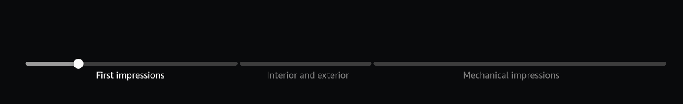
markers
Array of markers to display on the seek bar. Supports three types of markers:
// ReactNode markers - Custom components
<SeekBar
  markers={[
    {
      position: 200,
      node: () => (
        <Text style={{color: 'white', marginTop: 20}}>Description</Text>
      ),
    },
    {
      position: 30,
      node: (
        <View style={{width: 15, height: 15, backgroundColor: 'red'}} />
      ),
    },
  ]}
  currentValue={0}
  totalValue={1200}
/>

// Point markers - Colored points that segment the bar (commonly used for ads)
<SeekBar
  markers={[
    { position: 30, pointColor: '#FF0000' },
    { position: 60, pointColor: '#00FF00' }
  ]}
  currentValue={0}
  totalValue={1200}
/>

// Segment markers - Break the bar into segments
<SeekBar
  markers={[
    { position: 30, type: 'break' },
    { position: 60, type: 'break' }
  ]}
  currentValue={0}
  totalValue={1200}
/>

// Combined Point and Segment markers
<SeekBar
  markers={[
    { position: 20, pointColor: 'red' },
    { position: 40, type: 'break' },
    { position: 120, pointColor: 'red' },
    { position: 190, type: 'break' }
  ]}
  currentValue={0}
  totalValue={1200}
/>
Type ReactNodeMarker[] | BreakMarker[]
Marker Types
- ReactNode markers: Custom React components for complex visual elements
- Point markers: Colored points that break the seekbar into segments, commonly used for ad markers
- Segment markers: Break markers that divide the bar into distinct segments
Restrictions
- ReactNode markers cannot be combined with Point or Segment markers
- Point and Segment markers can be used together
- Point markers should have at least 3% space between them
- Point markers can only be placed up to 97% of the total SeekBar width
Example 1
Point markers

Example 2
Segment markers
displayAboveThumb
Custom content to render above the seek bar thumb. You can use a render function or React Node. Render function receives props: { mode, stepValue, multiplier, focused }.
// Static content
<SeekBar
    displayAboveThumb={
      <View
        style={{ alignItems: 'center', justifyContent: 'center', height: 50, width: 100 }}>
        <Text style={{color: 'white'}}>Seeking...</Text>
      </View>
    }
    currentValue={0}
    totalValue={1200}
/>

// Dynamic content
<SeekBar
  displayAboveThumb={({ mode, stepValue, multiplier }) => (
    <View
      style={{ alignItems: 'center', justifyContent: 'center', height: 50, width: 100 }}>
      <Text style={{color: 'white'}}>
        {`${mode} `}
        {stepValue * multiplier}s
      </Text>
    </View>
  )}
  currentValue={0}
  totalValue={1200}
/>

Type DisplayAboveThumbType | React.ReactNode
displayBelowThumb
Custom content to render below the seek bar thumb. You can use a render function or React Node.
<SeekBar
  displayBelowThumb={<Text>Live</Text>}
  currentValue={0}
  totalValue={1200}
/>

Type (() => React.ReactNode) | React.ReactNode
thumbIcon
A custom thumb icon component. You can use a render function or React Node. Render function receives { focused } prop.
// Static icon
<SeekBar
  thumbIcon={<View style={{ width: 20, height: 20, backgroundColor: 'yellow', borderRadius: 10 }} />}
  currentValue={0}
  totalValue={1200}
/>

// Dynamic icon
<SeekBar
  disabledWhenNotFocused={true}
  thumbIcon={({ focused }) => (
    <View style={{
      width: focused ? 24 : 20,
      height: focused ? 24 : 20,
      backgroundColor: focused ? 'yellow' : 'gray',
      borderRadius: 12
    }} />
  )}
  currentValue={0}
  totalValue={1200}
/>
Type ((props: ThumbIconProps) => React.ReactNode) | React.ReactNode
Note When using the dynamic icon with the focused callback argument, set disabledWhenNotFocused={true} for correct focus behavior.
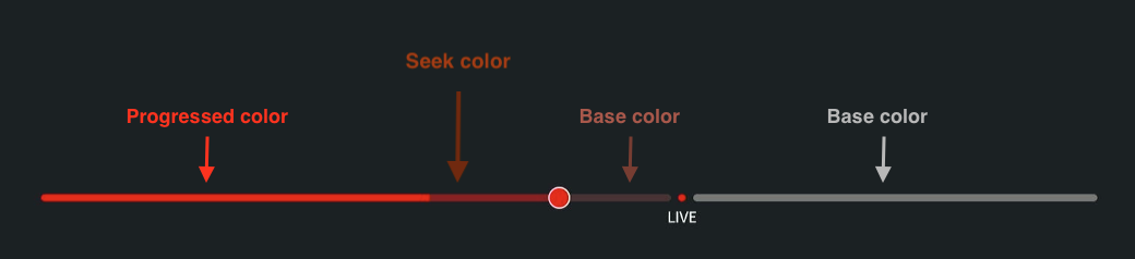
currentValueIndicatorColor
The color for the filled portion of the progress indicator. You can use a static color or a function that returns a color based on focus state.
<SeekBar
  currentValueIndicatorColor="#FF0000"
  currentValue={0}
  totalValue={1200}
/>

// Dynamic color based on focus
<SeekBar
  disabledWhenNotFocused
  currentValueIndicatorColor={(isFocused) => isFocused ? '#FF0000' : '#888888'}
  currentValue={0}
  totalValue={1200}
/>
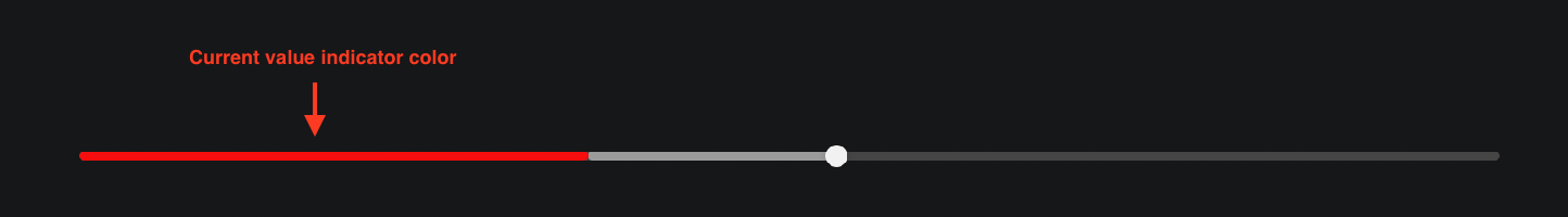
Type ColorValue | ((isFocused: boolean) => ColorValue)
barTrackColor
The color for the unfilled portion of the slider.
<SeekBar barTrackColor="#626262" currentValue={0} totalValue={1200} />

Type ColorValue
segmentColors
The color configuration for segments.
<SeekBar
  segmentColors={{
    0: { baseColor: "lightgreen", seekColor: "limegreen", progressedColor: "green", },
    1: { baseColor: "pink", seekColor: "brown", progressedColor: "red" },
  }}
  markers={[
    { position: 200, type: 'point', pointColor: 'red' },
    { position: 400, type: 'break' },
  ]}
  currentValue={0}
  totalValue={1200}
/>
Type SegmentColorsConfig
interface SegmentColorsConfig {
  [index: number]: {
    baseColor?: ColorValue; // Base color when not interacted with
    seekColor?: ColorValue; // Color when being seeked over
    progressedColor?: ColorValue; // Color when progressed through
  };
}
Configuration object for segment colors, allowing customization of specific segments by index. You can specify colors for any segments, not necessarily in order, and skip segments that don't need custom colors.
Note If animations are enabled, the segmentColors seekColor won't be applied. If there are no break markers, segment colors won't apply to the bar.
Usage examples
Yellow segment colors
  const segmentColors: SegmentColorsConfig = {
    2: {
      progressedColor: '#ffff00',
      seekColor: '#797926',
      baseColor: '#2e2e00',
    },
  };

Red segment colors
  const segmentColors: SegmentColorsConfig = {
    0: {
      progressedColor: '#ff0000',
      seekColor: '#811e1e',
      baseColor: '#432f2f',
    },
    1: {
      baseColor: '#727272',
    },
  };
Style props
barStyle
Style overrides for the slider bar.
<SeekBar
  barStyle={{ height: 8, borderRadius: 4 }}
  currentValue={0}
  totalValue={1200}
/>

Type StyleProp<ViewStyle>
currentValueIndicatorStyle
Style overrides for the progress indicator.
<SeekBar
  currentValueIndicatorStyle={{ backgroundColor: "#FF0000" }}
  currentValue={0}
  totalValue={1200}
/>
Type StyleProp<ViewStyle>
timeShiftIndicatorStyle
Style overrides for the timeshift indicator.
<SeekBar
  timeShiftIndicatorStyle={{ backgroundColor: "#00FF00", opacity: 0.7 }}
  currentValue={0}
  totalValue={1200}
/>

Type StyleProp<ViewStyle>
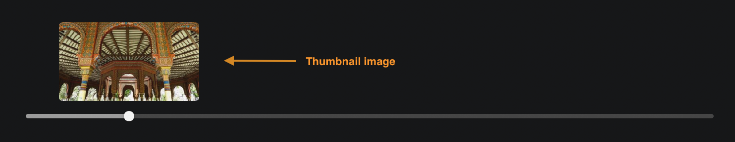
Thumbnail props
thumbnailStyle
Style overrides for the thumbnail container.
<SeekBar
  thumbnailStyle={{ borderRadius: 8, borderWidth: 2 }}
  currentValue={0}
  totalValue={1200}
/>

Type StyleProp<ViewStyle>
thumbnailImageSource
The image source for the thumbnail preview. Accepts a render prop for dynamic sources.
// Static source
<SeekBar
  thumbnailImageSource={{ uri: 'https://example.com/thumbnail.jpg' }}
  currentValue={0}
  totalValue={1200}
/>

// Dynamic source
<SeekBar
  thumbnailImageSource={(thumbValue) => ({ uri: `https://example.com/thumb_${thumbValue}.jpg` })}
  currentValue={0}
  totalValue={1200}
/>
Type ((thumbValue: number) => ImageSourcePropType) | ImageSourcePropType
thumbnailImageStyle
Style overrides for the thumbnail image.
<SeekBar
  thumbnailImageStyle={{ width: 120, height: 80 }}
  currentValue={0}
  totalValue={1200}
/>

Type StyleProp<ImageStyle>
thumbnailImageResizeMode
Resize mode for the thumbnail image.
<SeekBar
  thumbnailImageResizeMode="contain"
  thumbnailImageSource={{ uri: "https://example.com/thumbnail.jpg" }}
  currentValue={0}
  totalValue={1200}
/>
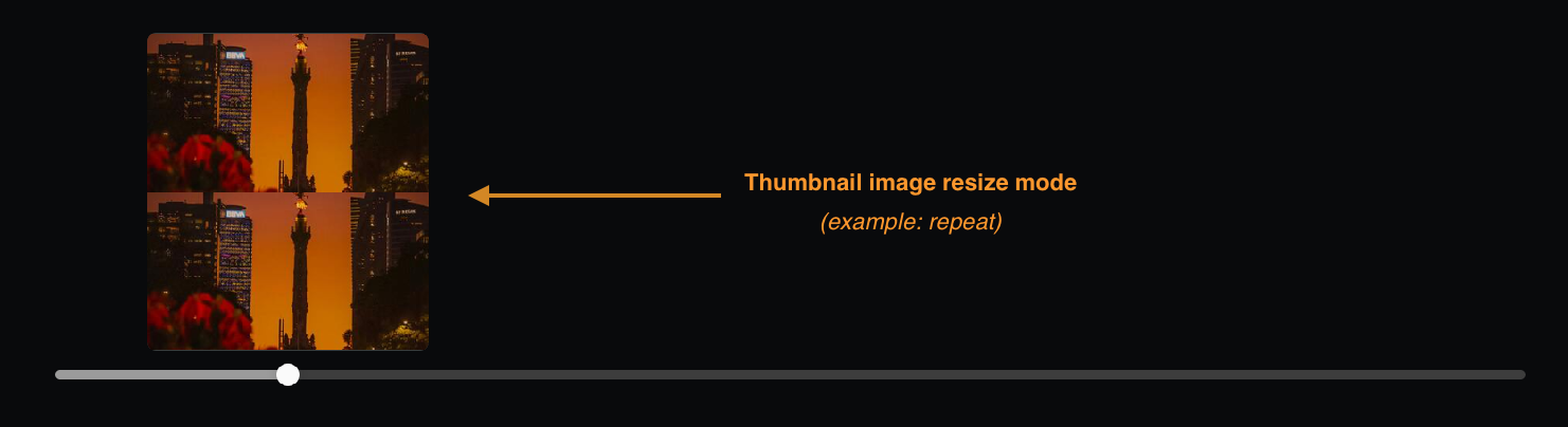
Type ImageResizeMode
Default "cover"
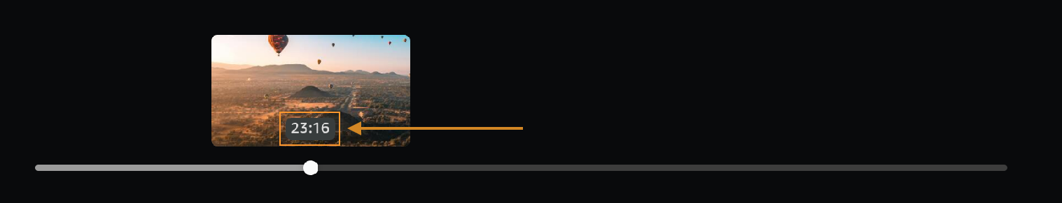
thumbnailLabel
Label to display in the thumbnail. Accepts a render prop for dynamic content.
// Static label
<SeekBar
  thumbnailLabel="Preview"
  thumbnailImageSource={{ uri: 'https://example.com/thumbnail.jpg' }}
  currentValue={0}
  totalValue={1200}
/>

// Dynamic label
<SeekBar
  thumbnailLabel={thumbValue => `${thumbValue} sec`}
  currentValue={0}
  totalValue={1200}
/>
Type ((thumbValue: number) => string) | string
thumbnailLabelTextStyle
Style overrides for the thumbnail label text.
<SeekBar
  thumbnailLabelTextStyle={{ color: "white", fontSize: 14 }}
  thumbnailLabel="Preview"
  currentValue={0}
  totalValue={1200}
/>

Type StyleProp<TextStyle>
thumbnailLabelContainerStyle
Style overrides for the thumbnail label container.
<SeekBar
  thumbnailLabelContainerStyle={{
    backgroundColor: "rgba(0,0,0,0.7)",
    padding: 4,
  }}
  thumbnailLabel="Preview"
  currentValue={0}
  totalValue={1200}
/>

Type StyleProp<ViewStyle>
Interaction timing props
longPressIntervalDuration
Interval duration in milliseconds for D-Pad long press actions. Controls how frequently the seeking action updates while holding the direction key. It's recommended to keep the default value as it matches the frequency of events sent by the remote control.
<SeekBar longPressIntervalDuration={400} currentValue={0} totalValue={1200} />
Type number
Default 200
Example 1
Long press interval duration: 200
Example 2
Long press interval duration: 400
longPressDelay
The amount of time in milliseconds before a user triggers the long press action. For D-Pad inputs, a user triggers a long press by holding the left or right key.
<SeekBar longPressDelay={500} currentValue={0} totalValue={1200} />
Type number
Default 250
Example 1
Long press delay: 200
Example 2
Long press delay: 3000
keyDownThrottleDelay
Delay for throttling key down events. Helps prevent excessive event handling during rapid key presses.
<SeekBar keyDownThrottleDelay={100} currentValue={0} totalValue={1200} />
Type number
Default 0
animationDuration
Duration of the animation in milliseconds when enableAnimations is true. Controls how long the thumb and progress transitions take. To have a better animation perception in long press and fast-forward or rewind interactions, it's suggested to have same value in both longPressIntervalDuration and animationDuration. Has no effect if enableAnimations is false.
<SeekBar
  animationDuration={200}
  enableAnimations={true}
  currentValue={0}
  totalValue={1200}
/>
Type number
Default 200
Seeking behavior props
maxStepValue
Maximum step value for progressive seeking during long press. Limits how large the seeking steps can become during acceleration.
<SeekBar
  maxStepValue={50}
  currentValue={0}
  totalValue={3000}
  enableLongPressAcceleration
/>
Type number
Default 160
stepMultiplierFactor
Multiplication factor for progressive seeking steps. Determines how quickly the seeking speed increases during acceleration. The step value is multiplied by this factor. Only applied when enableLongPressAcceleration or enableSkipForwardBackwardAcceleration is enabled.
<SeekBar
  stepMultiplierFactor={2}
  enableLongPressAcceleration
  currentValue={0}
  totalValue={1200}
/>
Type number
Default 1
Examples
stepMultiplierFactor={1}: Consistent acceleration -1x → 2x → 3x → 4x, ..stepMultiplierFactor={2}: Fast acceleration - speed doubles over time1x → 2x → 4x → 8x, ..stepMultiplierFactor={3}: Fast acceleration - speed triples over time1x → 3x → 6x → 12x, ..
stepMultiplierFactorInterval
Time interval between step multiplier increases. Controls how frequently the seeking speed increases during D-Pad left or right long press acceleration (in milliseconds). stepMultiplierFactor handles speed increases.
<SeekBar
  stepMultiplierFactorInterval={1500}
  stepMultiplierFactor={1}
  enableLongPressAcceleration
  currentValue={0}
  totalValue={1200}
/>
Type number
Default 1000
lowerSeekLimit
Minimum seekable value in the seekbar range. Prevents seeking to positions before this value.
<SeekBar lowerSeekLimit={300} currentValue={0} totalValue={1200} />
Type number
Default 0
upperSeekLimit
Maximum seekable value in the seekbar range. Prevents seeking to positions after this value.
<SeekBar upperSeekLimit={600} currentValue={0} totalValue={1200} />
Type number
Default totalValue
enableLongPressAcceleration
Enables progressive acceleration during long press interactions. When enabled, the step multiplier increases over time (for example, 1x, 2x, 3x, 4x) based on the stepMultiplierFactor and stepMultiplierFactorInterval settings. The step value is multiplied by the current multiplier. This affects the seeking speed when holding down left or right keys or buttons.
<SeekBar
  enableLongPressAcceleration={true}
  stepMultiplierFactor={1}
  currentValue={0}
  totalValue={1200}
/>
Type boolean
Default false
enableSkipForwardBackwardAcceleration
Enables progressive acceleration during skip forward or backward interactions. When enabled, consecutive skip forward (>>) or skip backward (<<) button presses increase the skip multiplier (for example, 1x, 2x, 3x, 4x, 5x) based on the stepMultiplierFactor setting. The step value is multiplied by the current multiplier.
<SeekBar
  enableSkipForwardBackwardAcceleration={true}
  stepMultiplierFactor={1}
  currentValue={0}
  totalValue={1200}
/>
Type boolean
Default false
enableAnimations
Enables or disables animations for the seek bar's thumb and progress movements.
When true, the seek bar animates position changes smoothly and thetimeShiftIndicatorStyle prop is not applied. When false, the position changes instantly and all visual elements will be rendered.
<SeekBar enableAnimations={true} currentValue={0} totalValue={1200} />
Type boolean
Default false
Type definitions
PartialDisablingConfiguration
interface PartialDisablingConfiguration {
  back?: boolean; // Disables back action
  playPause?: boolean; // Disables play/pause action
  skipBackward?: boolean; // Disables skip backward action
  skipForward?: boolean; // Disables skip forward action
  right?: boolean; // Disables right action
  left?: boolean; // Disables left action
  select?: boolean; // Disables select action
}
InteractionEventPayload
type InteractionEventPayload = {
  direction: "forward" | "rewind" | "fast_forward" | "fast_rewind" | null;
};
DisplayAboveThumbProps
type DisplayAboveThumbProps = {
  mode: SeekMode; // Current seeking mode
  stepValue: number; // Step value for seeking increments
  multiplier: number; // Current multiplier factor for accelerated seeking
  focused: boolean; // Whether the seekbar has focus
};
SegmentColorsConfig
interface SegmentColorsConfig {
  [index: number]: {
    baseColor?: ColorValue; // Base color when not interacted with
    seekColor?: ColorValue; // Color when being seeked over
    progressedColor?: ColorValue; // Color when progressed through
  };
}
ThumbIconProps
type ThumbIconProps = {
  focused: boolean; // Whether the seekbar has focus
};
SeekMode
type SeekMode =
  | "forward" // Normal forward seeking
  | "idle_forward" // Forward seeking state but not actively seeking
  | "rewind" // Normal rewind seeking
  | "idle_rewind" // Rewind seeking state but not actively seeking
  | "fast_forward" // Accelerated forward seeking
  | "fast_rewind" // Accelerated rewind seeking
  | undefined;
Glossary
The following list contains important terminology used in this document.
Thumb - An interactive element on the SeekBar that enables users to set the current value (currentValue). By default, the thumb will be placed on the currentValue of the SeekBar. If the user interacts with it, the thumb's position changes accordingly.
Timeshift - The action of scrubbing forward or backward by using the thumb.
Timeshift indicator - The indicator that represents the gap between the currentValue and the current thumb position as the user moves the thumb.
Current value indicator - The filled-in part of the SeekBar that indicates the current value (progress indicator).
Seek thumbnail - The image-based thumbnail component typically shown above the SeekBar thumb, that displays content such as an image preview and the thumbnail label.
Markers - Custom React nodes or views laid out horizontally throughout the SeekBar. Three types: ReactNode markers (custom components), Point markers (colored points), and Segment markers (break markers).
Point markers - Colored markers that break the seekbar into segments, commonly used for ad markers. Cannot be combined with ReactNode markers.
Segment markers (Break markers) - Markers that divide the bar into distinct segments. Can be combined with Point markers.
ReactNode markers - Custom React components for complex visual elements. Cannot be combined with Point or Segment markers.
Long press - When the user holds down the D-Pad button (left or right), triggering accelerated seeking behavior.
Skip forward/backward - Remote control buttons (>> and <<) that simulate long press interactions for seeking through content.
D-Pad navigation - Left or right directional pad controls used for seeking and thumb positioning.
Focus trapping - When enabled, prevents focus from moving left or right beyond the SeekBar while allowing up or down navigation.
Acceleration - Progressive speed increase during long press or consecutive skip actions, controlled by stepMultiplierFactor.
Seek limits - Boundaries (lowerSeekLimit or upperSeekLimit) that restrict seekable positions within the total range.
Segments - Sections of the seekbar created by break markers, each with customizable colors and visual properties.
Last updated: Sep 30, 2025