
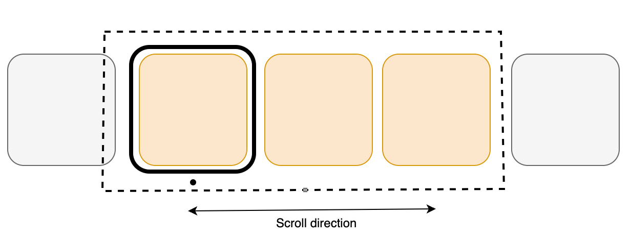
VUIC Carousel
A Carousel is used to implement a single row of content metadata tiles in a Vega application UI screen. Carousels are typically used in home screen grids, in More Like This UIs, and Related Content rows, among other use cases.
Usage
This version of Carousel is included in @amazon-devices/kepler-ui-components ~2.0.0. Check your package.json to confirm the version is set as shown below.
"dependencies": {
    // ...
    "@amazon-devices/kepler-ui-components": "~2.0.0"
}
Import
import { Carousel } from '@amazon-devices/kepler-ui-components';
Examples
Horizontal Carousel
import React, {memo} from 'react';
import {Image, Pressable, View} from 'react-native';
import {
  Carousel,
  CarouselRenderInfo,
  ItemInfo,
} from '@amazon-devices/kepler-ui-components';
import {useState} from 'react';

import {ItemType, ScrollableProps} from '../../Types';
import {CAROUSEL_STYLE} from './Style';

export const HorizontalScrollable = ({data}: ScrollableProps) => {
  function ItemView({item}: CarouselRenderInfo<ItemType>) {
    const [focus, setFocus] = useState<boolean>(false);
    const onFocusHandler = () => {
      setFocus(true);
    };
    const onBlurHandler = () => {
      setFocus(false);
    };

    return (
      <Pressable
        style={[
          CAROUSEL_STYLE.itemContainer,
          focus && CAROUSEL_STYLE.itemFocusContainer,
        ]}
        onFocus={onFocusHandler}
        onBlur={onBlurHandler}>
        <Image style={CAROUSEL_STYLE.imageContainer} source={{uri: item.url}} />
      </Pressable>
    );
  }

  const renderItemHandler = ({item, index}: CarouselRenderInfo<ItemType>) => {
    return <ItemView index={index} item={item} />;
  };

  const itemInfo: ItemInfo[] = [
    {
      view: ItemView,
      dimension: {
        width: 250,
        height: 420,
      },
    },
  ];

  const getItemForIndexHandler = (index: number) => ItemView;

  const keyProviderHandler = (item: ItemType, index: number) =>
    `${index}-${item.url}`;

  return (
    <View style={CAROUSEL_STYLE.container}>
      <Carousel
        data={data}
        orientation={'horizontal'}
        containerStyle={CAROUSEL_STYLE.horizontalCarouselContainerStyle}
        itemDimensions={itemInfo}
        itemPadding={20}
        renderItem={renderItemHandler}
        getItemForIndex={getItemForIndexHandler}
        keyProvider={keyProviderHandler}
        hasTVPreferredFocus
        hideItemsBeforeSelection={false}
        itemSelectionExpansion={{
          widthScale: 1.2,
          heightScale: 1.2,
        }}
        numOffsetItems={2}
        focusIndicatorType={'fixed'}
        maxToRenderPerBatch={10}
        firstItemOffset={100}
        dataStartIndex={0}
        initialStartIndex={0}
        shiftItemsOnSelection={true}
        trapFocusOnAxis={false}
        selectionBorder={{
          enabled: true,
          borderColor: '#FFFFFF',
          borderWidth: 2,
          borderRadius: 0,
          borderStrokeRadius: 0
        }}
      />
    </View>
  );
};

export const HorizontalMemoScrollable = memo(HorizontalScrollable);
Vertical Carousel
import {Image, Pressable, View} from 'react-native';
import {
  Carousel,
  CarouselRenderInfo,
  ItemInfo,
} from '@amazon-devices/kepler-ui-components';
import {memo, useState} from 'react';
import React from 'react';
import {ItemType, ScrollableProps} from '../../Types';
import {CAROUSEL_STYLE} from './Style';

export const VerticalScrollable = ({data}: ScrollableProps) => {
  function ItemView({item}: CarouselRenderInfo<ItemType>) {
    const [focus, setFocus] = useState<boolean>(false);
    const onFocusHandler = () => {
      setFocus(true);
    };
    const onBlurHandler = () => {
      setFocus(false);
    };

    return (
      <Pressable
        style={[
          CAROUSEL_STYLE.itemContainer,
          focus && CAROUSEL_STYLE.itemFocusContainer,
        ]}
        onFocus={onFocusHandler}
        onBlur={onBlurHandler}>
        <Image style={CAROUSEL_STYLE.imageContainer} source={{uri: item.url}} />
      </Pressable>
    );
  }

  const renderItemHandler = ({item, index}: CarouselRenderInfo<ItemType>) => {
    return <ItemView index={index} item={item} />;
  };

  const itemInfo: ItemInfo[] = [
    {
      view: ItemView,
      dimension: {
        width: 250,
        height: 420,
      },
    },
  ];

   const getItemForIndexHandler = (index: number) => ItemView;

  const keyProviderHandler = (item: ItemType, index: number) =>
    `${index}-${item.url}`;

  return (
    <View style={[CAROUSEL_STYLE.container]}>
      <Carousel
        containerStyle={CAROUSEL_STYLE.verticalCarouselContainerStyle}
        data={data}
        orientation={'vertical'}
        itemDimensions={itemInfo}
        itemPadding={10}
        renderItem={renderItemHandler}
        getItemForIndex={getItemForIndexHandler}
        keyProvider={keyProviderHandler}
        hasTVPreferredFocus
        hideItemsBeforeSelection={false}
        itemSelectionExpansion={{
          widthScale: 1.2,
          heightScale: 1.2,
        }}
        focusIndicatorType="fixed"
        numOffsetItems={2}
        maxToRenderPerBatch={11}
        itemScrollDelay={0.2}
      />
    </View>
  );
};

export const VerticalMemoScrollable = memo(VerticalScrollable);
Heterogeneous Carousel
import {Image, Pressable} from 'react-native';
import {
  Carousel,
  CarouselRenderInfo,
  ItemInfo,
} from '@amazon-devices/kepler-ui-components';
import {useCallback, useState} from 'react';
import React from 'react';
import {ItemType, ScrollableProps} from '../../Types';
import {CAROUSEL_STYLE} from './Style';

export const HeterogeneousItemViewScrollable = ({data}: ScrollableProps) => {

  function ItemViewType1({item}: CarouselRenderInfo<ItemType>) {
    const [focus, setFocus] = useState<boolean>(false);

    const onFocusHandler = useCallback(() => setFocus(true), []);
    const onBlurHandler = useCallback(() => setFocus(false), []);

    return (
      <Pressable
        style={[
          CAROUSEL_STYLE.itemContainerType1,
          focus && CAROUSEL_STYLE.itemFocusContainer,
        ]}
        onFocus={onFocusHandler}
        onBlur={onBlurHandler}>
        <Image style={CAROUSEL_STYLE.imageContainer} source={{uri: item.url}} />
      </Pressable>
    );
  }

  function ItemViewType2({item}: CarouselRenderInfo<ItemType>) {
    const [focus, setFocus] = useState<boolean>(false);

    const onFocusHandler = useCallback(() => setFocus(true), []);
    const onBlurHandler = useCallback(() => setFocus(false), []);
    return (
      <Pressable
        style={[
          CAROUSEL_STYLE.itemContainerType2,
          focus && CAROUSEL_STYLE.itemFocusContainer,
        ]}
        onFocus={onFocusHandler}
        onBlur={onBlurHandler}>
        <Image
          style={CAROUSEL_STYLE.imageContainer}
          resizeMode="cover"
          source={{uri: item.url}}
        />
      </Pressable>
    );
  }

  const renderItemHandler = ({item, index}: CarouselRenderInfo<ItemType>) => {
    return index % 2 === 0 ? (
      <ItemViewType1 index={index} item={item} />
    ) : (
      <ItemViewType2 index={index} item={item} />
    );
  };

  const itemInfo: ItemInfo[] = [
    {
      view: ItemViewType1,
      dimension: {
        width: CAROUSEL_STYLE.itemContainerType1.width,
        height: CAROUSEL_STYLE.itemContainerType1.height,
      },
    },
    {
      view: ItemViewType2,
      dimension: {
        width: CAROUSEL_STYLE.itemContainerType2.width,
        height: CAROUSEL_STYLE.itemContainerType2.height,
      },
    },
  ];

  const getItemForIndexHandler = (index: number) => {
    return index % 2 === 0 ? ItemViewType1 : ItemViewType2;
  };

  const keyProviderHandler = (item: ItemType, index: number) =>
    `${index}-${item.url}`;

  return (
    <Carousel
      data={data}
      containerStyle={CAROUSEL_STYLE.horizontalCarouselContainerStyle}
      orientation={'horizontal'}
      itemDimensions={itemInfo}
      itemPadding={40}
      renderItem={renderItemHandler}
      getItemForIndex={getItemForIndexHandler}
      keyProvider={keyProviderHandler}
      hasTVPreferredFocus
      hideItemsBeforeSelection={false}
      itemSelectionExpansion={{
        widthScale: 1.1,
        heightScale: 1.1,
      }}
      focusIndicatorType="fixed"
      numOffsetItems={3}
      maxToRenderPerBatch={11}
      firstItemOffset={100}
    />
  );
};
Features
FocusIndicator
The FocusIndicator style specifies how the focus indicator moves in a list of items in response to the D-Pad left and right key presses.
Natural
The natural style causes the focus indicator to float in the scroll direction until it reaches the start or end of the list.

Fixed
The fixed style causes the focus indicator to stay locked on the initial item’s position. When scrolling, the items reposition so that the focused item remains fixed.
Pinned focus style
The pinned focus style pins the focused item at a position during scrolling for larger sets of items. As the user approaches the beginning or end of the list, the scroll behavior transitions smoothly into the natural flow.
The optional prop pinnedFocusOffset allows users to define the pin location for the selected item and the FocusIndicatorType includes the focus style PINNED.
The pinnedFocusOffset ranges from 0% to 100%. This is the percentage of the size of the viewport. The height is used for vertical carousels and width is used for horizontal carousels. It defines the position where the selected item should be pinned relative to the start (in horizontal mode, except for languages written from right to left) or the top edge (in vertical mode) of the viewport.
focusIndicatorType and pinnedFocusOffset aren't required.| Prop | Type | Default | Details |
|---|---|---|---|
| focusIndicatorType | focusIndicatorType = fixed | natural | pinned |
fixed |
How the focus indicator moves in a list of items with DPad Left and Right key presses. fixed - Focus is fixed on the far left position of the item. natural - Focus floats in the direction of the scroll. pinned - Focus behavior mimics natural scrolling at the beginning and end of a list. As the user scrolls through the items, the focused item is pinned to a position along the scrolling axis, determined by pinnedFocusOffset. |
| pinnedFocusOffset | Percentage | undefined |
undefined |
Determines the relative position, in percentage, from the leading edge of the Carousel where the focus of the selected item is pinned. This value is a string Percentage type, for example, "50%". Note: When focusIndicatorType is set to pinned and pinnedFocusOffset isn't defined, the Carousel defaults to the natural focusIndicatorType behavior. |
pinnedFocusOffset does not handle 0% and 100% values correctly. Use the fixed focusIndicatorType for 0%, and natural for 100%.Recycling
The recycling technique involves reusing existing list item views to display new data as the user scrolls, rather than creating new views for each item. This reduces memory usage and optimizes rendering.
The Recycling View does not allocate an item view for every item in your data source. Instead, it allocates only the number of item views that fit on the screen and it reuses those item layouts as the user scrolls. When the view first scrolls out of sight, it goes through the recycling process, shown in the following diagram with detailed steps below.

- When a view scrolls out of sight and is no longer displayed, it becomes a Scrap View.
-
The Recycler has a Recycle View Heap caching system for these views.
a. When a new item is to be displayed, a view is taken from the recycle pool for reuse. Because this view must be re-bound by the adapter before being displayed, it is called a dirty view.
b. The dirty view is recycled: the adapter locates the data for the next item to be displayed and copies this data to the views for this item. References for these views are retrieved from the recycler view’s view holder.
c. The recycled view is added to the list of items in the Carousel that is about to go on-screen.
- The recycled view goes on-screen as the user scrolls the Carousel to the next item in the list. Meanwhile, another view scrolls out of sight and is recycled according to the above steps.
Variable Scroll speed
The Carousel component introduces a novel feature for controlling scroll speed through scrollDuration prop. Unlike existing components such as Flatlist or Flashlist, this feature offers enhanced flexibility, empowering end-users to finely tune their scrolling experience to suit their preferences.
The scrollableFocusScaleDuration prop controls the animation duration for item selection change when focus enters or exists the scrollable area. Adjust this value as needed for smoother transitions.
The itemScrollDelay is in effect when the tiles are transitioning, such as when they move. If only the focus is moving then itemScrollDelay does not apply.
Props
| Prop | Type | Default | Required | Details |
|---|---|---|---|---|
| testID | string |
kepler-shoveler |
FALSE | A unique identifer to locate this scrollable in end-to-end tests. |
| Data | Item[] |
- | TRUE | Data is a plain array of items of a given type. |
| itemPadding | number |
- | TRUE | The space between the adjacent items in scroll direction, in pixels. |
| orientation | Orientation = Horizontal | Vertical |
horizontal | FALSE | The direction for rendering the scrollable items. |
| itemDimensions | ItemInfo[] |
- | TRUE | Contains all the Views and their sizes, which are used to render the children of this scrollable. |
| maxToRenderPerBatch | number |
8 | FALSE | Maximum numbers of items to render at a time, when recycling through the scrollable. |
| numOffsetItems | number |
2 | FALSE | Number of items to keep to the top/left of the scrollable before recycling the component to the end. |
| firstItemOffset | number |
0 | FALSE | Amount of top/left padding to put on the scrollable. |
| itemSelectionExpansion | Dimension = { width: number; height: number } |
(0,0) | FALSE | Space to allocate for the selected item depending on the item's dimension |
| shiftItemsOnSelection | boolean |
TRUE | FALSE | Determines if items should be shifted in a row as the selection is shifted. |
| focusIndicatorType | FocusStyle = fixed | natural | pinned |
fixed |
FALSE | How the focus indicator moves in a list of items with DPad Left and Right key presses. fixed - Focus is fixed on the far left position of the item. natural - Focus floats in the direction of the scroll. pinned - Focus behavior mimics natural scrolling at the beginning and end of the list. As the user scrolls through the items, the focused item is pinned to a position along the scrolling axis, determined by pinnedFocusOffset. |
| pinnedFocusOffset | Percentage | undefined |
undefined |
FALSE | Determines the relative position, in percentage, from the leading edge of the Carousel where the focus of the selected item is pinned. This value is a string Percentage type, for example, "50%". Note: When focusIndicatorType is set to pinned and pinnedFocusOffset isn't defined, the Carousel defaults to the natural focusIndicatorType behavior. |
| hasTVPreferredFocus | boolean |
FALSE | FALSE | Whether the scrollable should try to obtain initial focus. |
| initialStartIndex | number |
0 | FALSE | Initial focused selected index for the scrollable. |
| dataStartIndex | number |
0 | FALSE | Indicates the first data index that is available to the scrollable. |
| hideItemsBeforeSelection | boolean |
FALSE | If set to true, then all items before the pivot/selected items are hidden. | |
| itemScrollDelay | number |
0.2 | FALSE | Amount of time, in seconds, used to scroll each item. |
| trapFocusOnAxis | boolean |
FALSE | FALSE | Prevents the focus from progressing to the nearest component outside the scrollable alongside its axis. Meaning, if the scrollable is horizontal and the user is at the first item and presses left, or last item and presses right, this flag prevents the focus from escaping the scrollable. |
| containerStyle | StyleProp<ViewStyle> |
undefined | FALSE | View style for the shovler container. |
| selectionBorder | SelectionBorderProps |
{ enabled: false, borderColor: 'white', borderWidth: 8, borderRadius: 8, borderStrokeRadius: 4, borderStrokeColor: 'black', borderStrokeWidth: 3, } |
FALSE | When this flag is set to true, the selected item has a style-able border enveloping the selected item. |
| ref | React.Ref<ShovelerRef<Key>> |
undefined | FALSE | Ref to access the Carousel component's ScrollTo and EnableDPad methods. |
| Prop | Function signature | Default | Required | Details |
|---|---|---|---|---|
| renderItem | (info: ShovlerRenderInfo) => React.ReactElement | null |
- | TRUE | Renders the scrollable Item. |
| getItemForIndex | (index: number) => React.FC |
- | TRUE | Either a constant step size for all the elements or a method to provide the step size per item index. |
| keyProvider | (data: ItemT, index: number) => keyT |
- | TRUE | Extracts a key from an object. |
The Carousel supports following methods through its ShovelerRef<KeyT>:
| Prop | Function signature | Default | Details |
|---|---|---|---|
| scrollTo | (index: number, animated : boolean) : void; |
- | Scroll to give Indexed Item on the Carousel. |
| enableDpad | (enable: boolean) : void; |
- | Support HW Key events on the Carousel. |
type Dimension = {  width: number; height: number }
type ItemInfo<Prop = any> = {
    view: React.FC<Prop>;
    dimension: Dimension
}
Customizations
Variable Scroll Speed
The scroll speed between each item on the carousel can be modified using the itemScrollDelay prop, which defaults to 0.2 seconds.
Focus Indicator Style
The carousel supports two types of focus indicators.
Natural
Causes the focus indicator to float in the scroll direction until it reaches the start/end of the list.
Fixed
Causes the focus indicator stays locked on the initial item’s position, and when scrolling the items reposition so that the focused item remains fixed.
Item Scale on selection
The selected or focused item on the carousel can expand in height and width by a specified factor compared to its original size.
Show/Hide Items before selection
Allows the option to hide or show items preceding the selected one during fixed scrolling. Displaying an item before the selected one provides a visual cue to the user that more items are available to the left.
Container Style
Allows setting the style for the entire carousel view. Common styles include background color, opacity, width, and height.
Selection Border
The Carousel component now supports displaying a border around a UI item when focused. This change introduces new props to configure the border style and a boolean that allows you to choose between using the native border or providing a custom one. Common use cases for selection border include:
Default border style with selctionBorder.enabled as true
selectionBorder={{
  enabled: true
}}
Default border style with selectionBorder.enabled as false
selectionBorder={{
  enabled: false
}}
Border style with borderProps and borderStrokeProps
selectionBorder={{
    enabled: true,
    borderColor: 'white',
    borderWidth: 4,
    borderRadius: 4,
    borderStrokeRadius: 0,
    borderStrokeColor: 'transparent',
    borderStrokeWidth: 0
}}
Troubleshooting
getItemForIndex is not a function
You may encounter an error like this example below.
TypeError: getItemForIndex is not a function (it is undefined)
This error is located at:
    in ItemRenderer
    in KeplerScrollable
    in KeplerScrollableWithRef
    in Scrollable (created by App)
    in RCTView (created by View)
    in View (created by App)
    ...
This error is due to the changes to Carousel in the 2.0.0 version of VUIC. The enhancements required changes to the input props and behavior of the component.
Verify which version of the package you are using. Go to your app's package.json file and find the "@amazon-devices/kepler-ui-components" dependency.
If the package version is 2.0.0 or higher, then you have the latest version of Carousel. You have two options to resolve the error: use the new version and update your implementation, or revert to the older version.
Option 1: Update your implementation
If you want to continue using VUIC version 2.0.0, you need to update your implementation of the Carousel component. See Migrate to the latest version above for more information.
Option 2: Revert to the previous Carousel version
If you want to continue with the previous version of Carousel, change the version of "@amazon-devices/kepler-ui-components" to ~1.0.0 in your package.json file.
Vertical scroll only works with a set height
In the case of vertical scrolling (specifically natural scrolling), you need to set containerStyle with a fixed height value.
When setting shiftItemsOnSelection to false, an unintended overlapping behavior can be observed
If you set shiftItemsOnSelection to false and do not set the correct height and width, an overlapping behavior can be observed in the carousel. You need to set the correct height and width to troubleshoot this issue. The shiftItemsOnSelection prop will let the carousel component make additional room while its selected to expand itself. If you set this to false, the carousel doesn't expand.
ItemDimension should be equal to or greater than the Card’s dimensions
If you do not set the itemDimension equal to or greater than the card dimensions, alignment may not happen properly.
This page refers to the Carousel component from KUIC version 1.0.6, supported by Vega SDK version 0.8 and earlier.
Migrate to the latest Carousel version for enhanced performance and new features such as recycling, variable scroll speed, and focus indicators.
Overview
Carousels are a design element used to display a list of options for the user in an eye-catching way. They are often used on the home page of video and music apps to display all the playable content that is available. It is also can be used in the system UI of device to call attention to various features. This Carousel component allows you to easily construct a list of such items on the screen while also providing customizability.
Compared to the traditional Flatlist component, Carousel automatically enables its items to be focusable. And it provides a visual indicator to indicate the currently focused item. You can override the default visual indicator or can provide a custom look. Under the hood, Carousel uses a RecyclerListView. Recycler lists are more performant than Flatlists on large lists because they are more efficient with garbage collection and memory usage.
Usage
The Carousel component has similar inputs to React Native’s Flatlist. Like Flatlist, this component requires you to specify an array of data and a render function to take that data and generate carousel items. Those items will be rendered inside the carousel and they will be scrollable with both the remote and by touch.
One unique requirement for the Carousel is specifying the dimensions for carousel items. All carousel items are allotted a fixed amount of space to be rendered, and any overflow is cropped.
Import
import { Carousel } from '@amazon-devices/kepler-ui-components';
Example
const data = [{imageUrl: "...", title: "...."}, ...]
const renderItem = ({ index, item }) =>
    {
        return <VideoTile title={item.title} image={item.imageUrl}>
    }

<Carousel
    data={data}
    renderItem={renderItem}
    itemDimensions={{ height: 280, width: 200 }}
    testID="Carousel"
    accessibilityLabel="Carousel"
/>
Props
| Prop | Type | Default Value | Required | Description |
|---|---|---|---|---|
data |
any[] | N/A | Yes | The data for the items displayed in the carousel. Each element of this array corresponds to an item in the carousel. For example, all the data needed to render the first item should be found in the first element of the data array. renderItem() will use the data to render each component. |
renderItem |
({index: number, item: any}) => JSX.Element |
N/A | Yes | This function will render the items in the carousel with the given data. renderItem() is called upon each element in the data array and should return the component that should exist at that index on the carousel. By default each item rendered in the Carousel is wrapped by a TouchableOpacity component. This is done so that the carousel items will be focusable by default. The default focus style is a white border around the item. To prevent this default behavior use the focusDisabled prop. |
itemDimensions |
{
 height: number;
 width: number;
} |
N/A | Yes | Each item in the carousel is given a fixed amount of space by the Carousel. Items do not have to take up the entire space alotted to them. For example, suppose a Carousel item grows in size when it is focused on. The itemDimensions in these scenarios, then should be the size of the fully grown item. Any content that exceeds the space specified in itemDimensions will be cropped out. |
customFocusedStyle |
ViewStyle | Undefined | No | This allows you to specify your own custom style when the carousel items are focused. This style is applied to a wrapper around the Carousel item. This prop overrides the default focus style. |
focusDisabled |
Boolean | False | No | This allows you to disable the focus effects provided by the Carousel. This should be used when users want to have complex effects (like in the FireTV launcher) when items are focused on. The customFocusedStyle will not be sufficient for complex animations. In these scenarios, you should set focusDisabled to be true. Then they can implement the focus effects themselves in the component they are using for carousel items. |
orientation |
horizontal | vertical | horizontal | No | Sets the direction and layout of the carousel. vertical: The Carousel will be oriented vertically. So all items will be arranged in one column, with the first item appearing at the top of the column. horizontal: The Carousel will be oriented horizontally. So all items will be arranged in one row, with the first item appearing at the leftmost spot of the row |
gap |
Number | 0 | No | Specifies the gap in pixels between carousel items. Even when set to 0, there will still be a gap around carousel items. This gap is derived from the default focus style. A transparent border is added to elements that aren't focused so that there are not unnecessary layout changes when the item is focused on. This can be overriden by using customFocusedStyle and setting the borderWidth to 0. |
itemContainerStyle |
ViewStyle | Undefined | No | Sets the style of the internal container inside the carousel that contains all the carousel items. |
style |
ViewStyle | Undefined | No | Sets the style of the overall Carousel. Use this prop to specify the dimensions of the Carousel and position it on your screen. |
Customization
Customization is available using style props (itemContainerStyle) and the gap prop. You can also customize how the carousel items appear when they are focused on using the customFocusedStyle prop.
Example
const data = [{imageUrl: "...", title: "...."}, ...]

const renderItem = ({ index, item }) =>
{
    return <VideoTile title={item.title} image={item.imageUrl}>
}
const customFocusStyle = {
    borderColor: 'yellow',
    borderRadius: 20,
}
<Carousel
    data={data}
    renderItem={renderItem}
    itemDimensions={{ height: 280, width: 200 }}
    orientation={"horizontal"}
    customFocusedStyle={customFocusStyle}
    gap={30}
    testID="Carousel"
    accessibilityLabel="Carousel"
/>
Interactivity
| Modality | Available |
|---|---|
| D-pad | Yes |
| Touch | Yes |
| Voice | No |
Accessibility
| Prop | Available |
|---|---|
accessible |
Yes |
accessibilityRole |
No |
accessibilityLabel |
Yes |
accessibilityValue |
No |
accessibilityActions |
No |
accessibilityState |
No |
UI experience
By default, the Carousel is horizontal and has a white border around the focused elements. The visuals of the carousel can vary dramatically based on what the user uses in the render function. As seen in the demo, there are no restrictions regarding items you put inside carousel or the shape of the items. If you want animations, you can add them directly onto the items that you pass in.
Last updated: Feb 04, 2026