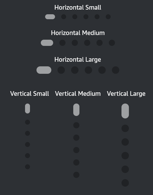
Pagination Indicator component provide a visual indicator for the number of pages and the current active page.
Usage
Import
Example
Props
| Prop | Type | Default Value | Required | Description |
|---|---|---|---|---|
numberOfPages | Number | N/A | Yes | Total number of pages |
activePage | Number | N/A | Yes | Currently active page (0 based) |
size | ’sm’, ‘md’, ‘lg' | 'md’ | No | Size of the PaginationIndicator |
activeColor | ColorValue | Undefined | No | Color of the active indicator |
inactiveColor | ColorValue | Undefined | No | Color of the inactive indicator |
vertical? | Boolean | False | No | Set orientation to vertical |
Customization
The active or inactiveColor provides customization along with option of size.
Interactivity
Accessibility
UI experience