Alexa Blogs

Echo Spot delivers everything customers love about Alexa in a compact design with the added convenience of a screen. Its screen can provide an engaging complementary experience to your voice user interface (VUI). Similar to Echo Show, you can use Echo Spot to extend your VUI by showing more information relevant to your dialogue with the additional visual and touch components.
Check out the latest enhancements to our Voice Design Guide for templates you can use as you start designing for Echo Spot. And to help you get started faster, here are seven tips to help you think through the voice design process and create standout skills for Echo Spot.
1. Get Creative with Echo Spot’s Unique Features
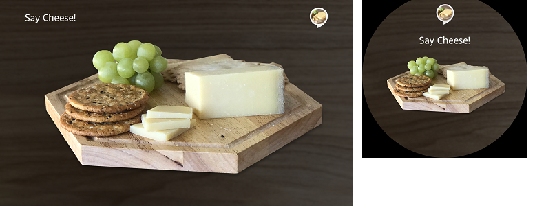
You can use Echo Spot’s small, circular screen to your advantage. Pick templates based on the interaction pattern you plan to use and think about how those visuals will scale across devices. Echo Spot also supports video. If you're using video, make sure you own the rights to the video and that it loads quickly.
2. Design with Distance in Mind
As you design for Echo Spot, make the primary content of each template visible and recognizable from up to 5 feet away. For context, the Echo Show display is visible from 7 feet away. Think of Echo Spot as a device people will view from their desk or side table.
3. Build for Both Echo Spot and Echo Show
To create screens that enhance the use of voice, use the templates we have provided. The templates render equally on Echo Show and Echo Spot. This makes it easy to offer consistent visual output that supports and enhances the voice-first experience of your skill.
4. Choose the Right Template
Though the templates render synonymously between Echo Show and Echo Spot, there are some notable differences. For instance, vertical and horizontal list items will render properly; however on Echo Spot they will appear one at a time. To see the template renderings in full, visit our Display Interface Reference.
5. Match Skill Responses with On-Screen Visual Displays
For each response in your skill, create a screen that matches the content. However, avoid duplicating the voice experience. Instead, offer additional information that adds to the experience but is not integral to the dialogue. For example, if you are creating a skill that gives you good pairings for cheese, the voice dialogue would tell you the components while Echo Spot would display them on screen.
6. Incorporate Text Thoughtfully
Compared to Echo Show, Echo Spot offers less screen space. Keep your messages and headings short to avoid excess text wrapping to multiple lines on the screen, and ensure your tone allows for quick and easy reading. Lean on your voice design experience and use visuals.
7. Use Hints for Voice
Hints help customers get to know your skill and to try other features. However, hints will not display in any template on Echo Spot. Think through the important hints you’d want to provide your user and incorporate them into your dialogue.

Remember that when you are creating skills for multimodal devices like Echo Spot, it is important to maintain a voice-first design.
Use the Voice Design Guide to Get Started
We’ve updated the Amazon Alexa Voice Design Guide with additional design practices and guidelines to help you deliver with the new capabilities using Echo Show and new Echo Spot visual templates. Visit the guide to get started.
More Resources
- Build Skills for Echo Show and Echo Spot
- Learn More About Echo Spot
- Best Practices for Designing Skills with a Screen
- Display Interface Reference
Build a New Skill, Earn Developer Perks
Bring your big idea to life with Alexa and earn perks through our tiered rewards system. US developers, publish a skill in December and receive an Alexa developer hoodie. If 100 customers use your skill in its first 30 days in the Alexa Skills Store, you can also apply to receive a free Echo Dot to help you make Alexa even smarter. If you need inspiration, consider creating a holiday-themed skill to get into the holiday spirit. If you're not in the US, check out our promotions in the UK, Germany, and India. Learn more about our promotion and start building today.

