APL FlexSequence
A FlexSequence is a component that combines a subset of Container properties with Sequence capabilities.
A FlexSequence uses a data set to inflate a repeating set of components and display them in a scrolling cross-axis list. The child components can be non-uniform and the list wraps the child items by default. The component combines a scroll view with a series of repeated components and inflates a data set.
Differences between FlexSequence and similar components that can display a list of items:
- Container – A
FlexSequencehas better performance on long lists, but a less flexible layout model. TheFlexSequencedoesn't support absolute positioning like aContainer. - Sequence – A
Sequenceis built to display a a single child "chain" on the cross-axis. AFlexSequencewraps the child components by default. - GridSequence – A
GridSequencespecifies a rigid grid for the child components, with fixed rows and columns. AFlexSequenceallows for arbitrary-sized child items.
FlexSequence requires APL 2024.3 or later. Provide an alternate experience for devices running older versions of APL.Properties
The FlexSequence component has the following properties:
- All actionable component properties
- All multi-child component properties
- All base component properties
- The
FlexSequenceproperties listed in following table. See the meaning of the columns.
| Property | Type | Default | Styled | Dynamic | Description |
|---|---|---|---|---|---|
|
|
One of: |
|
Yes |
Yes |
Alignment for children in the cross-axis. |
|
|
Boolean |
|
No |
No |
When |
|
|
Array of command |
|
No |
No |
Command to run when scrolling. |
|
|
Array of string |
|
No |
No |
Properties to save when reinflating the document with the |
|
|
One of: |
|
No |
No |
The direction to scroll this |
|
|
One of: |
|
Yes |
No |
The alignment that the child components snap to when scrolling stops. |
height and width component properties
To minimize visibility errors, the height of a vertical FlexSequence and the width of a horizontal FlexSequence initialize to 100 dp when not specified or set to auto.
layoutDirection component property
The FlexSequence layoutDirection property determines the direction to lay out the child components when sequence_scroll_direction_property is horizontal.
- LTR: The sequence arranges its children from left side, and scroll to right side.
- RTL: The sequence arranges its children from right side, and scroll to left side.
alignItems
The Flexbox specification for how to align child components in the cross-axis.
numbered
When true, set the data-binding ordinal for each of the items in the FlexSequence. The ordinals start with "1" and increment by one unless the numbering property in the child component is skip or reset. The firstItem and lastItem aren't included in ordinal numbering.
The numbered property doesn't display any numbers on the screen automatically. You can use the ordinal value in the data-binding context to display the numbers in a Text component.
onScroll
Commands to run during scrolling. The runtime attempts to run these commands one time per drawing frame during scrolling, but this attempt might not succeed. On slow hardware the onScroll command might run intermittently.
The event.source.position reported in the command is the percentage of the current scroll position as expressed by the width or height of the sequence. For example, assume the FlexSequence is 200 pixels wide and the contents have shifted left by 520 pixels. The event.source.position value is 2.60.
The event generated has the following form.
"event": {
  "source": {
    "type": "FlexSequence",
    "handler": "Scroll",
    ...                                // Component source properties
  }
}
For a description of event.source properties, see Event source.
The onScroll event handler runs in fast mode in the component data-binding context.
preserve
An array of dynamic component properties and bound properties to save when reinflating the document with the Reinflate command.
The FlexSequence component has the following additional named properties you can assign to the preserve array.
centerId– The id of the child in the center of the sequencecenterIndex– The index of the child in the center of the sequencefirstId– The id of the child at the top of the sequencefirstIndex– The index of the child at the top of the sequencescrollOffset– Absolute scroll position (measured in dp)scrollPercent– Relative scroll position (measured as percentage of the visible area)
The firstIndex option uses the index of the current child shown at the start of the sequence and (after reinflation) sets the scroll position to place the same child (by index) at the start of the sequence. The firstId uses the id of the current child shown at the start of the sequence and (after reinflation) sets the scroll position to put the same child (by id) at the start of the sequence.
The centerIndex option uses the index of the current child shown in the center of the sequence and (after reinflation) sets the scroll position to place the same child (by index) in the center of the sequence. The centerId uses the id of the current child shown in the center of the sequence and (after reinflation) sets the scroll position to put the same child (by id) in the center of the sequence.
When searching by id (for both centerId and firstId), if the id isn't found either before reinflation or after reinflation, the sequence is positioned at the start. When searching for a component by index (for both centerIndex and firstIndex), if no child is present at that index, the sequence is positioned at the start.
scrollDirection
The scrollDirection is either vertical or horizontal.
snap
The alignment that the child components snap to when scrolling stops. When the user scrolls through the content and then stops scrolling, the FlexSequence can shift the child items to "snap" to the start, center, or end of the FlexSequence container. The FlexSequence aligns the child item closest to the snap position. For example, when snap is center, the FlexSequence shifts the items so that the item closest to the center snaps to the center of the container.
A FlexSequence supports two types of snap behavior:
- Snap when scrolling has velocity – When the user scrolls through the content, releases the pointer, and allows the sequence to slow to a stop, the
FlexSequencealigns the child components as requested or at the start or end of the sequence. No snapping occurs when the user releases the pointer with little or no scroll velocity. For this type of snapping, setsnaptostart,center, orend. - Always snap (force snap) – After the user releases the pointer, the
FlexSequencealways aligns the child components as requested or at the start or end of theFlexSequence. With the force snap behavior, the scroll velocity doesn't matter. For this type of snapping, setsnaptoforceStart,forceCenter, orforceEnd.
Snapping excludes any padding when determining the start, center, or end of the FlexSequence container.
The snap property can take the following values:
none– (Default) No snapping occurs.start– Align the starting side of the child component to the start of the container when scrolling has velocity.center– Align the center of the child component to the center of the container when scrolling has velocity.end– Align the ending side of the child component to the end of the container when scrolling has velocity.forceStart– Align the starting side of the child component to the start of the container, regardless of scrolling velocity.forceCenter– Align the center of the child component to the center of the container, regardless of scrolling velocity.forceEnd– Align the ending side of the child component to the end of the container, regardless of scrolling velocity.
The snap property applies when the user scrolls the content. The property doesn't apply to scrolling commands. To align items during command-driven scrolling, use the ScrollToComponent or ScrollToIndex command and set the align property on the command.
Multi-child properties
A FlexSequence is a multi-child component. The FlexSequence inherits all the multi-child component properties. For details, see Multi-child component.
Actionable properties
A sequence is an actionable component. The FlexSequence inherits all the actionable component properties. For details, see Actionable component.
Properties for FlexSequence child items
The child components for a FlexSequence support additional properties that control how the item is positioned in the FlexSequence.
| Property | Type | Default | Styled | Dynamic | Description |
|---|---|---|---|---|---|
|
|
Number |
0 |
Yes |
Yes |
If positive, this component will stretch if there is extra space. |
|
|
One of: |
|
No |
No |
Control ordinal numbering of the next child. |
|
|
Number |
0 |
Yes |
Yes |
If positive, this component will shrink if there is not enough space. |
|
|
0 |
Yes |
Yes |
Additional space to add between this component and the previous component in the layout. |
grow
Flexbox grow property. A positive grow value stretches the component proportionally when there is extra space in the parent FlexSequence. A negative grow value is ignored.
shrink
Flexbox shrink property.
A positive shrink value shrinks the component below its normal size when there isn't enough space in the parent FlexSequence. A negative shrink value is ignored.
numbering
Controls the ordinal value when the numbered property of the FlexSequence is true. This property controls how the ordinal value updates for the next child in the sequence, not the current child in the sequence.
normal: The next child'sordinal=ordinal+ 1.skip: The next child'sordinal=ordinalreset: The next child'sordinal= 1
spacing
An amount of spacing to add between this component and the previous component in the sequence. The first item in the sequence ignores spacing. absolute dimensions. The spacing property doesn't support relative dimensions.
FlexSequence event object
When the FlexSequence is the source or target of an event, the following values are reported in event.source or event.target:
{
  // Component-specific values
  "type": "FlexSequence",
  "position": Number,        // Scrolled position of the component, as a percentage
  "allowForward": Boolean,   // If true, there is room to scroll forward
  "allowBackwards": Boolean, // If true, there is room to scroll backwards

  // Visible children
  "firstVisibleChild": Integer,       // Index of the first visible child
  "firstFullyVisibleChild": Integer,  // Index of the first fully visible child
  "lastFullyVisibleChild": Integer,   // Index of the last fully visible child
  "lastVisibleChild": Integer,        // Index of the last visible child

  // General component values
  "bind": Map,         // Access to component data-binding context
  "checked": Boolean,  // Checked state
  "disabled": Boolean, // Disabled state
  "focused": Boolean,  // Focused state
  "height": Number,    // Height of the component, in dp (includes the padding)
  "id": ID,            // ID of the component
  "opacity": Number,   // Opacity of the component [0-1]
  "pressed": Boolean,  // Pressed state
  "uid": UID,          // Runtime-generated unique ID of the component
  "width": Number      // Width of the component, in dp (includes the padding)
}
FlexSequence layout example
The following example shows a verticalFlexSequence with child items of differing heights and widths.
{
  "type": "FlexSequence",
    "width": 500,
    "scrollDirection": "vertical",
    "data": [
      { "W": 200, "H": 100 },
      { "W": 300, "H": 100 },
      { "W": 500, "H": 150 },
      { "W": 200, "H": 100 },
      { "W": 300, "H": 100 },
      { "W": 500, "H": 150 },
      { "W": 200, "H": 100 },
    ...
    ],
    "items": [
      {
        "type": "Frame",
        "height": "${data.H}",
        "width": "${data.W}",
      ...
      }
    ]
  }
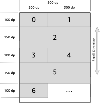
The following full APL document shows this example. The code uses background colors to distinguish between the child items.
{
  "type": "APL",
  "version": "2024.3",
  "theme": "dark",
  "mainTemplate": {
    "parameters": [
      "payload"
    ],
    "items": [
      {
        "type": "FlexSequence",
        "height": "100%",
        "width": 500,
        "bind": [
          {
            "name": "Colors",
            "value": ["red", "orange", "yellow", "green", "blue", "navy", "violet"]
          }
        ],
        "data": [
          {"W": 200, "H": 100},
          {"W": 300, "H": 100},
          {"W": 500, "H": 150},
          {"W": 200, "H": 100},
          {"W": 300, "H": 100},
          {"W": 500, "H": 150},
          {"W": 200, "H": 100}
        ],
        "items": [
          {
            "type": "Frame",
            "height": "${data.H}",
            "width": "${data.W}",
            "background": "${Colors[index]}",
            "item": [
              {
                "type": "Text",
                "height": "100%",
                "width": "100%",
                "text": "${index}",
                "textAlign": "center",
                "textAlignVertical": "center"
              }
            ]
          }
        ]
      }
    ]
  }
}
Related topics
Last updated: Oct 30, 2025