Alexa responds, informs, and asks questions in a natural and conversational way. Consider the following best practices when designing what Alexa will say to your customers.
- Be brief
- Speak and write naturally
- Prompt with guidance for the user
- Use conversation markers
- Add variety
- Use parallel language
- Remember what was said
- Provide definitive choices
- Use brevity, arrangement, and pacing when listing options
- Handle problems
- Provide contextual help
- Choose the right template on Echo Show or Echo Spot
- Use pre-recorded audio
- Play videos on Echo Show and Echo Spot
Be brief
Users need Alexa to speak concisely without extra words. This helps them understand what Alexa is saying and feel confident about what is happening. Longer responses tend to be more difficult to follow and remember.
- One-breath test
-
When writing what Alexa will say, read aloud what you’ve written. If you can say the words at a conversational pace with one breath, the length is probably good. If you need to take a breath, consider reducing the length.
-
For a response that includes successive ideas, such as steps in a task, read each idea separately. While the entire response may require more than one breath, make sure you only take breaths between and not during ideas.
- Distance test
-
For Echo Show, test with a seven-foot distance. For Echo Spot, test with a five-foot distance.
-
Echo Show and Echo Spot supplement the voice experience with on-screen details. Avoid duplicating the voice experience, and instead offer additional information within the graphical experience. Use visuals to provide feedback and enable the user to more quickly finish what he or she wants to do.
-
For information about implementing visual experiences on Echo Show and Echo Spot, see how to choose the right template.
Speak and write naturally
Inspire users to say what they want naturally. Don’t prompt with a menu of options. Instead, let the user know what’s possible and guide the user toward productive input.
Make sure that Alexa speaks like a person, for example using contractions and avoiding jargon. This will help the user more easily understand Alexa and encourages the user to speak naturally in return.
Be sure to listen to how your prompts sound when spoken by Alexa. Sometimes, a written phrase doesn’t sound natural and needs to be reworded.
Do
Alexa, ouvre Planifie un voyage.
Planifions ce voyage. Où voudriez-vous aller ?
Don’t
Planifions ce voyage. Dites-moi, “J’aimerais aller à un nom de ville” pour dire où vous voulez aller. Dites-moi, “Je partirai à une date précise” pour dire quand vous partez. Dites-moi, “je pars d’un nom de ville” pour dire votre ville de départ. Qu’est-ce que vous aimeriez faire ?
- Echo Show and Echo Spot
- Avoid simply reading what’s shown on screen, and instead have Alexa speak about the main idea and allow the user to look at the visuals for additional context or options.
Prompt with guidance for the user
Generally, end with a question before having the user respond. The question provides a cue to begin speaking and coaches the user on what to say next. End the prompt right after the question so that people don’t try to answer while Alexa is speaking. Be specific, but be ready for the user to answer in a different way or to over-answer.
Do
Planifions ce voyage. Quelle ville aimeriez-vous visiter ?
Don’t
Planifions ce voyage. Je peux vous aider une fois que je sais où vous allez et ce que vous voulez faire là-bas. Où voudriez-vous aller ? Vous avez été à Portland récemment.
- Next steps on Echo Show and Echo Spot
- With a screen, you can be more sparing with asking questions to keep the conversation going, and rely more on the screen to provide the next step for the user. The user can decide to touch the screen or speak to initiate the next step, for example by saying “Alexa, show more.”
Use conversation markers
When people converse, they use marker words and phrases to organize and direct topics, which help divide the conversation into more comprehensible chunks. Users of your skill will benefit from marker words and phrases, too.
- Timeline markers
- “D’abord,” “ensuite,” “après,” and “enfin” help set expectations about duration, sequence, and readiness for next steps. Use these words when multiple steps or significant time investment will be part of the experience. However, avoid using timeline markers for quick interactions.
- Acknowledgements and feedback
- “Merci,” “c’est noté,” “d’accord,” “ok,” and “bien sûr” let the user know that he or she has been understood or that information has been received.
- Pointers
- “ça,” and “celui/celle que,” help to identify subjects that have been previously referenced or are about to be mentioned.
- Transitions
- “Maintenant,” “sinon,” and “aussi,” help to introduce change when moving to a different topic.
Do
OK, il y a trois étapes pour laver un pull. (pause d’une demi-seconde)
D’abord, retournez le pull et lavez-le sur programme délicat en utilisant un détergent ordinaire. (pause d’une demi-seconde)
Ensuite, mettez le pull dans la sèche-linge pendant 10 minutes à basse température. (pause d’une demi-seconde)
Après, étendez le pull sur une surface plate pour terminer le séchage. C’est tout !
Add variety
Use variety to inject a natural and less robotic feel into a conversation and make repeat interactions sound less rote or memorized, for example by randomly selecting from reasonable synonyms of the same prompt.
Introduce variety if the user will hear the same prompt frequently, for example in your opening and closing prompts. This kind of variety is a good way to add personality.
- Adaptive prompts
- As a person uses a skill more and more, he or she becomes increasingly comfortable and remembers what will happen. Consider making the prompts shorter and more direct, and even acknowledge the frequency of use.
Example
Alexa, dis à mon tuteur de lancer la leçon d’aujourd’hui.
Variation 1
D’accord, voici la leçon d’aujourd’hui.
Variation 2
Cela va être amusant! Profitez de la leçon d’aujourd’hui.
Variation 3
Bonne chance! La leçon d’aujourd’hui est géniale !
Variation 4
Je commence la leçon d’aujourd’hui. Amusez-vous bien !
- Predictability on Echo Show and Echo Spot
- On the screen, it is okay to be repetitive and predictable, and your users will thank you for it. Use consistent terminology, graphics, and labeling throughout the visual experience so that it’s easy for users to quickly scan and navigate content.
Use parallel language
Use noun and verb forms consistently, especially for items in a series. See more on lists.
Do
Je peux vous aider à trouver un taxi, donner un pourboire à votre chauffeur, vérifier la hausse des prix, ou obtenir la copie d’une facture.
Don’t
Je peux vous aider à trouver un taxi, donner un pourboire à votre chauffeur, obtenir la facture de votre dernère course, ou vérifier la hausse.
Remember what was said
Similar to conversing with a friend, users appreciate when Alexa remembers what happened recently and what was said, especially for frequent actions and static information. For example, you could be in the middle of a game, walk away for an hour or two, and pick up right where you left off.
To build this in your skill, see the documentation for session attributes, the guidance in the Node.js SDK for session attributes, and the guidance for persistence.
- Familiar images on Echo Show and Echo Spot
- Consider showing an image and a prompt related to what the user was last doing with the skill. For example, you might show “Would you like to resume baking the carrot cake?” with an image of the cake.
Provide definitive choices
Organize your responses and prompts so that the user has a clear choice to make. Open-ended questions can confuse the user or cause the user to answer in ways that you’re not expecting or supporting. For example, asking “What would you like?” is too open-ended. Even something like “Would you like Brie or Gouda?” opens up a likely response of “Yes.”
Do
Nous avons du Brie ou du Gouda. Lequel voulez-vous ?
Don’t
Aimeriez-vous du Brie ou du Gouda ?
Lequel voulez-vous ? Brie ou Gouda ?
- Complete the task and end the skill session
- Once your skill has provided the information that the user asked for, it’s best to end the skill session. While you might feel like the user might be losing out on discovering new features, using open ended questions to prompt users is frustrating and lowers engagement over time. An open ended question such as, “Is there anything else I can help you with?” puts high cognitive load on the user to remember what your skill does. The frustration for the user only compounds itself in noisy situations or when the user has to explicitly end the session because the skill keeps prompting them to continue. If users are not discovering actions in your skill, consider rewriting the introduction to your skill and adding new content.
Do
Je voudrais du Brie.
Excellent choix ! Le Brie est meilleur quand il est chambré et s’accompagne à merveille avec des biscuits secs et des fruits, tels les raisins.
Don’t
Je voudrais du Brie.
Bon choix, c’est délicieux.
Puis-je vous aider pour autre chose ?
- Choices on Echo Show and Echo Spot
-
When the user asks for a list, your skill should reply conversationally by voice and more formally in a template on the screen. Create list items that are easy to choose from by using clear item names, images, and hint text that gives the user an idea of what to say. Remember that while people can tap on a list item to make a choice, they can also say the name of the item. See intents for navigating and scrolling through lists. Remember that while the customer may see multiple list items on the screen with Echo Show, only one item at a time appears on Echo Spot.
-
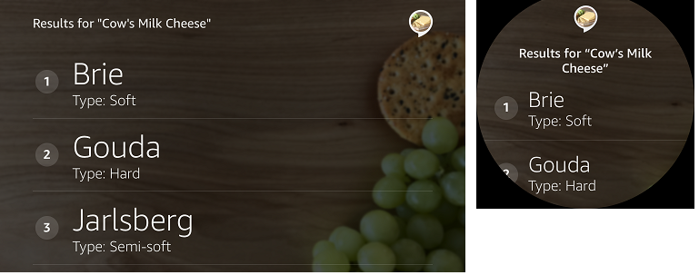
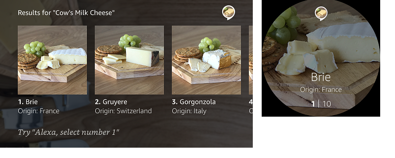
To show choices from a list, you’ll typically want to use a List Template. Note how these list templates appear on Echo Show (left) and Echo Spot (right).
-
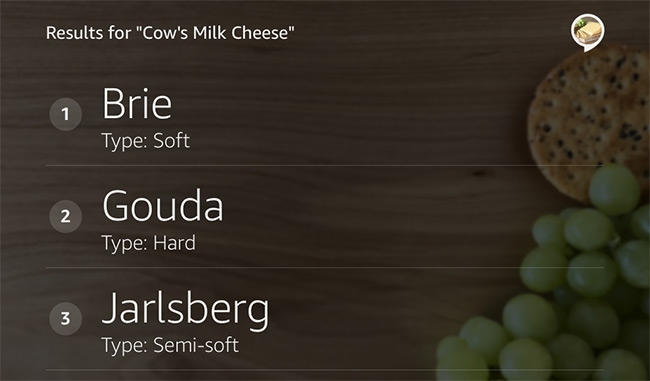
List Template 1, vertical list, on Echo Show and Echo Spot:
-
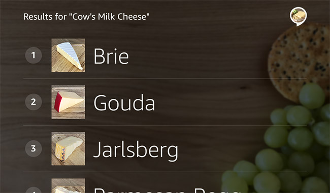
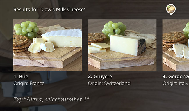
List Template 2, horizontal list, on Echo Show and Echo Spot:
Do
Quels types de fromages sont fabriqués avec du lait de vache ?
Variation 1
Voici quelques types de fromages à base de lait de vache.
Variation 2
Le Brie et le Gorgonzola sont populaires. Voici d’autres populaires aussi.
- Titles on Echo Show and Echo Spot
- In the template, make the choices clear and establish the context with a title that explains what list is being shown. Use title case, for example: “Results for ‘Cow’s Milk Cheese’”. Vary the voice response, while making sure the title on the template is precise and consistent. This helps someone who’s viewing the screen quickly understand what to expect in the list.
Use brevity, arrangement, and pacing when listing options
Lists are longer and more complex than a simple response. If you need to give between two and five options, treat each item like a simple response, and clearly set expectations for what’s about to come.
Have Alexa say something to introduce the list, for example “Here are the popular quick meals,” and have her pause briefly between items in the list. Verify that you can comfortably read each item aloud at a conversational pace with one breath.
- Brevity with lists
-
Have Alexa read the essential content in each list item; for example, always read titles, and only read secondary text if critical to the voice response. Generally, it shouldn’t take more than 20 seconds to read the first few items in the list.
-
Start with reading between two and five items, and adjust based on the following:
- How familiar the user is with the list items.
- How long and voice-friendly the item names are.
- The total number of elements read and displayed per item, for example Alexa might read the item name while displaying elements for image, ratings, and distance.
- Whether the count of items sounds like enough without sounding too long.
- Arranging items into lists
- To improve comprehension when reading a list, try to cluster items into sets of two or three. Also, don’t try to pack everything into the list items. Allow the user to tap the item to learn more.
Do
Voici des fromages que vous aimeriez peut-être. Cheddar et Gouda, ainsi que Gorgonzola, Parmesan et Brie.
Don’t
Les fromages que vous aimeriez sont le cheddar, le gouda, le Jarlsberg, le cheddar Porter, le fromage bleu de Saint-Agur, le gorgonzola, le brie, le gruyère, le cheddar fort et le parmesan reggiano.
- Pacing with lists
- Use pacing to help the listener distinguish where one list item ends and the next begins, for example:
- Specify a comma plus a 350-ms pause using SSML after each item instead of a period or question mark. This makes the final item sound more similar to other items in the list.
- Avoid adding an additional pause to list introductions that end with a period or question mark.
- For lengthy list items or those that require the user to think more deeply, consider replacing the 350-ms pause with a 400-ms pause.
- Always test the experience by listening and then adjusting until it sounds right.
- Reading lists aloud
-
When Alexa reads only a few of the possible items in a list, provide a way for the user to tell Alexa to read more.
-
When you know that your customers are interested in more than the first few items, have Alexa prompt the user with a question like “Would you like to hear more cheeses?”
-
Echo Show or Echo Spot: Have Alexa tell the user “Let me know if you’d like to hear more.” Then, wait for the user to jump in. This allows the user to take up to 30 seconds to review and tap items or ask for more information. If the user doesn’t take action within 30 seconds, the skill session ends.
Do
(Echo Show or Echo Spot only) Dites-moi si vous souhaitez en savoir plus.
Do
Voulez-vous en savoir plus sur d’autres fromages ?
- List introductions on Echo Show or Echo Spot
-
When introducing a list on the screen, it’s best to keep it simple and provide minimal information about the content and let the user peruse the list.
-
Avoid instructions like “You can say the name of the cheese or tap on the item.” Such instructions are redundant and have limited value to the user because interacting with lists is common across skills. Also, avoid stating the item count unless the count is important and changes from interaction to interaction.
-
Additionally, don’t ask a question before presenting the list. For example, asking “Which cheese do you want? Gouda, Cheddar, Brie,…” confuses the user about when to speak, and the user may try to answer the question while Alexa reads the options. Don’t use prompts that encourage the user to barge in, for example “When you hear the option you want, just say it.” Barge-ins are also discouraged because the user has to use the wake word to interrupt Alexa’s response.
- List items on Echo Show or Echo Spot
-
Usually, list items don’t need ending punctuation because the text isn’t a full sentence. However, a list of sample questions that you’re providing to the user should contain question marks. For example, a list item may contain “What happened on this day in 1918?”
- Lists on Echo Show or Echo Spot
-
To improve the user’s ability to scan the list, be selective about which information you show. With Echo Spot, the user can only see one list item at a time regardless of the list template chosen, but with Echo Show, ensure that you choose a layout that helps the user browse items quickly. For items the user might skim, consider showing more items on screen for the Echo Show by using a narrower image for each item. When the user needs to study the details of each item, for example when choosing a recipe, consider using a wider image.
-
List Template 2 with portrait images on Echo Show:
-
List Template 2 with landscape images on Echo Show:
-
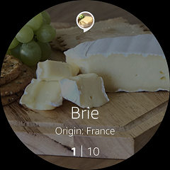
List Template 2 on Echo Spot:
- Vertical lists on Echo Show
-
On Echo Spot, all lists are shown one item at a time, so there is no distinction between vertical and horizontal lists. For Echo Show, the developer has control as to the way the list appears.
-
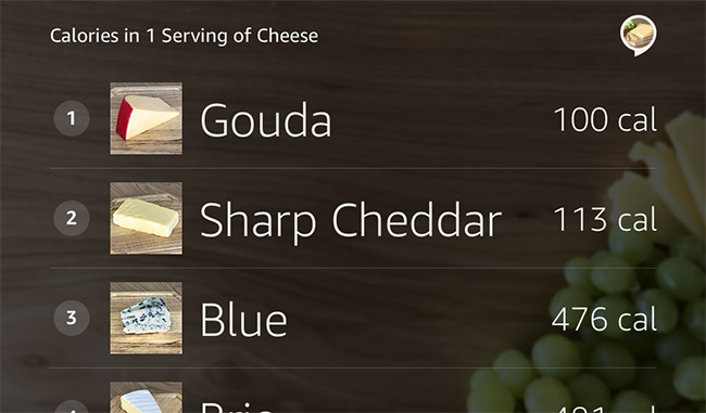
Use vertical lists for lists without images and for lists where images are not unique to the list items. Also, use vertical lists for efficiency when small images are enough for a good user experience. Vertical lists are ideal for the following types of content:
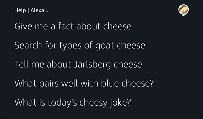
- Lists of sample utterances (phrases the user can say in your skill)
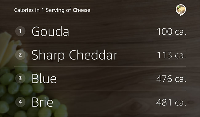
- Numeric information, for example prices or calorie counts
- Lists of stock quotes
- Bank transaction history
- Lists of food items
- Lists of contacts
- Table of contents
- Time tables
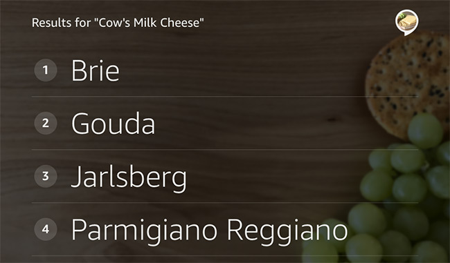
List Template 1, vertical list, Echo Show:
- Variations on vertical lists on Echo Show
-
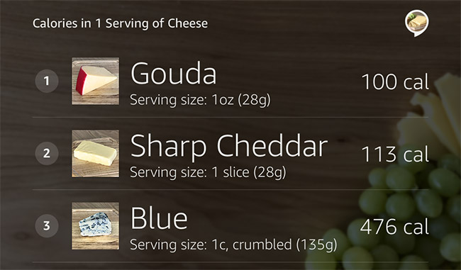
Text for a list item can wrap onto a second line. After the second line, text is truncated and does not extend to a third line. To specify text for the second line, use a line break or use the secondary text field. To place text in the far right column, use the tertiary text field.
-
List Template 1 with primary and secondary text fields:
-
List Template 1 with primary and tertiary text fields:
-
List Template 1 with primary, secondary, and tertiary text fields:
- Vertical list with thumbnail images
-
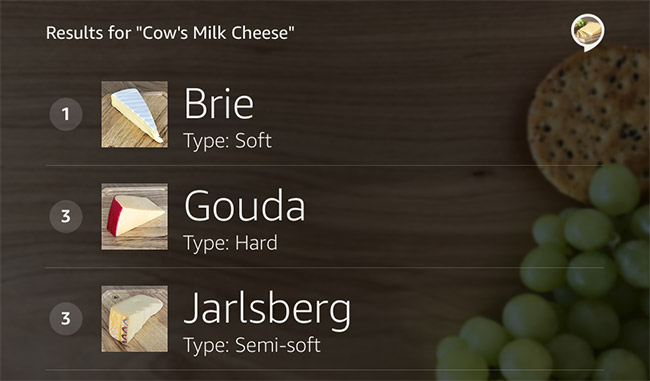
List Template 1 with thumbnail images and primary text field on Echo Show:
-
List Template 1 with thumbnail images and primary and secondary text fields:
-
List Template 1 with thumbnail images and primary and tertiary text fields on Echo Show:
-
List Template 1 with thumbnail images and primary, secondary, and tertiary text fields on Echo Show:
- Lists with unique images on Echo Show
-
Use a horizontal list when you have unique images that help users recognize or choose items from the list. A horizontal list is also great for books, albums, movies, videos, destinations, unique establishments/businesses, and products.
-
List Template 2 with square images on Echo Show:
- *Variations on image lists
-
List Template 2 can accommodate a variety of aspect ratios, and resizes your images to fit the template. The image height should be 280px and the image width should be between 192px and 498px. The template scales down images that are larger than the maximum width of 498px and the maximum height of 280px.
-
List Template 2 with portrait images, 192x280, on Echo Show:
-
List Template 2 with square images, 280x280, on Echo Show:
-
List Template 2 with wide images, 372x280, on Echo Show:
-
List Template 2 with landscape images, 498x280, on Echo Show:
Handle problems
When Alexa doesn’t hear or understand the user, use natural and gentle phrasing to help get the conversation back on track.
- Re-prompt
- When Alexa receives no answer from the user, use a re-prompt with a slight rewording. This is an opportunity to add detail in case the customer did not understand.
Do
Alexa, ouvre Planifie un Voyage.
Où aimeriez-vous aller ?
(Pas de réponse)
Je peux vous aider à planifier un voyage. Pour commencer, je vais vous poser des questions pour savoir où et quand vous souhaitez partir et ce que vous ferez une fois que vous serez là-bas. Quelle ville aimeriez-vous visiter?
- Alexa doesn’t understand
- If Alexa hears but cannot process what the user said, be upfront about it and try to get the conversation back on track. Use a straightforward request that helps the user know what he or she can do next. This will help prevent the user from feeling lost.
Do
Alexa, ouvre Planifie un Voyage.
Où aimeriez-vous aller ?
J’aimerais aller à cheval.
(Your skill’s logic detects that “cheval” is not a city you support.) Je n’ai pas compris ca. Où aimeriez-vous aller ?
- Alexa “didn’t understand” versus “didn’t hear”
- If Alexa says that she didn’t hear, the user might try to speak more loudly, which will not resolve the issue. Alexa heard the user and didn’t understand what was said.
Don’t
Je n’ai pas bien entendu. Quelle ville aimeriez-vous visiter ?
- Alexa understands but can’t help yet
- When the user asks for an unsupported function, use some form of “I can’t help you with X yet” to inform the user that the function is not available but may be in the future. To support this, you need to implement intents for planned features. You can then track when users request a feature that you do not support yet, which may also give you insight into how to prioritize features.
Do
J’aimerais louer une voiture.
Je ne peux pas encore vous aider. Cependant, je peux vous aider à planifier un voyage. Quelle ville aimeriez-vous visiter ?
- Error messages
-
While errors are uncommon, they can be a source of confusion. When possible, let the user know what the error was and avoid using technical jargon. If the error is likely to be present for only a few seconds, tell the user to try again. Otherwise, avoid encouraging the user because the user may encounter the same error. Consider a specific message like “Your smart lock isn’t responding right now.”
-
Cases not yet supported: Users can say anything in a voice interface, and it is important to gracefully handle errors and guide users back to the skill. For use cases that aren’t yet supported, say something like “The Trivia Mania challenge can’t help you with that yet.” When the user’s statement is unintelligible, say something like “Sorry, I didn’t get that.”
-
Repetition: After handling the error, prompt the user again with the most recent question that Alexa asked. Avoid telling the user you didn’t hear or didn’t understand, because this encourages users to repeat themselves more slowly or loudly instead of rewording the request.
Provide contextual help
When responding to a request for help, provide additional prompts to give more context to the immediate conversation. For example, if a user asks for help in the middle of confirming a pizza order, focus on completing the confirmation and avoid including information about selecting a topping. Design the conversation to ensure that help is not needed very often.
Do
Alexa, ouvre Viens me chercher.
Voulez-vous que je vous envoie une voiture pour venir vous chercher à la maison ou au travail ?
Comment je configure mon adresse ?
Vous changez votre adresse professionnelle ou personnelle dans l’application téléphonique Viens me chercher. (pause d’une demi-seconde) Si l’adresse est déjà définie, je peux vous aider maintenant. Aimeriez-vous une voiture pour venir vous chercher à la maison ou au travail ?
Do
Comment j’utilise cette skill ?
Viens me chercher vous envoie une voiture. Vous pouvez me demander de réserver une voiture, paramétrer mon adresse ou évaluer mon dernier conducteur. (pause d’une demi-seconde) Nous pouvons venir vous chercher à la maison ou au travail. Que souhaitez-vous ?
The Node.js SDK includes an example of setting up help handlers for different states of a skill.
- Help on Echo Show or Echo Spot
- In the help response, include information about the functionality of your skill and a few examples of phrases people can say. Then, have Alexa ask a question and listen for the user’s response, for example “The ABC skill can help you learn the English alphabet and practice the alphabet song. You can say things like, ‘What comes after W,’ or ‘I want to sing the alphabet song.’ So, how can I help you?” Use sentence case for sample utterances.
- Body Template 1 with help phrases on Echo Show:
- Hints: Echo Spot does not support hints, but some templates on Echo Show support a hint phrase at the bottom to help users quickly understand what they can do next. Populate this field wherever possible. When you ask a question and listen for the user’s response, the blue voice chrome at the bottom of the screen partially blocks the hint. Because of this, it’s best not to add hints when asking a question; only use hints when the screen is static. Ensure the hints do not contain vital information for using the skill.
Body Template 6 with hint phrase on Echo Show:
Choose the right template on Echo Show or Echo Spot
When designing your skill to appear on screen with Echo Show and Echo Spot, pick templates based on the interaction pattern you plan to use. Each template maps to a pattern or scenario for an optimal customer experience. For each intent in your skill, choose a template that matches the response and allows appropriate voice and touch actions for selection, video control, scrolling, and navigation. The key scenarios that templates help with are:
- Invocation/welcome to the skill
- Lists
- Content details
- Full-screen images
- Multi-turns (dialog with multiple turns, or questions/answers)
- Clarifications
- Help
- Navigation
- Close session/goodbye
Choose from the following seven templates. These descriptions reflect the Echo Show experience. Refer to Display Template Reference for more details about the template displays.
- List Template 1 – Vertical list with optional thumbnail images
- List Template 2 – Horizontal list with images and optional hint
- Body Template 1 – Full-width text (use Body Template 7 for best support of full-width images)
- Body Template 2 – Image right with short text on left with optional hint
- Body Template 3 – Image left with long text on right and no hint
- Body Template 6 – Multi-turn scenario with short text and optional hint
- Body Template 7 - Scalable foreground image with optional background image
- Consistent and easy-to-read content
-
Use title case for titles on templates, for example “Results for ‘Cow’s Milk Cheese’”. Also use bold, italics, and underline styling consistently across templates.
-
In general, use the default text size <font size = "7"> for body content because it is easiest to read from a few feet away. Additionally, don’t use all uppercase text for large blocks of text because it’s hard to read. Adjust font sizes to create visual hierarchy and use paragraph breaks to break up long blocks of text.
- Full-width text
-
For long blocks of text and for messages where there isn’t other content to show, use Body Template 1. The template accommodates shorter text that won’t scroll, and longer text that can scroll by touch. Use this template when you’re displaying content and don’t have an accompanying image, or when you’re presenting information without asking a question.
-
Body Template 1 with 1-2 lines of text on Echo Show and Echo Spot:
-
Body Template 1 with long text that scrolls by touch on Echo Show and Echo Spot:
- Foreground images
-
If you want to emphasize a foreground image, with an optional background image, use Body Template 7. The foreground image will scale appropriately depending on the device used.
- Voice buttons (Actions)
-
Think of actions as voice buttons that need to stand alone on their own line. Don’t embed action links in the paragraph text. Ensure that the utterance exactly matches the action link so that users can say “Watch Video” as well as click the “Watch Video” action to watch a related video. Prominently display primary actions and keep these above the fold and distinct from the body copy. Common primary actions include: Watch Trailer, Showtimes, Share, Add to List, Reserve a Table, Get a Ride, and Buy Tickets. Don’t display more than three actions per template.
-
Body Template 3 with optional actions on Echo Show and Echo Spot:
- Full-width foreground image with optional background image (Body Template 7)
-
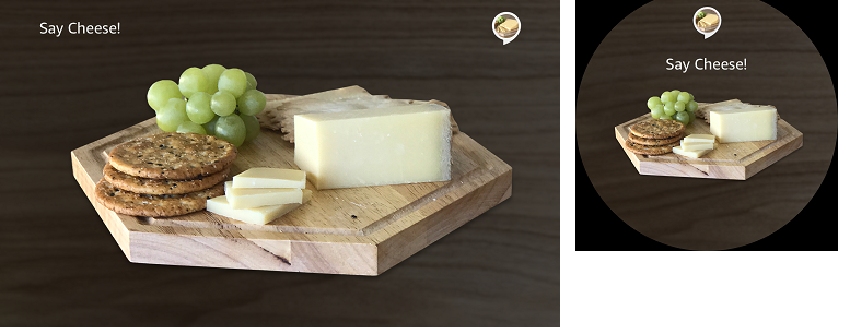
You can use Body Template 7 to display a single full-screen foreground image as seen below. Use an image that’s easy to view from seven feet away on Echo Show, and five feet on Echo Spot. If you need to provide multiple images, use one of the other templates. The background image is optional, and will be scaled to fit the device screen. These images show Body Template 7 on an Echo Show and an Echo Spot.
-
Body Template 7 with a full-width foreground image and transparent background image:
- Specific entities (Body Templates 2 & 3)
-
Use Body Templates 2 and 3 when Alexa’s response is a specific entity (person, place, or thing) or a property of an entity that a user requested directly or chose from a list. Make sure the user can easily view at least one element from a distance, ideally the title and image. Use Body Templates 2 and 3 when:
- The user requested a specific entity, for example a recipe, an account, a restaurant, a stock, or a driver profile.
- The user requested a property of a specific entity, for example the phone number of a restaurant, the balance on a specific account, or the 52-week high of a specific stock.
- The user selected an item from a list in order to learn more.
- The user’s search yields only one item.
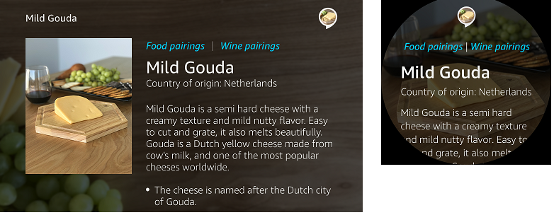
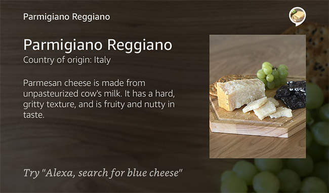
Body Template 2 with non-scrolling text and optional hint on Echo Show:
Body Template 3 with shorter text on Echo Show:
- Images on Body Templates 1, 2, and 7
-
Use images that are beautiful and add value to your skill. Match the aspect ratio and size of the slot so that the image does not appear stretched. Minimize latency by using images smaller than 100 KB. Use transparent background for images because the screen background is gray, and white backgrounds look less polished.
-
Echo Show and Echo Spot have dark and light mode, which changes the default background color automatically. When in dark mode, all-black images are difficult to view, and in light mode, all-white images are difficult to view. Add a contrasting outline to all-white or all-black images so that they are visible in either mode.
- Content priority
-
Order attributes according to their importance to the user. Common attributes include: byline, rating, price, availability (in/out of stock), category/genre, address/location(s), phone number, and hours of operation.
- Supplemental information on screen
-
Do not simply read out what is on the template. Keep the voice response conversational, natural, and brief. Use the template to provide additional detail that may not be voice friendly or as essential to hear. Make the text on the template similar, though not necessarily the same as the Text-To-Speech (TTS) output. Having the text on templates clear and succinct is the best user experience.
- Variations of Body Templates 2 and 3
-
These two detail templates can accommodate optional actions and long text on both Echo Show and Echo Spot, and hints on Echo Show. These images are for Echo Show.
-
Body Template 2 with optional actions on Echo Show:
-
Body Template 3 with long text that scrolls by touch on Echo Show:
-
Body Template 3 with optional actions and long text on Echo Show:
- Multi-turn (Body Template 6)
-
Body Template 6 is ideal for multi-turn situations, which is a conversation with multiple turns in which Alexa asks questions and the user responds with the answers. This template can be used in a variety of circumstances: welcome, navigation, clarification, and goodbye. It’s ideal for asking a question, making a clarification, or displaying search results with zero items.
-
Reminder: To let users know that it is their turn to talk, ask the user a question before listening for the user’s response. Many people interact with Alexa without looking at a device, and have no visual indication that the skill is waiting for a response. Asking the user a question follows conversational norms that let the user know when to speak. Remember that hints do not appear on Echo Spot, and should never be used as an integral part of the skill experience.
-
Body Template 6 with optional hint on Echo Show:
-
Multi-turn text: Use the default text size of <font size=“7”> for body text. Use sentence case for optimal readability. It’s best to display Alexa’s question verbatim unless there’s a hint.
-
Background images: It’s best to use an image that doesn’t have text on it already because any text added to the template will clash. In addition, text that looks good in a background image on Echo Show will not look good on Echo Spot. Be mindful of using background images that contain large areas of white or very light colors as this will diminish readability because the text on top will be white.
-
In order to decrease latency, use images that are 500KB or smaller.
- Opening the skill
-
A welcome prompt, for example “Welcome to Cat Facts,” reinforces that users are in a skill experience, and that they invoked the desired skill. It is also your first opportunity to establish your brand identity on Alexa.
-
Content display: We recommend a content-forward approach to welcoming users to your skill. In other words, immediately introduce them to content that they can engage with. For a recipe skill, a content-forward approach might be to use List Template 2 to display trending recipes. A movie ticketing skill might use the same template to show movies opening soon, or top-rated movies currently in theaters. A skill for getting to know dog breeds might open to a list of popular dog breeds or use Body Template 1 to share the Dog of the Day.
-
Introduction of skill functionality: You can use the spoken welcome message to suggest other intents so users know what is possible beyond interacting with what is currently on the screen. The more proactive your skill is at offering interactive content, the less pressure you put on the user to think of what to say. If you’re having a hard time deciding which content to lead with, consider the content that you feature in the hero spot on your website or the landing page of your app.
Do
Example message for “The Daily Cheese”
Bienvenue dans Votre fromage du jour. Vous pouvez chercher des fromages par leur consistence, les associations avec du vin ou de la bière, le type de lait utilisé ou me demander de l’aide pour découvrir plus d’options.
Example message for “Dog World”
Bienvenue dans le monde des chiens. Le chien du jour est le Fox Terrier, une petite race très joueuse. Vous pouvez chercher par race, regarder des vidéos de dressage ou me demander de l’aide pour découvrir plus d’options.
- Welcome message
-
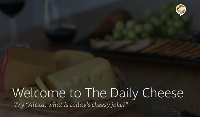
If you don’t have a verbose message to lead with, consider using an attractive background image and minimal text, for example “Welcome to The Daily Cheese” with “Try ‘Alexa, what is today’s cheesy joke?’” beneath. Echo Show and Echo Spot are voice-forward devices that also have screens, so make sure that Alexa tells users what they can do rather than making users read the screen. If people need a list of sample phrases they can say, use List Template 1, because it’s optimized for lists of phrases and supports voice scrolling.
-
Body Template 6 used as a welcome on Echo Show:
- Navigation
-
Tell the user what the skill can do, and then support a variety of natural ways the user might access the functionality. Avoid presenting multiple questions at the end of a task, for example “Do you want to hear more?” or “OK, can I help you with anything else?” Users tend to be frustrated by having to answer questions after completing a task.
- Clarification
-
Clarifications allow users to speak to Alexa naturally without having to provide all information at once, and without needing to know which information is required. If something is missing or ambiguous, Alexa asks questions to clarify. Keep in mind with clarifications that it’s best to ask the user a question immediately before listening for the user to respond. It can confuse the user if Alexa asks a question and continues to speak, because the user expects that Alexa is listening when she is in fact still speaking.
Do
Alexa, commande une voiture.
Pour quelle adresse ?
Do
Alexa, prends un rendez-vous.
Pour quelle date ?
- Body Template 6 with a clarification question on Echo Show:
-
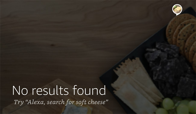
Null result: Use Body Template 6 when there are no results found. Use hints to help redirect the user to find results, but keep in mind hints are not available to users with Echo Spot or Echo devices without screens.
-
Body Template 6 showing a null result with optional hint on Echo Show:
-
Close of the skill session: A thoughtful way to end the skill is with a goodbye message and an image. This helps users understand that the experience with the skill is now over. This template and message can be used as a response for the AMAZON.CancelIntent or the AMAZON.StopIntent.
-
Body Template 6 with a goodbye message on Echo Show:
Use pre-recorded audio
Consider using pre-recorded audio when it is helpful, especially if you have access to recognizable voice talent. Try out skills like The Grand Tour and The Wayne Investigation to hear examples.
Short-form audio
Audio clips that are less than 90 seconds are considered short-form audio. Short-form audio allows the skill session to remain open, which means that the user does not have to re-invoke the skill by saying Alexa again. Use short-form audio when you expect additional interaction with the user after playing the audio clip.
- File type: .mp3
- Specification: 16000Hz w/ bitrate (48kbps)
- Length: 90 seconds maximum
See the SSML Reference to learn more about implementing short-form audio.
Long-form audio
If you have an audio-based skill like a podcast, you’ll be using long-form audio. Audio clips that are more than 90 seconds are considered long-form audio. When the audio starts playing, the skill closes. The user can control the audio by making requests without the invocation name, for example by saying “Alexa, next.” To interact with the skill again, the user would need to invoke the skill by saying “Alexa” and the invocation name. Use long-form audio when you expect the user interaction to consist of audio-control requests. Your skill can also add new audio files to the queue for continuous playback, such as with a playlist.
- File types: .acc .mp4 .mp3 .hls .pls .m3u
- Specification: Bitrates from 16kbps to 384 kbps
- Length: No limit
Learn more about implementing long-form audio in Audio Streaming in Alexa Skills and AudioPlayer Interface Reference.
Play videos on Echo Show and Echo Spot
If you have video content, you can now add it to your skill to enhance the experience on Echo Show. You can either immediately launch the video, display a list template with video offerings, or lead users to a video via an action link.
Ensure that the volume level in the video is at about the same level as Alexa’s talking voice. During video playback, the audio must remain synced with the video.
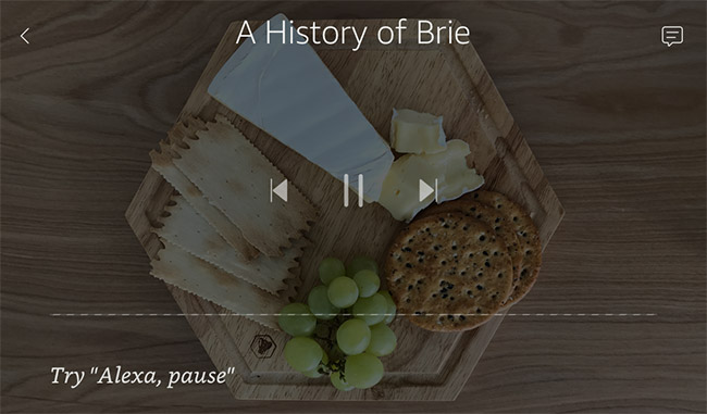
Echo Show with Video app with title of video and hint:
Echo Spot with Video app in default mode:
