Alexa Blogs

With the Echo family of devices now including devices with screens like Echo Show and Echo Spot, Alexa skill builders have to consider their graphical user interface (GUI) in addition to their voice user interface (VUI) during the voice design process. Here are some tips for designing multimodal, voice-first experiences that prove engaging across all Alexa-enabled devices.
1. Create a Voice-First Experience with Visuals
Voice needs to be the primary interaction method with Alexa, even when designing for devices with screens. Consider the display as a way to enhance your skill. Design your voice interaction first, then think about how you can enhance the conversation with visuals.
Be sure keep your VUI consistent across all devices to avoid unnecessary development work. Your customers rely on your skill to deliver an unvarying voice experience. The interaction model for your skill on a voice-only device should be the same as on a multimodal device. Create an experience that avoids display-centric commands like “touch the screen” or “click here.”
It is good practice to account for what customers might say when interacting with a display. If they are looking at an Echo Spot screen, their interaction with the voice component may be different than that of a user looking away. For example, to return to a previous response in a skill, a user might say “Back” or “Up.” If so, what should the behavior be for the latter case, if any? Plan how you want the user to interact with voice in your skill, but also how they may interact with the visual components.
2. Choose the Right Templates to Streamline Your Designs
The templates for Echo Show are consistent with Echo Spot, which makes it easy to quickly design visual experiences that will work across devices.
There are some notable differences in how you should use the templates due to the different sizes and shapes of the devices. The same fundamental principles per template still apply:
Body Template 1
Use this template to present information in long blocks of text.
Body Template 2 and 3
Use this template for presenting information on a specific entity with a lot of detail. This screen typically follows selecting an item from a list or if a user’s request yields only one item. Note: Hints can be displayed on Echo Show, but not on Echo Spot.
Body Template 6
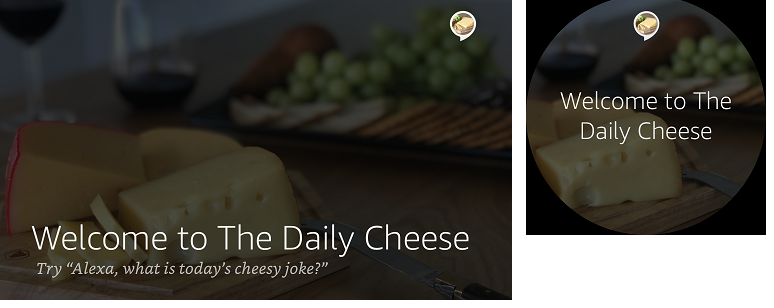
This template is used as an introductory, title, or header screen.
Body Template 7
Use this template to display a full-width foreground image.
List Templates
Your list templates can display multiple choices or items to a user. List items should be selectable via both voice and touch.
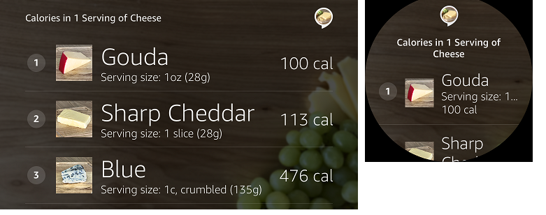
List Template 1 should be used for lists where images are not the primary content because the content will be relatively small on Echo Spot.
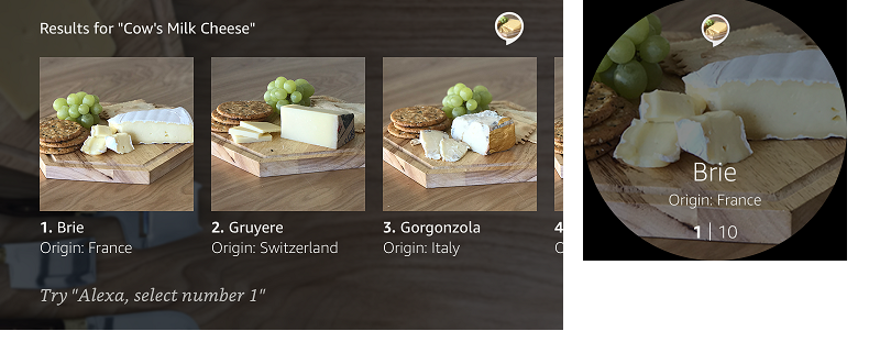
List template 2 should be used for lists where images are the primary content. Note that for Echo Spot, only one item will be visible at a time.
Finally, regardless of the templates you choose to use, remember that you are building for both Echo Show and Echo Spot. You cannot design for a specific device. The templates make multimodal development easier and faster. Design once, and the content will translate appropriately for the device.
3. Use Body Content and Graphics to Complement Voice
When designing for multimodal devices, it is important that your content is easy to consume. Consider brevity, arrangement, and pacing when you are writing your dialogue and designing your visuals.
There are some important technical design principles to consider with your visual components for both Echo Show and Echo Spot:
- Links: Do not nest action links within list items. These will be difficult to select by voice and will yield unpredictable results with touch.
- Text Aligning: Use the new text alignment attributes to selectively align important text. Avoid using line breaks to vertically align text within a TextView. Note that modifying the alignment will change it on all form factors.
- Font size: Use font size overrides sparingly. Default font sizes have been set for all templates to allow for maximum legibility at the recommended distances.
- Markup: Use markups (such as bold and underline) in meaningful ways to enhance the way your content displays on devices.
- Actions: Action links should not be underlined and need to be accessible by voice.
- Hints: Use the header text and hint directives appropriately instead of relying on the content of your background images. Note that text hints will not appear on Echo Spot, so incorporate them into your VUI as needed.
- Images: Images should be used to make for a more delightful and colorful experience. They should not be sized specifically for Echo Show or Echo Spot as that’s not scalable for larger and smaller form factors. Use images that look great on all multimodal devices.
Get Started with the Voice Design Guide
We’ve updated the Amazon Alexa Voice Design Guide with additional design practices and guidelines to help you deliver with the new capabilities using Echo Show and new Echo Spot visual templates. Visit the guide to get started.
More Resources
- Build Skills for Echo Show and Echo Spot
- Learn More About Echo Spot
- Best Practices for Designing Skills with a Screen
- Display Interface Reference
Build Engaging Skills, Earn Money with Alexa Developer Rewards
Every month, developers can earn money for eligible skills that drive some of the highest customer engagement. Developers can increase their level of skill engagement and potentially earn more by improving their skill, building more skills, and making their skills available in in the US, UK and Germany. Learn more about our rewards program and start building today.
Special thanks to Jaime Radwan for co-authoring this post!


