Alexa Blogs

Editor’s Note: Using the new Alexa Presentation Language (APL), you can deliver richer, more engaging voice-first interactions to your customers across tens of millions of Alexa-enabled devices with screens. Today we welcome a community expert—Adva Levin, Alexa Champion, founder of Pretzel Labs, and winner of the Alexa Skills Challenge: Kids—to offer some best practices for building multimodal skills. She shares how she redesigned her Kids Court skill into a multimodal experience.
APL lets developers and designers create flexible designs for multimodal devices that include voice and display. Since voice-first multimodal devices are so new, for many people multimodal design can be a first-time experience both as a user and as a designer. The Alexa team has been putting together best practices for designing multimodal skills, and you can get inspired by some APL skills here.
As a designer approaching a relatively new medium, it’s also interesting to look at other mediums for inspiration. My favorite example is of a waiter taking an order at a restaurant. If you observe that situation closely, you can see how the diners’ attention naturally shifts from looking at the menu to listening to what the waiter says, briefly glancing at the menu, and vice versa. Things get even more interesting when the waiter starts talking about specials that are off the menu!
This attention shift happens naturally in a person-to-person conversation. When you design the visual and voice components of your Alexa skill, mirror this interaction. It’s up to you as a skill builder to guide the customer through a good user experience that navigates the conversation so your skill can help them achieve their goals.
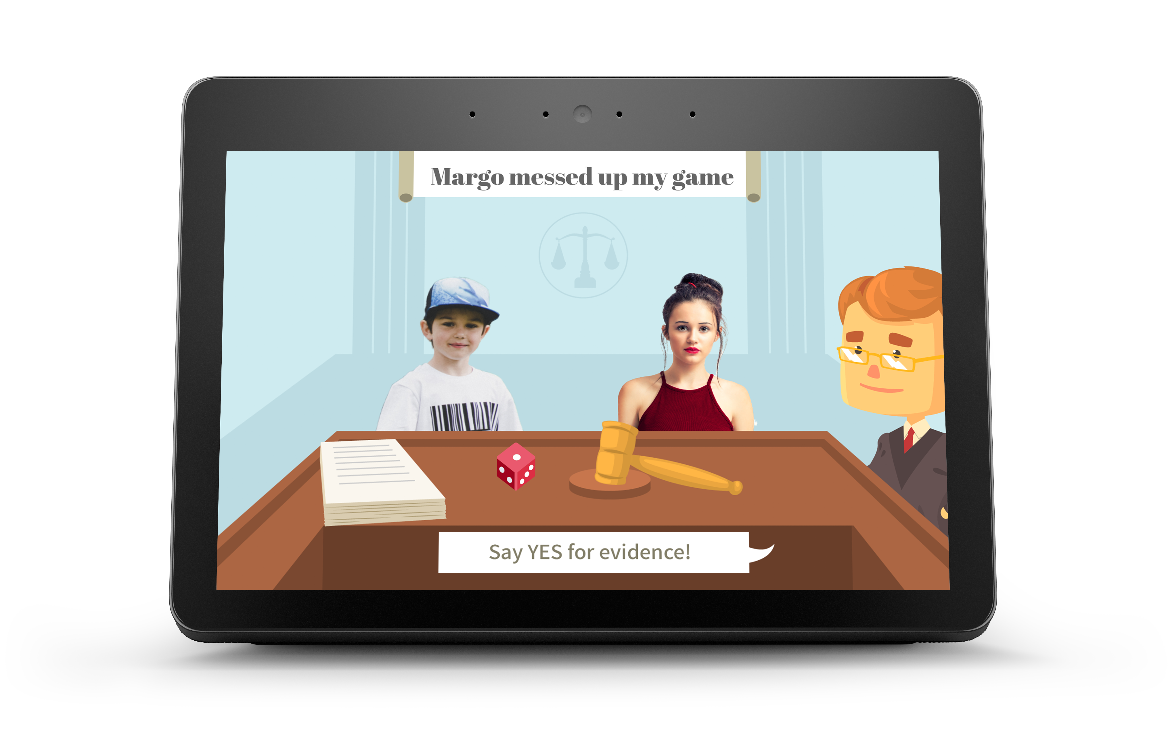
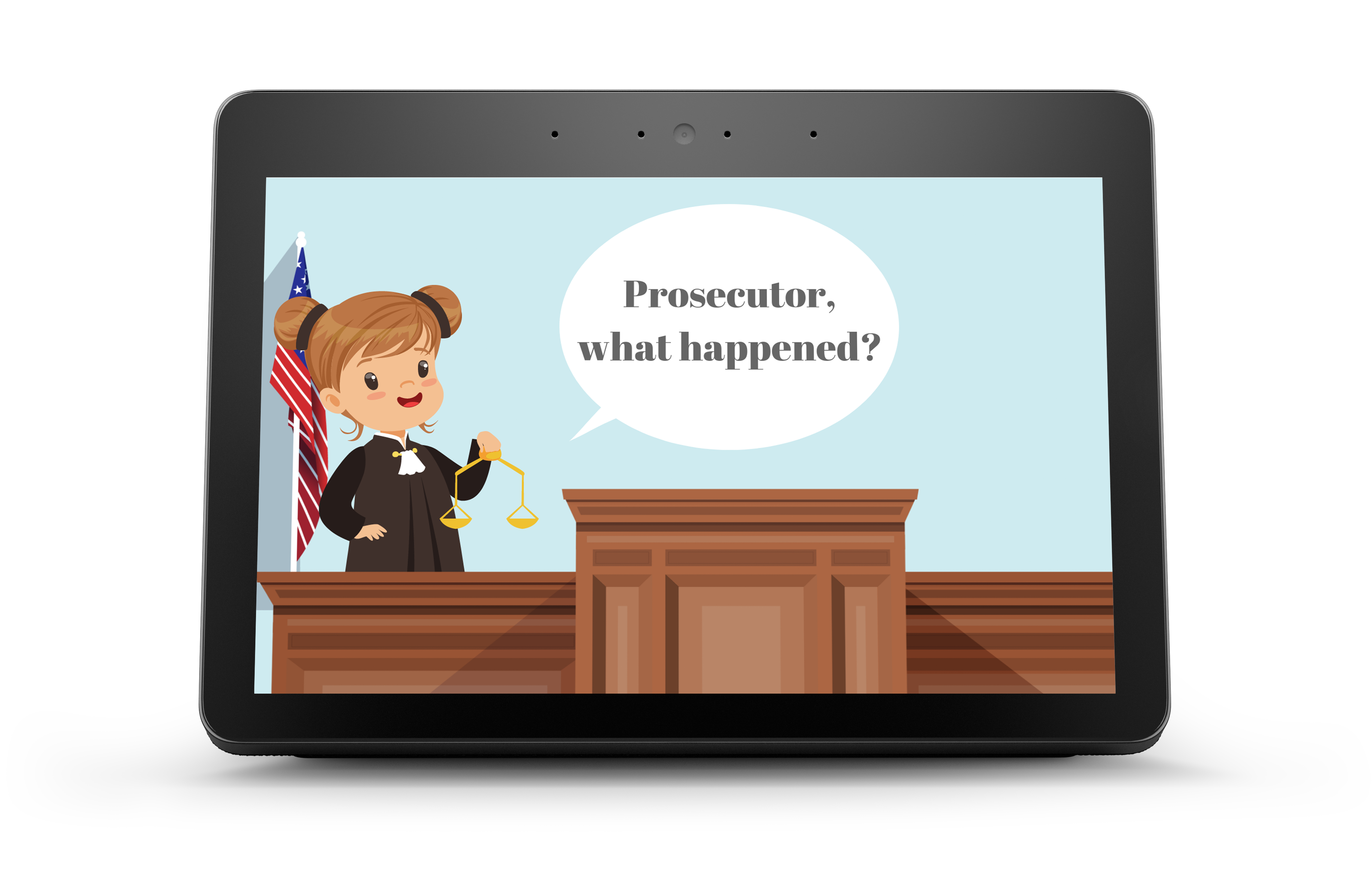
When redesigning Kids Court as a multimodal skill, I wanted the visuals to draw the users into the humorous world of a skill where Alexa is the judge in their fights. However, it was also important to keep the users (who are mostly kids and their parents) focused on the conversation and not get them too distracted by visuals. I went with a calm, illustrated graphic language that shows what happens at the court, and a combination of animated and real characters to show that the court deals with situations from real life. I used speech bubbles to help the users concentrate on what they are supposed to say to carry the conversation forward.
 Here are some best practices I picked up while designing a voice-first, visual experience for Kids Court.
1. Picking the Right Balance
What is the right balance between audio and visuals for your skill? Here are some examples and considerations:
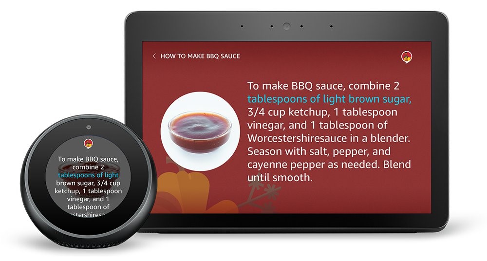
Using subtitles, or SpeakItem Command: Think of this like a TV show that has captions. This concept keeps the experience consistent between voice-only devices and multimodal ones. It is best used for wordy skills, or skills where it’s critical that the user understands every single word Alexa is saying. For example, try to ask Alexa to look something up on Wikipedia.

Enhancing the conversation with visuals: Professional conference speakers rarely use heavily worded slides, but the images are there to enhance, support, and help focus the audience on what the speakers are saying. This example works best for most skills. I recommend watching a few TED talks to see how the speakers strike a balance between speaking and showing their slides. For example, in Kids Court, the written text is a shortened version of what Alexa says. The speech bubble helps users understand what to say at key interactions, and the graphic layer around it contributes to a more lively overall experience.
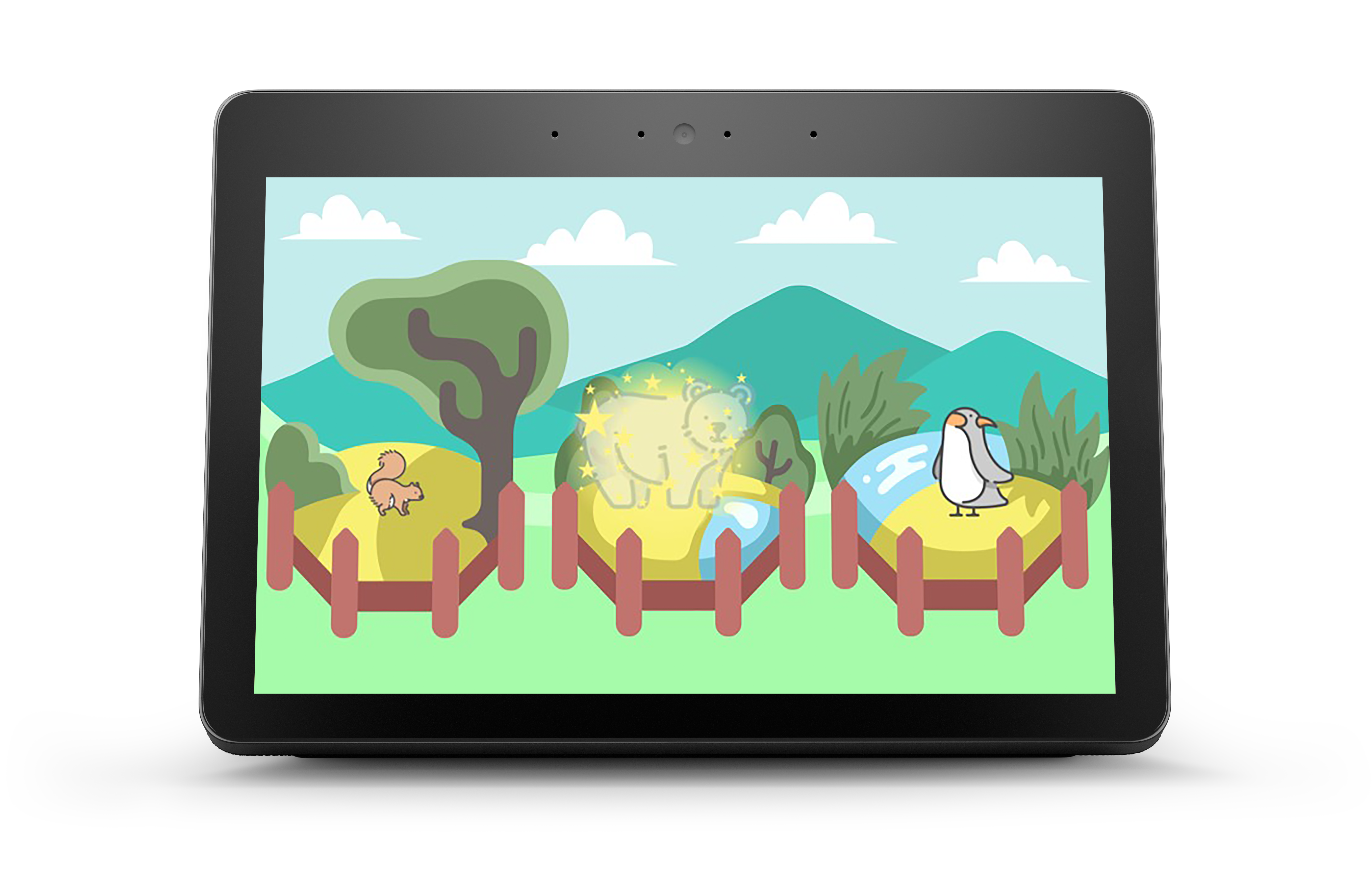
 Using voice-supported visuals: An example for this is a TV show that has beautiful imagery that is accompanied by a voice over, like a nature show with voice-over narration. This can be tricky, as you still need to provide a good experience for voice-only users, but it’s a good source of inspiration for use cases that rely heavily on visuals. For example: The Magical Zoo skill draws users in by using beautiful illustrations and sound effects. There is no text on the screen, and Alexa gives verbal cues hinting which animal to transform next.

2. Designing for Different Devices
Using APL, you can design and build voice-first, visual experience that are optimized for different device types, delivering a quality customer experience. As you design your experience, consider the functionality of the device. Is the screen used for display only, or should the user be able to use touch buttons in addition to using voice commands? As you think about adapting your concept to different device sizes, consider the environment and the customer’s context.
For example, the communal experience in the living room on a Fire TV is completely different than a quick glance at your Echo Spot in the bedroom. Adapting to different screen sizes doesn’t only mean creating different sizes of images, but may also require different concepts for different devices. What elements and information is it key for you to show on the smaller devices? Here are some more tips for designing voice-first experiences for different Alexa-enabled devices.
3. Storyboarding
Create a detailed storyboard, breaking down your skill into interaction points. Write down what Alexa says in each point, and mark the key interaction points where visuals can support and enrich the experience.
Sync the images with the audio by using the pager component. At every beat, think where you want your users’ attention - listening or looking - and design your speech, sounds, and images accordingly. For specific parts of the skill where you have longer pieces of audio and want a carefully tailored experience, you can use videos.
If you’re using text in your visuals it can be helpful to shorten the visual text, but be careful not to confuse your user with different calls to action.
4. Creating Your Graphics
Now that you have a sketch of the exact screens you need, you can start designing your visuals. Keep your skill’s style in mind, including persona, voice, and tone of your skill. Your visual language should be in line with the personality, speech, and sound design to create a harmonious experience.
You can explore graphic design tools, like Photoshop and Pixelmator, or online tools like Canva, Pixlr or Crello for backgrounds. Another option is to work with a graphic designer who can help you bring your vision to life.
Related Content
- See What Others Have Built with APL
- How to Design with the Alexa Presentation Language Components to Create New Voice-First Experiences in Your Alexa Skill
- 10 Tips for Designing Alexa Skills with Visual Responses
- 4 Tips for Designing Voice-First Alexa Skills for Different Alexa-Enabled Devices
- How to Design Visual Components for Voice-First Alexa Skills
- How to Quickly Update Your Existing Multimodal Alexa Skills with the Alexa Presentation Language
- New Alexa Skill Sample: Learn Multimodal Skill Design with Space Explorer
- New Alexa Skill Sample: Learn Multimodal Skill Design with Sauce Boss
