Alexa Blogs

Designing the visual response output for your skill with the Alexa Presentation Language (APL) can be an exciting experience, especially if you're new to the world of voice-first design. If you've been following this series, I've been sharing some tips and tricks of the trade to help developers and designers extend their ideas and enhance the overall customer experience by adding rich visuals to multimodal Alexa skills.
With some of the basics covered in previous posts, it's now time to dive deeper into what's possible with APL from a design perspective. I'll also cover the kinds of unique opportunities APL gives you to be innovative with the visual output for your skill.
If you're not already familiar with APL, and its terminology, let's do a quick refresher. APL components are reusable, self-contained artifacts used to display visual elements on the screen such as text, images, and sequences of data (like lists). You can embed components within other components, or inside of layouts and patterns to create rich, robust, multimodal interactions that can not only be tailored for your skill's experience, but also to the device the customer is using it on. Confused? Let's break it down a little more. Think of APL components as individual building blocks that you can stack and combine in any way you can imagine to build that perfect rocket. Or in this case, a complimentary visual output for your skill's voice-forward response.
Anyone who has built something out of building blocks knows the possibilities are endless. You can build your rocket exactly like the kit's included instructions show, or you stretch your imagination and use the different colored and sized blocks to build your own customized version of the rocket. Maybe you don't even build a rocket at all and instead use those same bricks to build a car. The same can be said for APL. Developers and designers alike can now arrange and combine APL components in any way they desire to customize and tailor a visual output to match their personal brands, supplement customer needs, and extend and enhance the overall intended experience.
To help jump-start your imagination with these building blocks, let's take a look at three APL components and how you can use them in different ways to design new experiences for your skill.
Pager
First up, pager. The pager component displays a series of items like a carousel, which automatically advance based on the timing set by the developer. Elements displayed by the pager do not need to exactly match with the text to speech (TTS) that Alexa is reading, but should add context for the customer. Pager is also good for content that you'd like to automatically paginate for the customer, limiting the need for them to scroll by either voice or touch, which could potentially disrupt their flow.
 Use cases for the pager component can include:
- Flipping through a carousel of images to create a photo gallery or image viewer.
- Stitching together different visual responses to form a step-by-step or how-to instructions.
- Transitioning a customer to the next part of the experience without requiring their interaction.
- Creating a progressive reveal, like showing a joke and then the answer as not to reveal the punchline before Alexa says it.
- Including separate but extra, or supplemental, information for the response to preemptively predict the customer's next need. For example, displaying additional meta data related to a store's location beyond just the address.
The pager component can be used to combine as many items as you'd like, but we recommend no more than 6 or 7 in order to avoid overwhelming your customer. Also consider limiting the length of the TTS paired to each item to around 10 seconds each, unless your use case requires longer. This will help retain the customer's attention and prevent boredom.
Read about more best practices for the pager component here.
Speech Synchronization
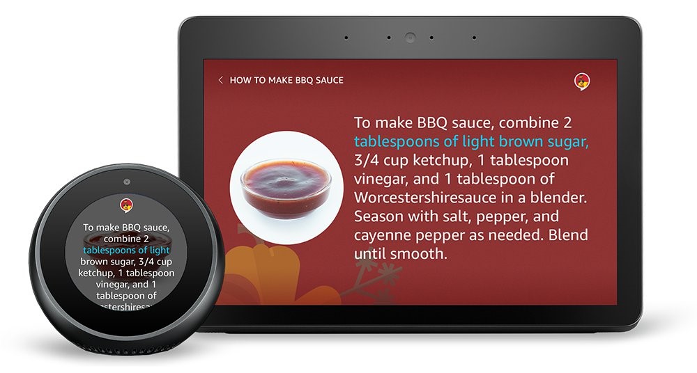
The speech synchronization is a styled state that can be a great visual aid for customers, helping them to follow along and maintain context even if they are multitasking. Similar to karaoke, a concept many of us are familiar with, this is typically applied to a text component and used to synchronize highlighting with Alexa's voice response.
 Use cases for the speech synchronization can include:
- Creating a line-by-line read along experience for a story or narrative.
- Highlighting each item in a list as it's read aloud so the customer can create an association with each result.
- Helping a customer follow along with step-by-step instructions or directions.
- Using speech synchronization on individual text components, broken down per letter, to create a visual spelling aid.
- Providing a one-to-one text output of Alexa's response when there are no appropriate visuals to show.
When using speech synchronization in your skill for text-based examples, we recommend matching the text output to exactly what Alexa is reading. You should also minimize the use of other elements on the screen to keep the customer's attention focused on what is being presented to them.
Read about more best practices for the speech synchronization here.
TouchWrapper
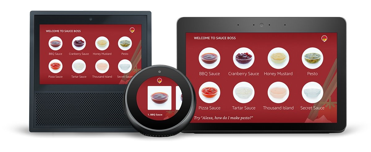
TouchWrappers are a great way to add touch or selection interactivity (if using a 5-way remote) to a skill's visual response. They create touch targets, and enable a single touch gesture on any component they are added to, like an image or text component. Similar to a hyperlink on a webpage, when a customer interacts with a component wrapped in a TouchWrapper, you can trigger the event you specify to advance them to the next step of their interaction with your skill.
 Use cases for the TouchWrapper component can include:
- Using images to replace text selection in a game, like choosing between an apple or an orange based on a clue.
- Creating graphical buttons or icons to match your personal brand.
- Adding touch or remote selection to list items returned as a result of a search.
- Enabling a graphic toggle to show or hide an element of the response, like additional images or text.
- Establishing a navigation pattern through text-based links for features or content related to the response.
With TouchWrappers though, it is important to keep in mind that all Alexa-enabled screen devices still need to remain voice-forward. Customers should never been required to touch the screen to continue their interaction. So for each TouchWrapper you have in your response, be sure to include the ability to select that same item by voice.
Read about more best practices for TouchWrappers here.
We encourage you to use these, and other APL components, in unique and innovative ways to create fun and engaging skill experiences for your customers. Don't be afraid to use your imagination, experiment, and push boundaries; your customers will thank you for it. We can't wait to see what you build!
Related Content
Use the resources below to learn more about APL, and how to design multimodal skills for Alexa.
- Alexa Design Guide: Components
- Alexa Design Guide: Layouts
- See What Others Have Built with APL
- 10 Tips for Designing Alexa Skills with Visual Responses
- 4 Tips for Designing Voice-First Alexa Skills for Different Alexa-Enabled Devices
- How to Design Visual Components for Voice-First Alexa Skills
- How to Quickly Update Your Existing Multimodal Alexa Skills with the Alexa Presentation Language
- New Alexa Skill Sample: Learn Multimodal Skill Design with Space Explorer
- Alexa Skill Teardown: Building the Interaction Model for the Space Explorer Skill
- Using AWS Lambda to Bring the Space Explorer Sample Skill to Life
