Alexa Blogs
Visuals play a very important part of our daily lives, whether we are are conscious of it or not. Every day we pick up on visual queues from our surroundings–the environment, coworkers, friends, and families–that help us navigate through the world. Maybe it's the flashing of a “Don't Walk” sign to warn us of oncoming traffic, or the look on a family member's face after a long day that indicates they need a little extra attention. Regardless of the context or situation, we use these visuals and visual queues to guide and enhance our daily experiences.
Similarly, in the world of Alexa skills, we can enhance voice-first experiences using imagery, typography, and text within a skill to provide these types of visual queues to customers and help them navigate through a skill experience on devices with screens. And when developers add visual and touch interactions to a skill, it enables Alexa to provide a richer, more engaging voice-first experience. By combining voice with complementary visuals, you can deepen connection and engagement between your skill and target audience.
To achieve this, follow these best practices for using imagery and text within your multimodal skill.
Using Imagery in Your Alexa Skills

When adding images and other visual elements, like backgrounds and icons, ask yourself the following:
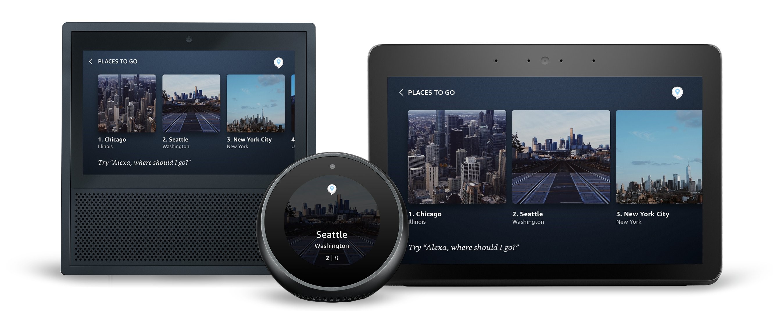
Does this image compliment the voice response and add additional clarity or context for the customer? An image is worth a thousand words, and contextually relevant images are a great way to bring visuals to your skill while providing information that may be overwhelming to hear by voice. Use images thoughtfully to enhance your voice response by adding complementary metadata and queues for customers as they take the journey through the experience. Just make sure the images you show the customer in your visual response are in harmony with what Alexa is saying, and with the customer's current request.
Can a customer differentiate this image from others offered in the same visual response? Long lists of titles or similar-looking search results can lead to high cognitive load or additional friction for customers. Displaying differentiating images for each item in a search result will help simplify the customer's choices and allow them to easily scan and select the item they are looking for.
Do the background images enrich the visual experience without interfering with, or distracting from, the primary content layered on top? Layering text over images in the background of your layout is an easy way to provide texture to the content shown on the screen. But resist the urge to overly complicate your visual responses. Also make sure to apply a colored opacity layer, or scrim, over your image to help with the legibility and accessibility of the foreground text.
Is the imagery device specific? Using the Alexa Presentation Language (APL) and conditional logic, it's possible to send different variations of your experience to different devices, meaning you can now tailor your imagery per device. This could include sending appropriate image resolutions, or even different background art that scales correctly according to the Viewport Property of the device. Remember, if an image is large, it may be slow to load, or may not load entirely on the screen leading to a broken experience for your customer.
Learn more about images and imagery in the Alexa Design Guide.
Using Text in Your Alexa Skills

When adding text and applying styling to the text in your multimodal responses, consider the following:
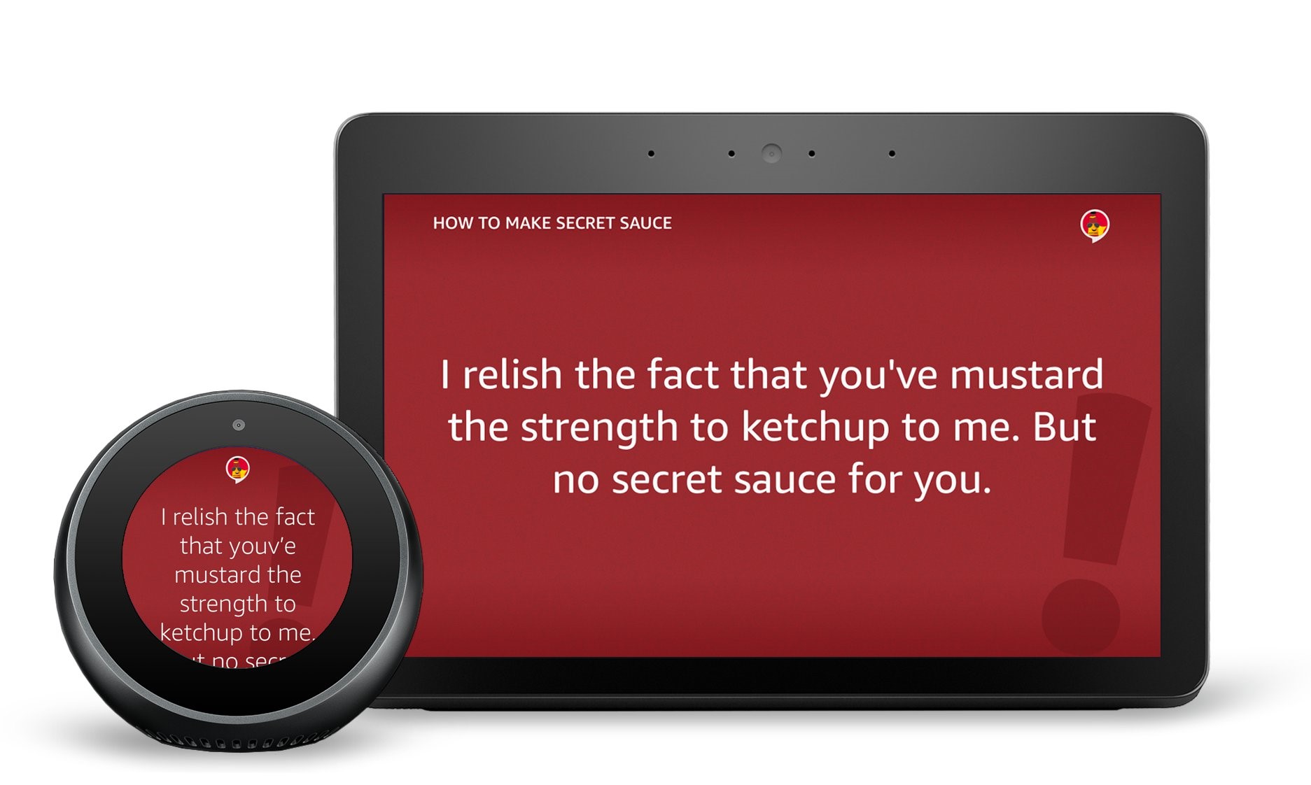
Is the text it legible at different distances? Text size is critical to the readability and accessibility of your visual experience. Because a customer may not always be near a device, we recommend using type sizes that are larger than what you may be accustomed to. This will ensure that if a customer is far from their device, they still can quickly read the content being shown on screen.
Has the the text been styled appropriately to add visual and information hierarchy? By taking advantage of a combination of font sizes, weights and markup tags (such as italics, strong, underline, etc.), developers can create visual and information hierarchy within their responses. This level of detail will help customers to identify important information at a glance and decipher the difference between that information. They will be able to read it better, and have overall better recognition and comprehension of what they read. To make typography easier for developers, APL offers a variety of type scales to help.
Are the line lengths of your text responses appropriate for the device and for your content? The right line length can decrease eye fatigue and increase a customer's comprehension or reading of the text being presented by Alexa on their screen. When addressed successfully, line length can also drastically change the look and feel of each response, creating a higher level of visual polish for the skill. For text within your multimodal skill, we recommend a maximum line length of 40 characters for shorter text, such as headlines or titles, and 60 characters for longer form text, such as body copy.
Have hints been used for visual and contextual help? Styling text as hints is the ideal way to provide additional contextual help to customers. Hints are a great way to not only help customers identify and learn what to say as they interact with your skill, but they can also be used to help customers discover new functionality. Remember, whenever possible, hints should be contextually relevant and the hint style should be used exclusively for showing a customer what they can say to invoke Alexa as they use your skill.
Learn more about text and typography in the Alexa Design Guide.
Last Chance to Enter the Alexa Skills Challenge: Multimodal
In addition to building a visually rich Alexa skill with APL, you can enter the Alexa Skills Challenge: Multimodal with Devpost and compete for cash prizes and Amazon devices. We invite you to participate and build voice-first multimodal experiences that customers can enjoy across tens of millions of Alexa devices with screens. Learn more, start building APL skills, and enter the challenge by January 22.
Related Content
- Alexa Design Guide: Visual Experiences
- Alexa Design Guide: Presentation
- New Alexa Skill Sample: Learn Multimodal Skill Design with Space Explorer
- Alexa Skill Teardown: Building the Interaction Model for the Space Explorer Skill
- How to Quickly Update Your Existing Multimodal Alexa Skills with the Alexa Presentation Language
