Alexa Blogs
With the Alexa Presentation Language (APL) you can build interactive, multimodal Alexa skills with more customization than ever before. APL is a JSON-based markup language influenced by front-end technologies and native development practices. It lets you completely control your layouts and presentation, with the flexibility to scale across multiple devices or create a custom layout that highlights the strengths of a specific class of device.
Some of the key ingredients of APL include:
- Components: Building blocks, including containers, text, and images
- Layouts: Composed components with their own properties that can be reused across multiple screens
- Packages: Importable files containing styles, resources, and layouts
- Viewport Characteristics: Information about the device passed directly to APL
- Conditional Clauses: Using properties and/or characteristics to determine the state of a component or layout
We’ve built several new Alexa skill samples to help you get started using APL and gain some first-hand multimodal skill-building experience. In this post, we do a deep dive on one of the samples called Space Explorer. We’ll walk you through the sample and some best practices for building voice-first visual experiences.
Why We Created the Space Explorer Sample Skill
Images of space are visually engaging. Vast expanses of black punctuated by bright planets and gorgeous star clusters makes for some truly striking visuals. It was easy to envision a skill that would benefit from having a screen. But beyond that, NASA has done an amazing job of aggregating those visuals and releasing them to the public domain.
We always recommend that developers lead with voice when designing an Alexa skill. For Space Explorer, though, we wanted to create a skill that indexes heavily on delivering beautiful visuals and clear interaction patterns, but still complements the voice experience and avoids anti-patterns like requiring touch for navigation.
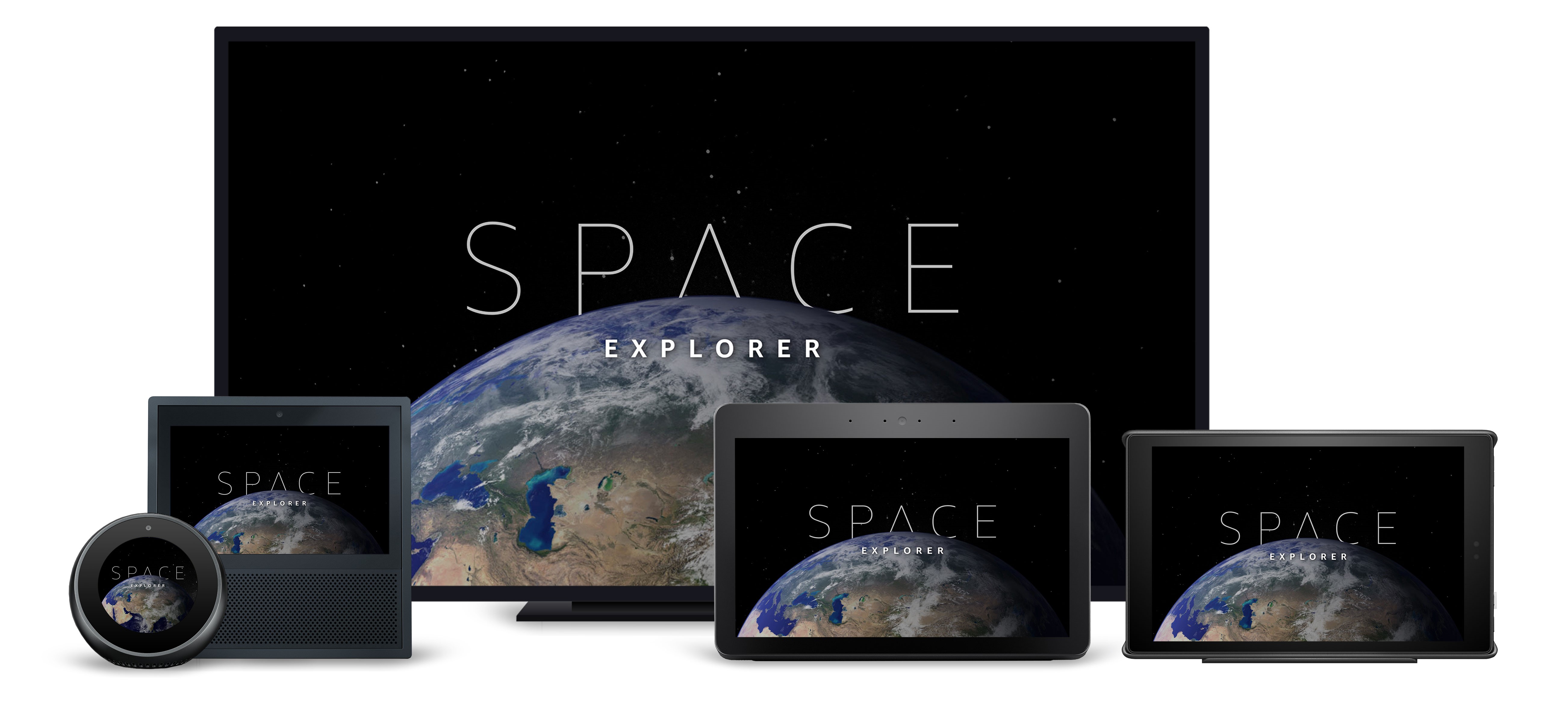
Creating a Voice-Forward Experience with Space Explorer
Multimodal design is a fast-growing discipline within Amazon. Since the original Echo Show was in development we've spent countless hours creating a system of design for this new class of devices. For Space Explorer, we looked at the list of tenets that have been created and cherry-picked a few that had special relevance for our purpose. When designing Space Explorer, we kept all of our voice design tenets in mind, primarily:
- Be Voice-Forward, but Not Voice-Only: Anything a customer can touch should have a voice counterpart. However, everything said in voice does not need a touch input. What Alexa says should be relevant to what it shows and vice versa. Customers will likely alternate between looking at a device and looking away throughout the experience. Be sure the voice flow and screen flow are comprehensive on their own and complimentary together. Screens should provide additional context when Alexa is speaking.
- Honor User Modality: If a customer speaks to Alexa, then Alexa should respond with voice. If a customer touches the screen, then Alexa should not respond with voice.
- Emphasize Patterns & Consistency: Adherence to common patterns will reduce cognitive overhead for customers.
Designing the Voice Interaction for Space Explorer
Screens give Alexa a new medium to deliver information, provide context, and enhance the voice experience. As with any other voice-driven experience, we started with a script to explore the many ways a customer could interact with Space Explorer.
Customer: Alexa, open Space.
Alexa: Welcome to the solar system. What would you like to explore?
[The screen shows the Solar System with touchable planets and large celestial bodies, like comets and asteroids.]
Customer: Let's go to Saturn.
Alexa: Approaching Saturn, the sixth planet from the sun. What would you like to learn?
Customer: Tell me about the rings.
Alexa: The rings of Saturn are the most extensive ring system of any planet in the Solar System. They consist of countless small particles, ranging from micrometers to meters in size, that orbit about Saturn. The ring particles are made almost entirely of water ice, with a trace component of rocky material. There is still no consensus as to their mechanism of formation; some features of the rings suggest a relatively recent origin, but theoretical models indicate they are likely to have formed early in the Solar System's history.
Customer: Alexa, what is Saturn made of?
Alexa: Standard planetary models suggest that the interior of Saturn is similar to that of Jupiter, having a small rocky core surrounded by hydrogen and helium with trace amounts of various volatiles. This core is similar in composition to the Earth, but more dense.
[The screen shows a split screen image and text.]
Early design exercises focused on creating a voice interaction model that felt natural. We wanted customers to go on an adventure, so we started with flows that took you to different places within the solar system. That meant context would be important, as well.
Imagine you’re flying to Mars. When you step off the shuttle, you'll probably say something like, “Wow. What's in the atmosphere?” not “Wow. What's in Mars' atmosphere?” You might follow it up by asking about another planet's atmosphere, though, so it was important to maintain that ability to dive straight into other content without the preamble of traveling there, first.
One of the strengths of voice interactions is the ability to completely bypass navigational necessities present in traditional interfaces. So we designed the voice interaction model to allow customers to travel anywhere in the solar sytem and ask contextual questions about their location as well as completely non-contextual information about any other location.
Conversely, one downside of voice interactions is the lack of way-finding tools. Once you get to a location, the customer needs to either be told what they can say, or the developer needs to handle all potential scenarios. The former can be tedious and long and the latter is almost impossible. That's where having a screen becomes a huge advantage.
Designing the Visuals for Space Explorer
Once we had an idea of how the user would navigate through the skill, it was time to figure out how to bring that to life, visually. The first step was to consider what data we were trying to present. Because the screen should be viewed as a companion to the voice experience, we needed it to complement the audio, not mimic it. Just like in a presentation, it wasn't about having Alexa just speak out what you see on the screen.
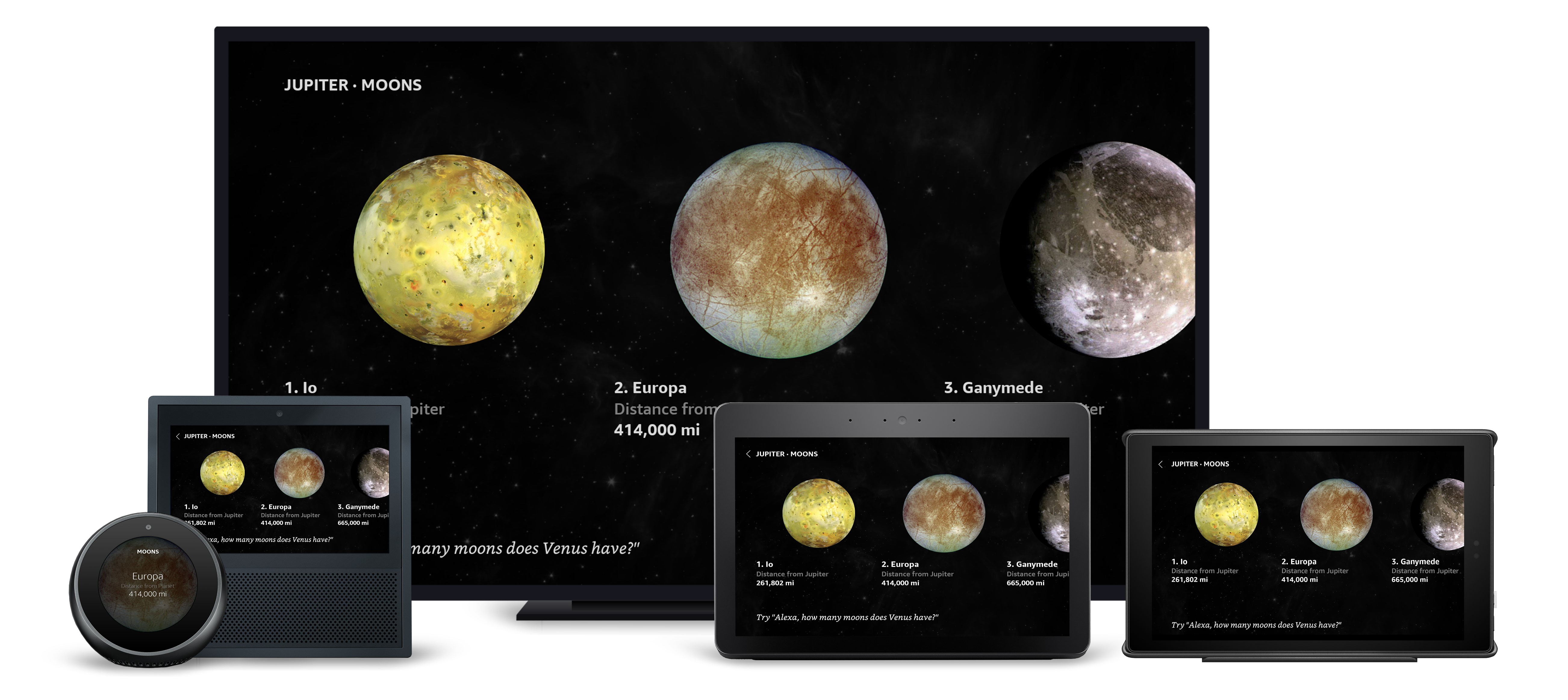
If the data was visual, it should be shown. A great pattern for presenting multiple visual data points is the horizontal list, such as in the inner and outer solar system and the list of notable moons.
 If the data was driven by numbers, we considered how that data could be represented in graphs or other formats to make the numbers compelling. Distance, for example, shows the expanse of our galaxy without displaying a table of numbers.
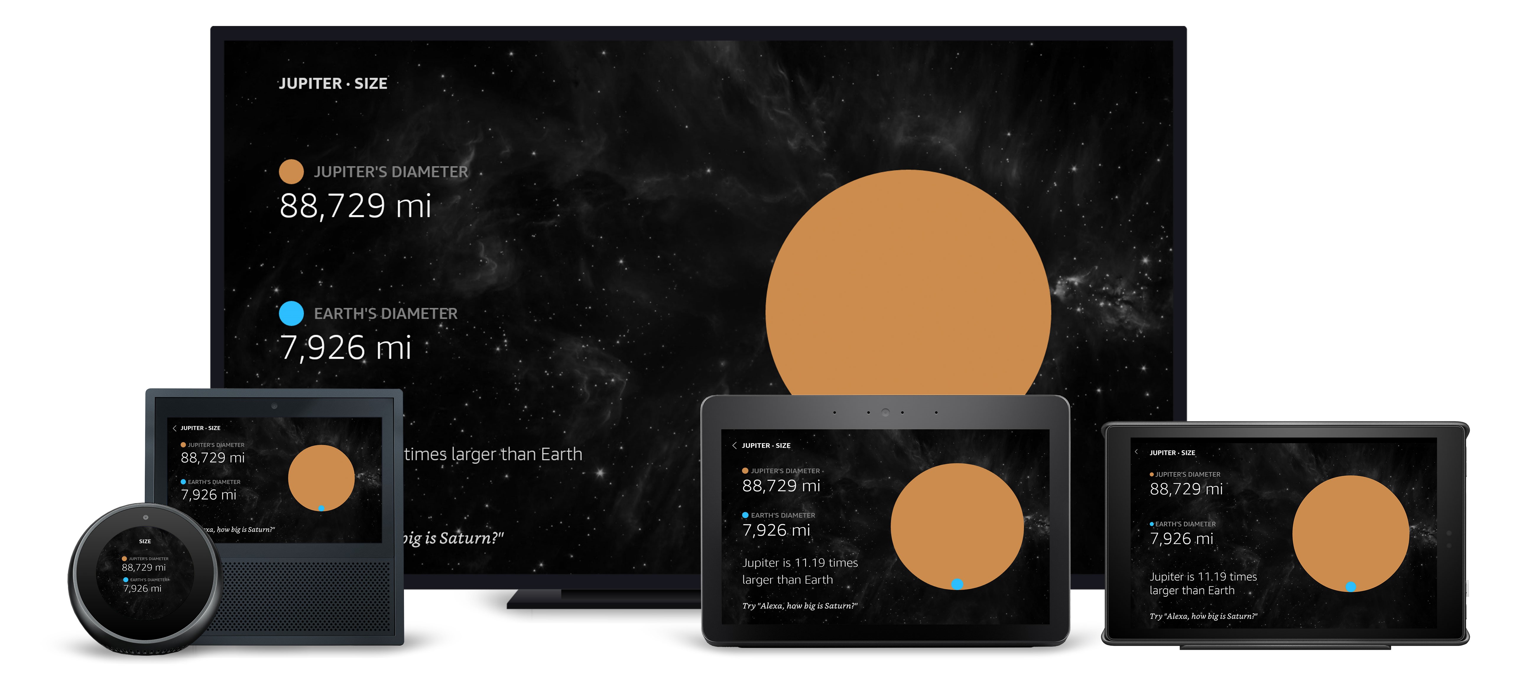
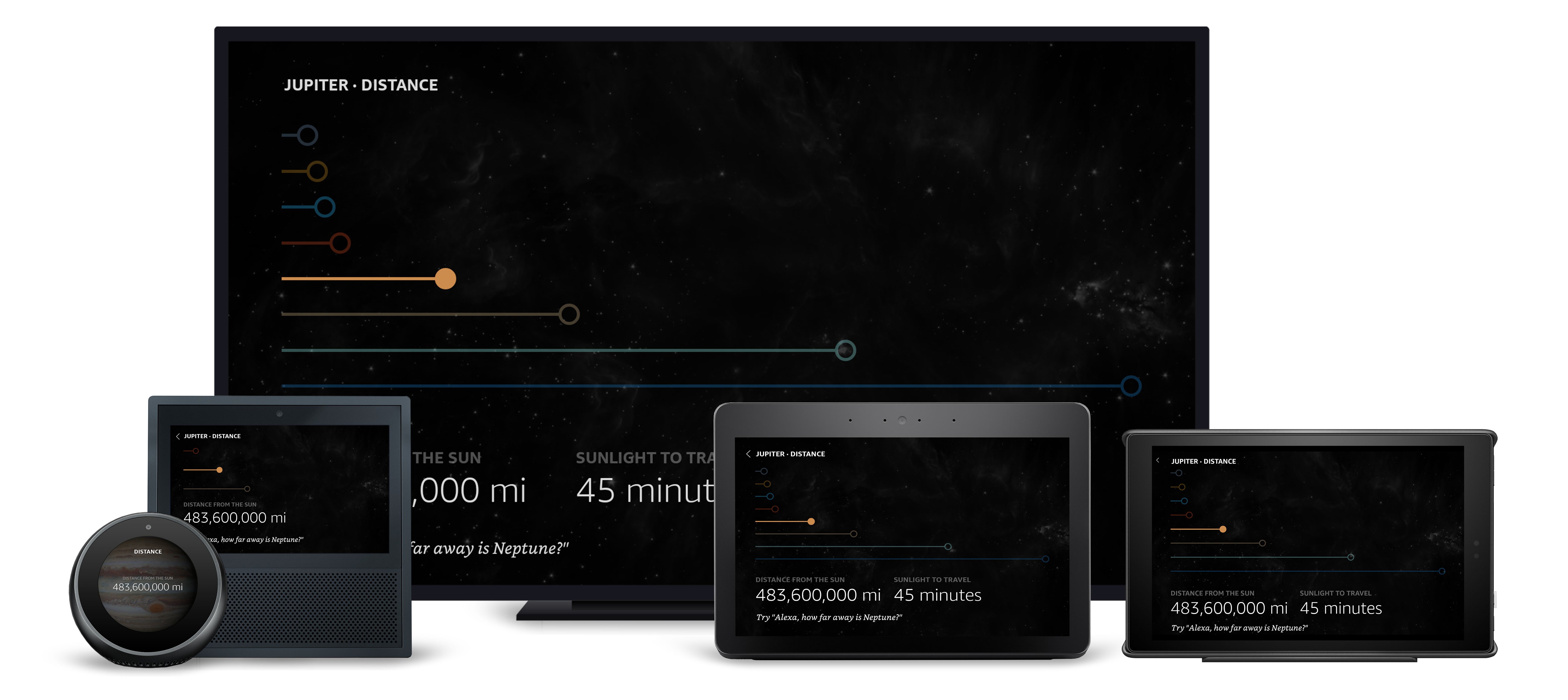 It was also important to use the visuals to enhance the user's understanding of the data. In the above screens, we provide some context to help ground the massive distances by showing that data relative to the other planets, as well as presenting additional information about the time it takes sunlight to reach that distance. We used similar thinking to create the size views.
 The composition of the atmosphere was specifically designed to map to the periodic table of elements.
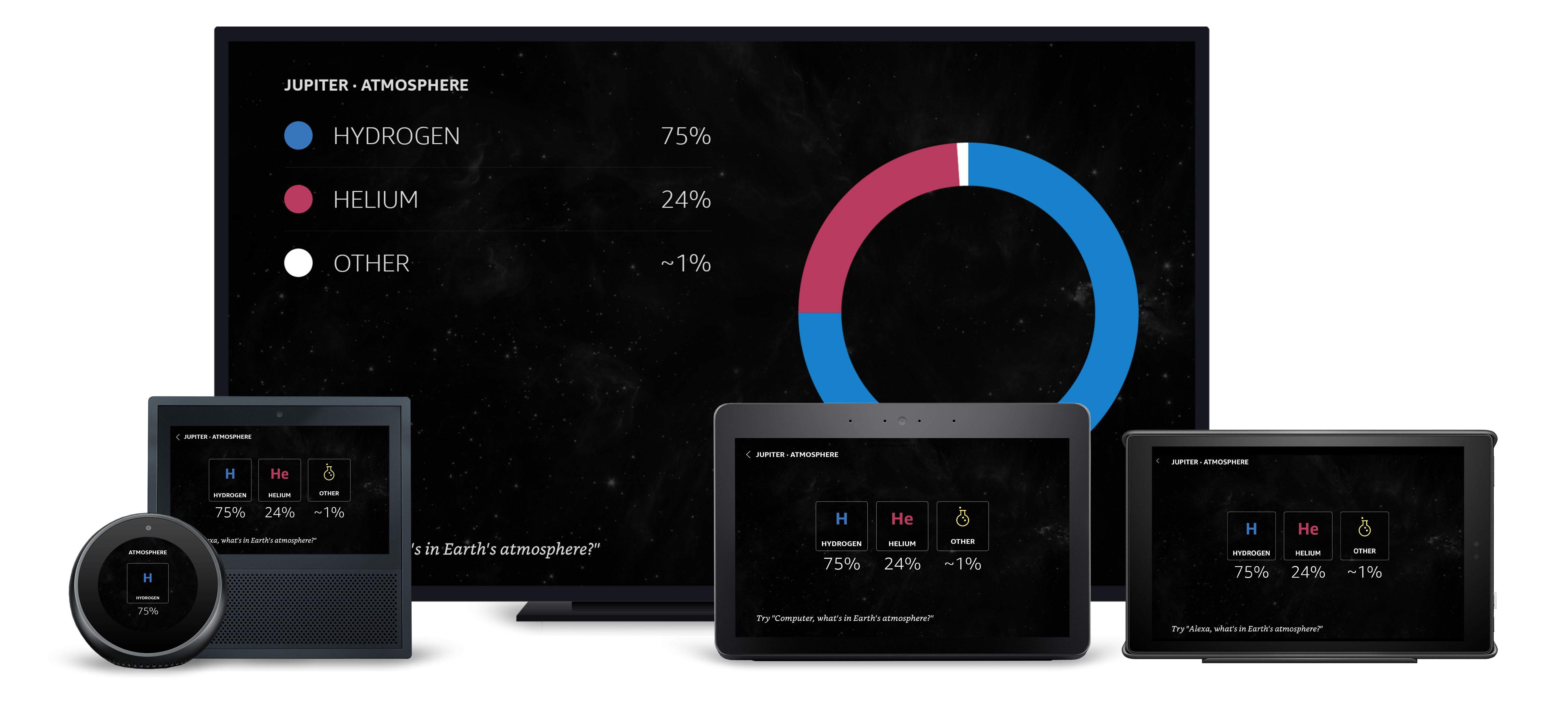 Another important factor we designed for was the variable nature of the displays. What works for presenting information on one device doesn't necessarily work on another. In the above example, we use the periodic-table style element blocks for most displays, but changed the number of elements on screen for the smaller Echo Spot display. We also used the much larger television screen to include a donut chart, which didn't fit well on the smaller displays.
Creating Touchable and Voice-Driven Elements for Space Explorer
We’re all familiar with the interaction patterns that come with smartphone apps. Our challenge was to design screens that users could touch and speak to. A great example of that is the planet details page.
.jpg._CB459235689_.jpg)
As we've already mentioned, screens are great for adding way-finding context to your skill. Using lists to present options to users helps them better navigate, and including ordinals on those lists makes that even easier. For example, on this screen a user can say, “Overview,” or “Tell me about it,” or “Number one.”
Taking Screens Out of the Equation
With the interaction model planned and screens designed, it seemed logical to start development right away. However, we were forgetting an import part of the puzzle. Alexa is, first and foremost, a voice-only interface. Designing an interaction model that relies on a screen doesn't work for Alexa-enabled devices without screens. We needed to go back and create an alternative interaction model that did all the things our screens did with voice alone.
For instance, instead of simply welcoming a user to the solar system and asking them what they wanted to do, we needed to provide some examples and options. We also realized we needed to make it possible for a user to ask for help, and that Alexa's response should be specific to the user's current location.
In future blog posts, we'll dive into how we used APL to achieve our vision and how AWS Lambda played an integral part in that. We'll also talk about fleshing out the interaction model and using the developer portal to test and iterate quickly. Stay tuned.
Related Resources
- Space Explorer Sample Code
- Alexa Presentation Language Technical Documentation
- 10 Tips for Designing Alexa Skills with Visual Responses
- 4 Tips for Designing Voice-First Alexa Skills for Different Alexa-Enabled Devices
- How to Design Visual Components for Voice-First Alexa Skills
- How to Get Started with the Alexa Presentation Language to Build Multimodal Alexa Skills
