Best Practices for Skill Card Design
Cards can be powerful additions to the user experience with Alexa. A card can enhance the voice experience by delivering value-add content relevant to the voice conversation.
There are many form factors to consider in how cards are displayed. Users view home cards in the Amazon Alexa app for iOS/Android/Fire OS and on screen when interacting with Alexa on Fire TV, and on Alexa-integrated Fire tablets. On Alexa-enabled devices with a screen, users view cards that follow a default format unless you use Alexa Presentation Language or display templates to provide a custom display.
This guide provides design best practices for both simple and standard cards.
Types of cards
There are two main types of cards:
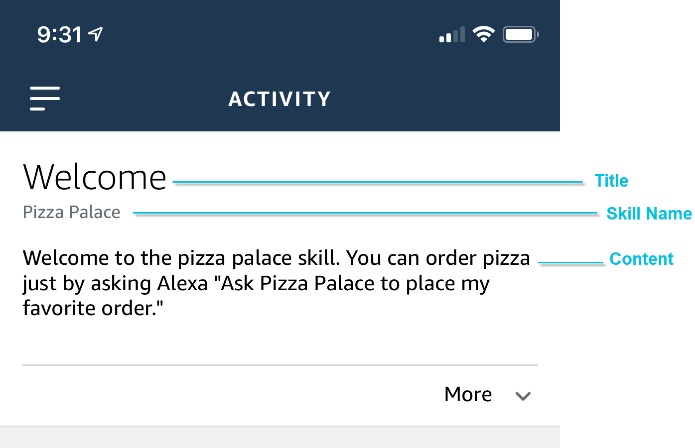
- A simple card displays plain text. You provide the text for the card title and content.
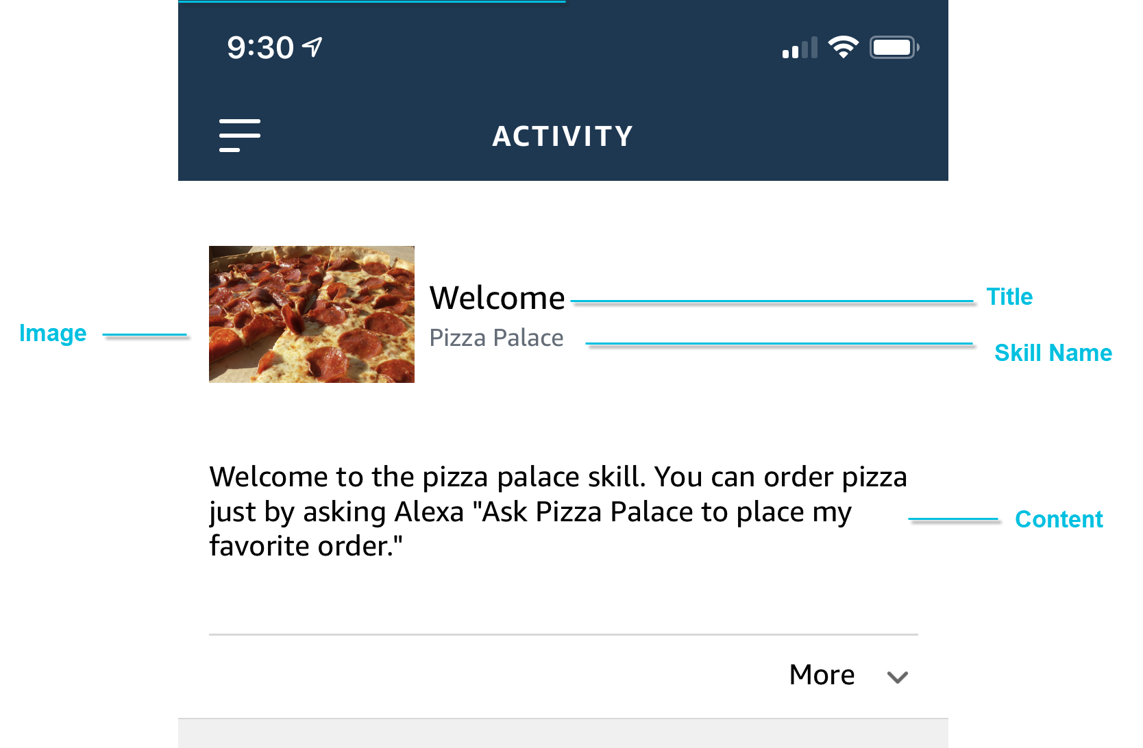
- A standard card displays plain text and an image. In addition to the card title and content, you provide the URL for the image.
Cards displayed in the Alexa app
Cards displayed on Alexa-enabled devices with a screen
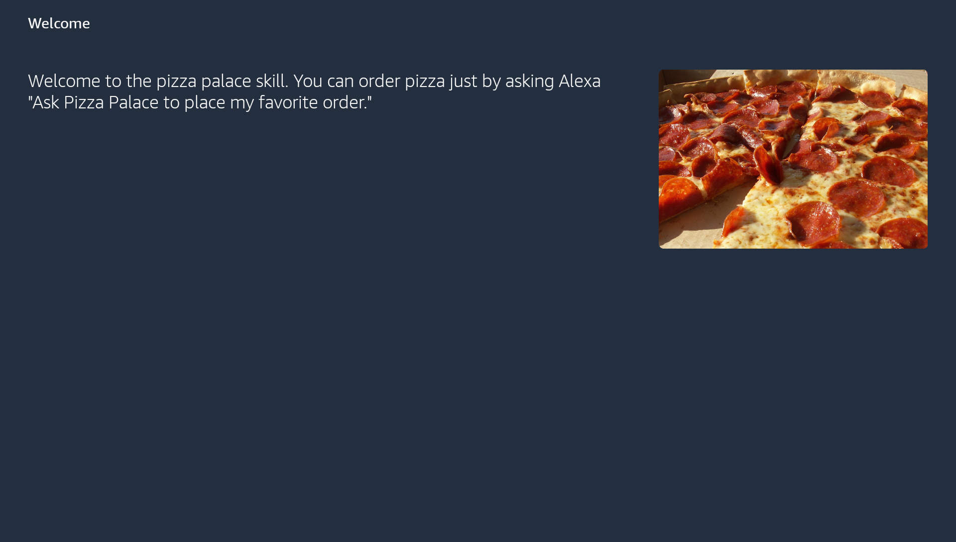
When users invoke a skill on an Alexa-enabled device with a screen, you can use Alexa Presentation Language or display templates to define the visuals on the screen. When your skill response doesn't include APL or a display template, Alexa displays the content of the card.
A Simple card just displays the text. For a Standard card with an image, Alexa displays the card text on the left and the card image on the right.
Fire tablets and Fire TV devices use the same format to display cards. Consider using Alexa Presentation Language to provide a richer user experience on these devices. For design guidance, see Multimodal Design: Introduction.
General
When to include cards, and how often?
The timing and frequency of pushing cards is important.
- Limit the number of cards: Too many will take the user out of the voice experience. Avoid pushing cards with every response, unless it is absolutely necessary.
- Don't make it a necessary step: Avoid making the user leave the voice experience to complete a task or view something on the Alexa app in order to continue. For screen devices, voice should remain the primary form of interaction, and as much as possible, the user should be able to navigate through the skill strictly by voice.
User: Alexa, ask Pizza Palace what did I order last?
| Do | Don't |
|---|---|
|
Pizza Palace: You ordered a pepperoni and ham pizza with extra sauce |
Pizza Palace: I've sent a card to the Alexa app with the information on your last order. You can take a look and come back. |
Use cards for the details
Cards can support the voice experience by sharing additional information or details of a voice event.
- Highlight the Right Details: Help a user evaluate a product where only the product name or a very brief description was shared via voice. For example, share reviews, images, ratings numbers, dimensions, and so on for a product.
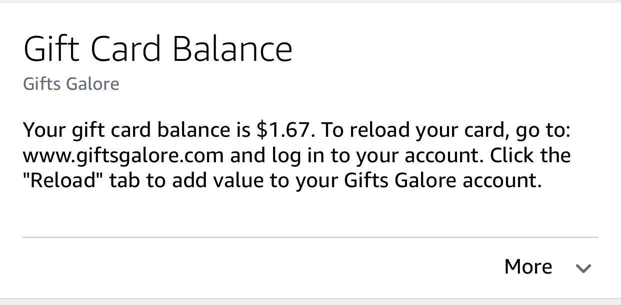
- Add Context: Provide extra context for the voice interaction. For example, a request to make a purchase with a gift card could send a card indicating the gift card balance if it is below a threshold.
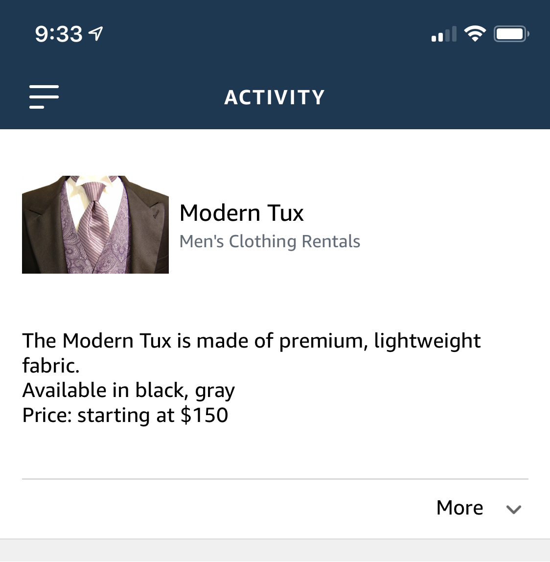
User: Tell me more about your Modern Tux.
Alexa: Our Modern Tux is made of premium, lightweight fabric and is available in black and gray. Rental prices start at $150. Would you like to learn more about renting this tuxedo?
Alexa: Thank you for making a purchase with us. I've noticed that your gift card balance is now below $5.
(The voice interaction is complete. The skill sends a card with more details about the gift card balance to enhance this interaction, but it is not required.)
Don't rely on history
The Alexa mobile app has a scrollable history, but the Fire TV does not support a history of skill cards. Therefore, it is important to use cards as one-off individual experiences
- Use cards as individual experiences: Don't depend on the card before or after using the skill since the user might not be able to access it.
- Don't expect users to save information on the cards: Cards can't be saved. Don't expect users to save the data on the cards or refer to it in the future. For instance, while details about a transaction are useful as a card, the card can't serve as a transaction receipt since the user can't save it. In addition, users can't search for old cards.
Help the user navigate
Cards can be a great way to get a lost user back on track, or enable self-service to show users what they can do.
- Provide guidance: Give enough detail for the user to move forward when lost – without going overboard.
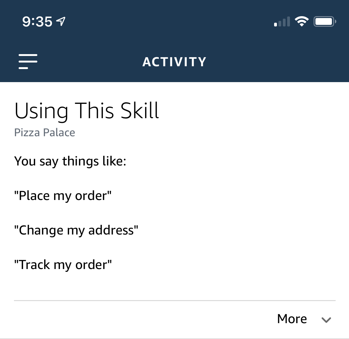
- Suggest sample utterances when they need help: Share sample utterances when
AMAZON.HelpIntentis triggered. - Keep the timing and context in mind: Don't offer utterances that can't be used in the context of the current situation. For example, don't suggest a checkout utterance when there aren't any items in the user's cart.
User: How can I use this?
Pizza Palace: Some things you can do with Pizza Palace include: place my order, change my address, or track my order.
(This interaction sends a card with suggested utterances.)
Text usage
Text amount and hierarchy
Think of cards like slides in a powerful slide presentation.
- Keep it short, informative and clear: Structure text for cards in brief, informative sentences or lines of text. Avoid unstructured product details.
- Don't rely on large blocks of text: Cards are not meant for long blocks of text. Keep details to a minimum so a users can evaluate the card at a quick glance.
- Sometimes you need a break: Use line breaks to help format individual lines of addresses, product details or information. However, don't double line break when separating parts of a street address.
- Links can't be clicked; avoid them or provide clear direction: Since URLs in cards are not clickable links, don't just show URLs to direct users to other sites. Instead, provide instructions to direct the user. For example, have Alexa say something like "go to the settings section of (the website name)".
| Do | Don't |
|---|---|
|
|
|

Text case
There is a right way and a wrong way to approach text casing on cards.
- Make it easy to read: Use sentence case for body text and title case for headlines to make it easier to read.
- Reserve it for the titles: To improve readability, don't use title case for the body text.
- Don't shout: Avoid using all caps in headlines or body copy.
- Do a grammar check: Make sure your text is readable and grammatically correct.
| Do | Don't |
|---|---|
|
|
|


Imagery usage
Image use on cards is limited to a single image on a card. Images are shown at a variety of sizes across the Alexa-enabled device spectrum. It is therefore important to ensure details are limited and images are provided at sizes optimized for smaller and larger screens.
Image simplicity and optimization
- Use simple high-quality images: Choose images with simple shapes and details that can be seen from several feet away to several inches away. Think: Fire TV vs mobile. Save them at 72dpi.
- Use both small and large images: Small images are 720px x 480px. Large images are 1200px x 800px.
- Don't use text on images: Err on the side of no text on imagery to ensure the best card experience but if you must make sure it's easy to read at smaller sizes.
- Give credit: Include any image credit/reference as text on the Alexa card. (Do not place them on the image). Don't use images from the Internet or images you do not have express written license to use.
| Do | Don't |
|---|---|
|
|
|


Adding to the experience
Think of the card as less of a receipt for a transaction and more of a part of the overall experience. Create unique experiences that build on the overall conversation.
- Optimize the card for reading: Don't place transcripts of user's Alexa conversations on the card. Provide quick, easy-to-understand copy.
- Make it delightful: Add moments of surprise and delight into the card. For example, the 4AFart skill displays a funny phrase on the card.
- Keep it visually interesting: Where relevant, use different images based on what the user has heard, or the text represented on the card. Avoid using the same image on every card, if possible.
- The right details matter: Bring the experience to life by adding images and supporting information. For example, if the user orders tulips, show them a picture of a tulip arrangement.
Next steps
- Next: Test Your Skill
- Previous: Including a Card in Your Skill's Response
- Return to: Steps to Build a Custom Skill
Last updated: Nov 28, 2023